About Dashboard:
This dashboard shows the team performance by sales per hour, revenue per hour, customer satisfaction, sales vs. hours, total sales, customer ratings, for regions & products.
The dashboard contains 6 interactive charts, 1 table & 2 slicers to display information to management.This dashboard has been developed with formulas.
The dashboard focuses on total transparency of performance by the team.
There are many ways in which you can visualize team performance data to understand the achievements by various teams. In October, ExcelForum team launched a dashboard competition in which you were asked to visualize sample data. The challenge has generated a huge thrill around the community and fetched 118 incredible entries.
Thanks everyone for participating and making this a huge learning experience for everyone. Excel Forum team has learned several useful dash board and charting tricks.
In this article, we will show you the steps on how to create this dashboard.
Let us see how the Dashboard made by Dirk Granneman looks:

We have divided this dashboard into 9 sections of information. Let us take a look at each one separately.
Section1:
The header contains all the teams’related information. If we click on any one of them then that team will be highlighted &all the related information will get automatically interactive.
![]()
Section2:
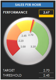
In this section, sales per hour is shown with two parameters,target & threshold,using speedometer chart.

Section3:
The following picture shows the revenue per hour, by target & threshold.

Section4:
The below picture shows customer satisfaction in percentage, by target & threshold.

Section5:
This section covers Sales vs. Hours.

Section 6:
This section covers total sales for the selected region & product.

Section 7:
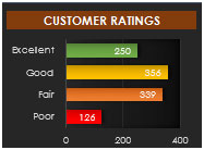
The following picture shows customer ratings with 4 parameters, as excellent, good, fair & poor using bar chart.

Section 8:
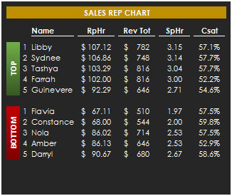
This section shows information about top 10 & bottom 10 Sales rep chart per rev per hour, rev total, sales per hour & CSAT.

Section 9:
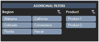
This section is created using slicers, controlled by region & product. We can select any combination of region & product, and on the basis of the selection all related information gets updated dynamically.

Using this dashboard we can get a clear view of the Team Performance;and thus we can get the information from various points of view.
The applications/code on this site are distributed as is and without warranties or liability. In no event shall the owner of the copyrights, or the authors of the applications/code be liable for any loss of profit, any problems or any damage resulting from the use or evaluation of the applications/code.
Can any1 help me in making a new dashboard based on my requirements for HSE KPI's
Thanks
Thanks Navpreet for the appreciation. 🙂
I am downloading this and will give it a try. Thanks for creating this tool.
Impressive