Gauge Chart in Microsoft Excel

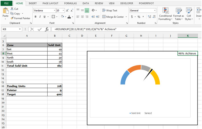
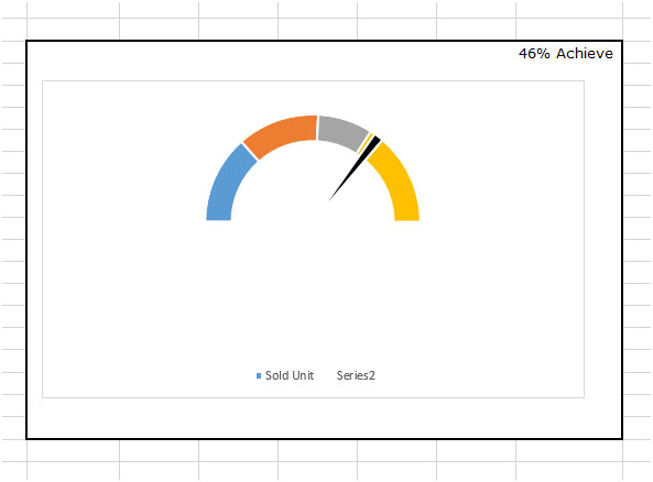
A Gauge Chart is a combination of Doughnut chart &Pie Chart in a single chart. The Gauge chart looks like a speedometer which we can find in Cars, bikes, Ac etc. That is why we can call a this Speedometer chart too.

To prepare the Gauge chart we have to use the Doughnut Chart along with Pie Chart.
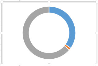
Doughnut Chart: - Doughnut chart is used to show the proportion of the whole. Use it instead of Pie Chart when there are multiple series that relate to a larger sum.
img1

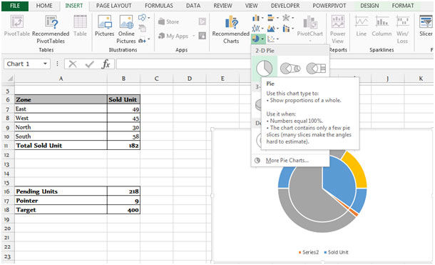
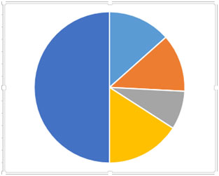
Pie Chart: - This chart is used to show the proportion of the whole. Use it when numbers are equal to 100% and the chart contains only few pie slices (many slices make the angels hard to estimate).
img2

Let’s take an example & understand:

We have a table from Range “A6 to B11”, which is having Zone & Sold unit with total sold unit. Column A contains the Zone Name, Column B Sold, & in cell B11 is having total sold unit. We have another table of Targets & Require sold unit per zone.
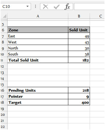
img3

To prepare the Gauge chart follow below mentioned steps:-
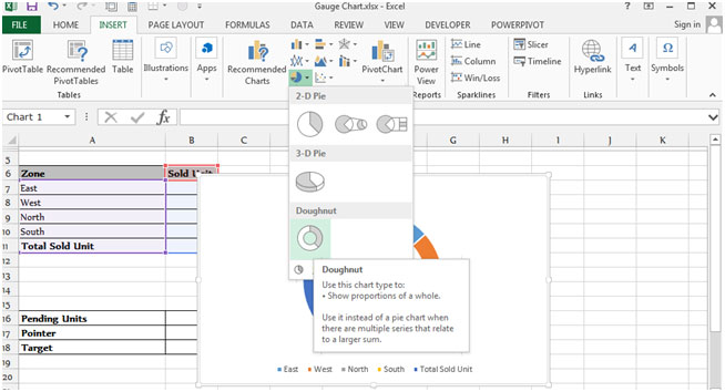
  • Select the range “A7 to B11”.
  • Go to the Insert tab, Select Doughnut Chart from the Chart Group.

img4

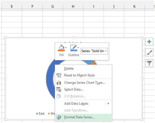
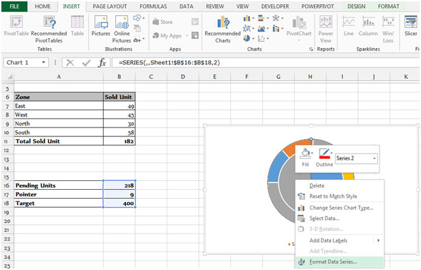
  • After inserting the Doughnut Chart, select the series of “Total Sold Unit”.
  • Right click of the mouse pop up will appear, click on Format Data Series.

img5

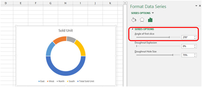
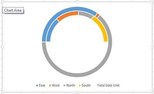
  • Format Data Series Dialog box will appear, Select the series option and change the angle to 270 degrees.

img6

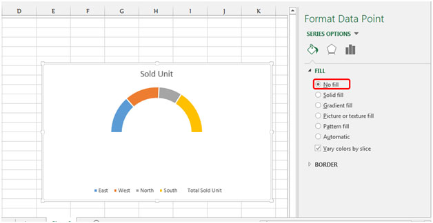
  • the Total Sold Unit series and fill it with No Fill.

img7

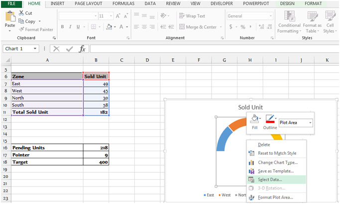
  • Click on the chart and right click of the mouse click on Select Data.

img8

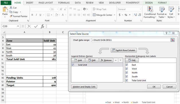
  • Select data Source dialog box will appear.

img9

  • Click on the Add button, Edit Series dialog box will appear.
  • Click on Series Value, select the range of the next table B16:B18.

img10

img11

  • Excel will automatically create the new chart Doughnut, we have to change this chart into Pie Chart.
  • Right click on the chart with the mouse, Select Change the Chart Series.

img12

  • Select the Check Box of Series 2, Select the Pie Chart from the drop down menu.
  • Click on ok.

img13

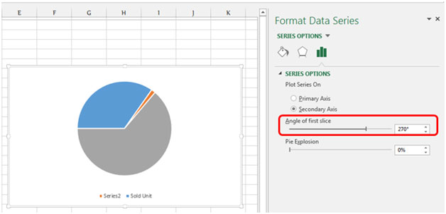
  • Right click on the chart and select Format Data Series, Choose the Secondary Axis from Series Options and change the angle to 270 degrees.

img14

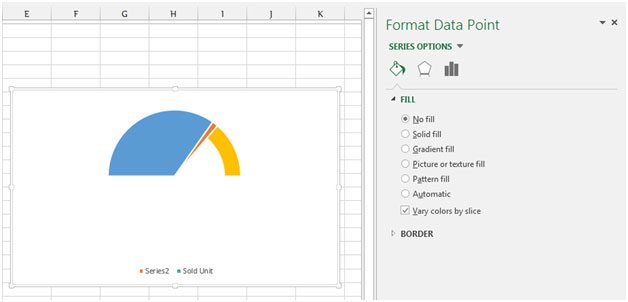
  • After changing the angle, in the target series select No fill option from Fill Tab.

img15

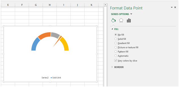
  • In the series of pending units select No Fill option.

img16

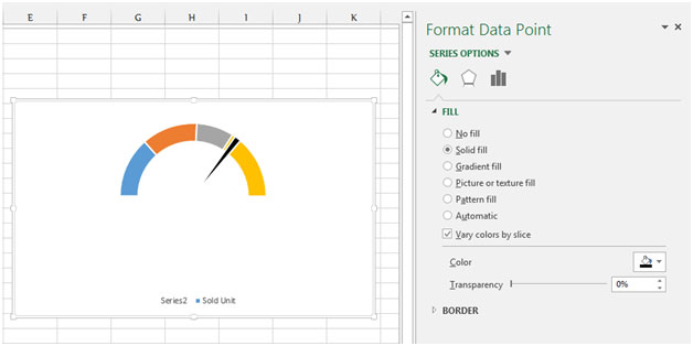
  • Select the series of pointer go to Fill Tab, Choose the solid fill and change the color in black.

img17

We will prepare the Gauge chart presentable follow below given steps to prepare the chart more presentable:-
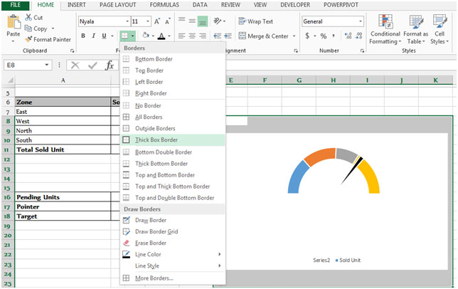
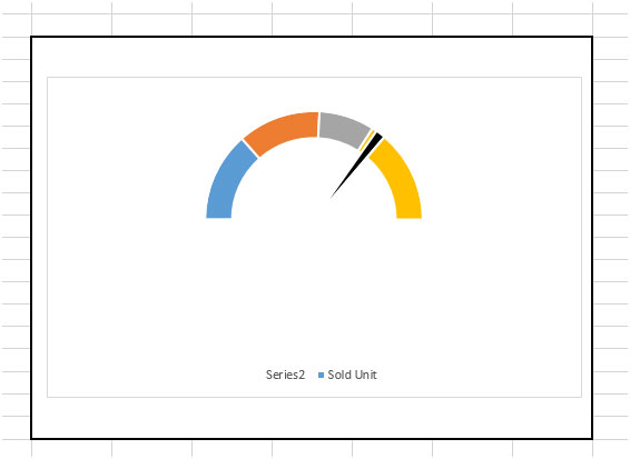
  • Select the background area of the chart, Fill this area with the white color, and Select the thick box border.

img18

img19

  • Select the cell K8, we write the formula in this cell for display the %age of achievement in this cell.
  • Our function will be =ROUNDUP((B11/B18)*100,0)&"%"&" Achieve" and Press Enter on your keyboard.
  • The function will return the %age of achievement.

img20

img21

This is the way you can prepare Gauge Chart – with the combination of 2 charts Doughnut chart and Pie Chart in Microsoft Excel in 2010 & 2013.

Comments

Leave a Reply

Your email address will not be published. Required fields are marked *

Terms and Conditions of use

The applications/code on this site are distributed as is and without warranties or liability. In no event shall the owner of the copyrights, or the authors of the applications/code be liable for any loss of profit, any problems or any damage resulting from the use or evaluation of the applications/code.