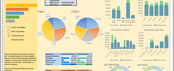
Finance Dashboard:-It is used to present the fiscal performance. This dashboard is used to show how much revenue generated in the year, quick ratio, and short term assets. The idea behind the dashboard of any executive officers isthat just by one "look" you can get information about the need to drive the business forward.
Basically financial dashboard provide the information about the company’s performance. Through this dashboard we can analyze the company’s performance and growth. On the basis of financial analysis management take the decisions for the Company’s growth and take the appropriate decision about the goals and targets to the company.
Below shown dashboard is presenting the Financial Analysis.
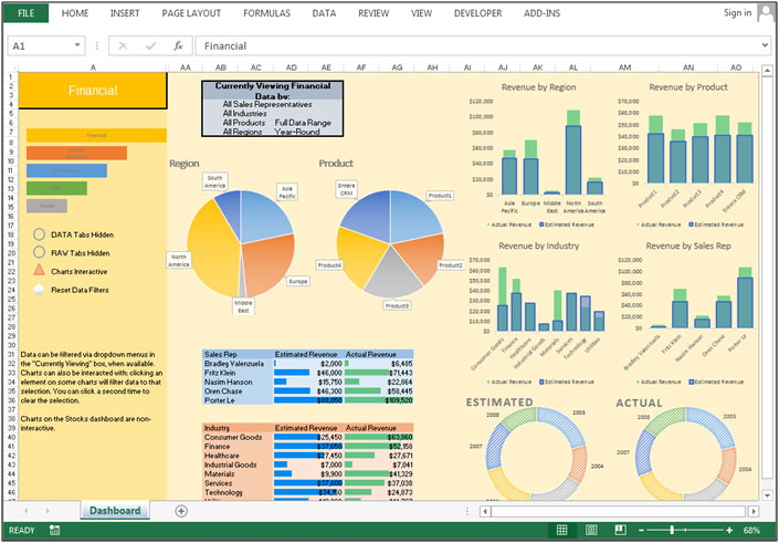
In this dashboard we have the Revenue generation report, comparisons.

Pie Chart:- In the Pie chart we can see how the revenue is contributed by all the regions and in the 2nd Pie chart we can see the contribution of every product.

In the first table we can see the comparison in between estimated revenue and actual revenue for Sales persons.
In the second table we can see the comparison between estimated revenue and actual revenue for every department.
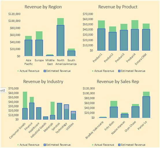
In all the charts we can see the graphical comparison between Actual revenue and estimated revenue.
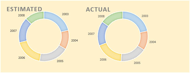
Doughnut chart used to show the actual v/s estimated revenue year wise.
Human resources dashboards are useful to analyze the performance and improvement areas of resources, employee satisfaction. We can finalize the salary standard for every levels and designation accordingly.

Human resource dashboard is usedto present the department, all employees, all salaries, and all hire dates.

Pie chart used to show the headcount share to every department. Through this chart we can see that Customer support is having very less share of headcount compared to other departments.
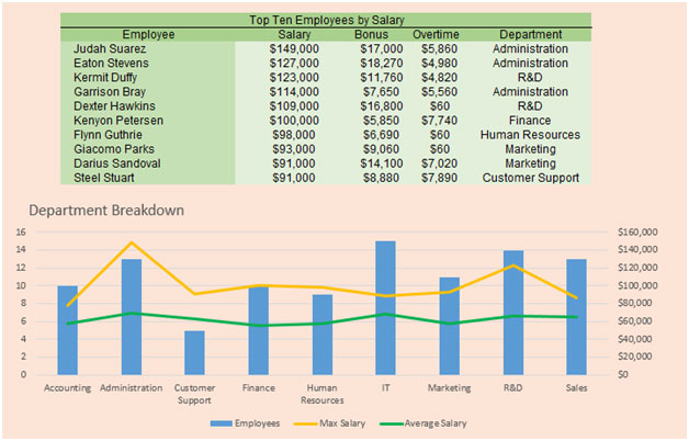
Here we can present the salary break down as per the Salary, Bonus, and overtime. Through the chart we can present the department wise report as per Employee, Max Salary, and Average Salary.

Bar chart is used to present the number of employee according to salary criteria. Through this chart we can see that large number of employees are taking 70,000($) salary.

Doughnut chart is used to show the ratio by hire date.
Team performance dashboardanalyses the team performance. By using the team performance dashboard we can see individual performance and make improvements in the performance on the basis of data.It helps us to forecast the next vision of targets and achievement and managing things like how we can improve sales, how we can generate revenue etc.
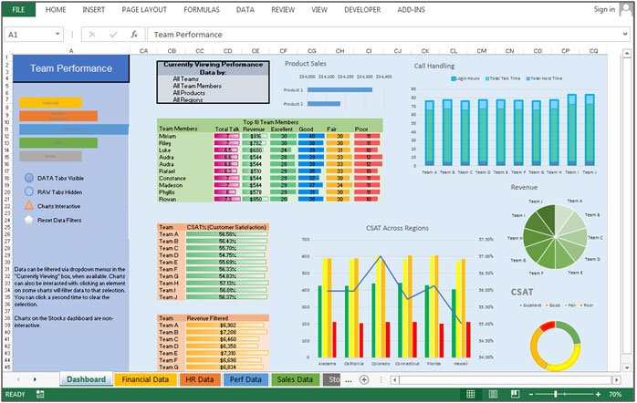
Team performance dashboard will present the report according to all teams, all team members, all products, and all regions.
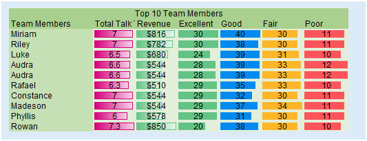
In this table top 10 Team members are showing according to the talk time, revenue, CSAT of Excellent, Good, Fair, and Poor.

In this table we have CSAT % team wise and Revenue filtered team wise.
Graphical picture used to show the CSAT % region wise.

Column Chart used to show the login hours, Total talk time and Total hold time team wise.
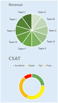
Pie chart is used to show the revenue contribution by the every team and doughnut chart is used to show the CSAT ration overall.
Sales performance dashboard is useful to analyze the performance of sales. By using the sales performance dashboard we can see the individual performance and make improvement in the performance on the basis of data.It helps us to forecast the next vision of targets and achievement and managing the things like how we can improve sales and how we can generate revenue etc.
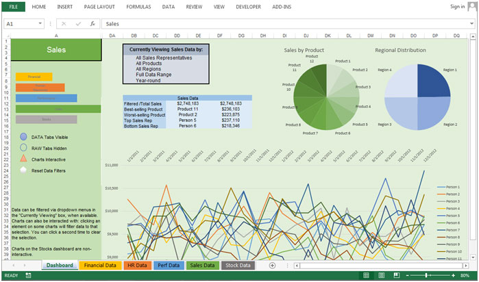
Team performance dashboard will present the report according to all sales representatives, all products, all regions, full data range, and year round.

In this table we can see the summary of sales in terms of Total sales, best-selling, worst-selling, top sales rep, and bottom sales rep.
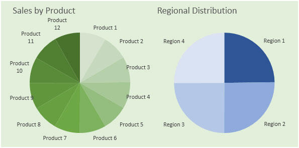
Pie charts are used to show the sales contribution product and region wise.

Line chart is used to show the sales number to every sales person.
Stock Dashboard is useful to show the share trend, that how the share is performing in the last year, last month and last day. It is useful to analyze where we should invest our money.


In the first table we can see top traders by volume, closed At, and %age.
In the second table we can see the comparison in between Previous and current day’s highest, lowest and average trade value with percentage.
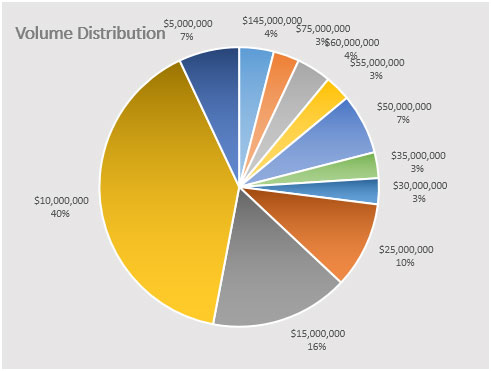
Pie used to show the volume contribution.
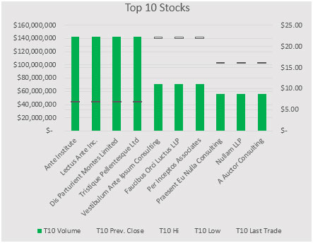
Column chart used to show the graphical picture of Top 10 Stocks with volume.
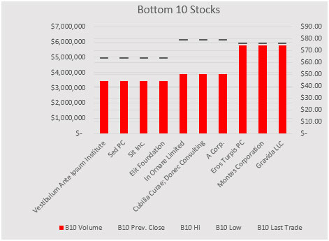
Column chart used to show the graphical picture of bottom 10 Stocks with volume.
![]()
If you liked our blogs, share it with your friends on Facebook. And also you can follow us on Twitter and Facebook.
We would love to hear from you, do let us know how we can improve, complement or innovate our work and make it better for you. Write us at info@exceltip.com
The applications/code on this site are distributed as is and without warranties or liability. In no event shall the owner of the copyrights, or the authors of the applications/code be liable for any loss of profit, any problems or any damage resulting from the use or evaluation of the applications/code.
Excellent Dashboard with Innovative Thoughts. Great to know this excel. Thanks for sharing
Well done, i want to do spreadsheets like this
Very good and impressing workings, and beautiful presentation, thanks a lot.
Awesome. Am falling short of words. Simply amazing! Keep me posted of your new work!
Thanks for the Data Validation note advice above.
Another area I'm unable to solve is how to make a Tab selection via a macro.
Are you able to supply a sample or some guidance please?
How to make a tab selection in VBA? That part is easy enough:
Sheets("SheetName").Select
In actuality, the different dashboards in here are all on the same tab, though. They're each in a different range of columns. What I'm doing, each time the switch macro is clicked, is hiding all 5 dashboards, then unhiding the one that was clicked, like this:
Sheets("SheetName").Range("AA:EZ").EntireColumn.Hidden = True
Sheets("SheetName").range("BA:BZ").EntireColumn.Hidden = False
Thanks for the response.
Yes I recognise what you have stated above.
What I'm looking to achieve is the pretty bits where it would be possible to change the bar graph indicator to the full length of the revised selection, and adjust the other lengths.
I see how the lengths adjust. I'm looking for how to place the trigger for - this is the one to be the full length.
As part of this I will make the workbook default to the display I want to be seen whenever it is opened.
Not to worry, challenged to work something out I've come up with a cheats way by dropping in default values to the dataset.
Thanks again for your impressive workbook.
Dear K bryant 414,
I'm also impressed by the dashboard you have developped. I am specofically very curious how you made the graphs interactive. I made a couple of dashboards my self too, by using slicers. If I could turn slicers into graphs like you did I can further improve my dashboard. So could you let me know hoe you did that?
Your answer will be highly appriciated.
Gr,
Erik Suurmond
Hi Kbryant and well done, this is mesmerizing!
How do i add new data on the raw tabs so it updates data tabs and graph data please?
I'm just afraid to leave something out.
Thx
Congratulations... u have done a great job...
Great work
Something simple within. Where Ben, MaraisV, and DB have been referring to the notes that appear on the sheet when various cells are selected.
They don't appear to be "Comments".
What is this note method called?
How do I edit?
How do I add for future?
Those are done via Data Validation.
On the Excel ribbon, go to Data, then Data Validation. The second tab, Input Message, will display when the cell is selected.
SUPER!!! Congratulations
It helps me a lot mahy rhanks!!!!
Hi Kbryant - thanks for responding and let me 1st say what an amazing dashboard. It really is so intuitive.
I am referring to the input message on the Data Tabs cell;
“The DATA tabs have parsed and calculated data. These are based on the RAW tabs and should not be altered directly.
To update data, add new data to the RAW tabs and use the Update button.”
Just wondering if because the data is parsed on the tables you had VBA in there to automatically update it?
Congrats to you kbryan414 on 1st place. Did you use, write any macros? hyperlinks? Which version of xls? I could add to this spreadsheet.
A good effort, some great ideas which I will definitely recycle. From experience I have learnt that the use of colours are very important. How will your dashboard look on the big screen in the boardroom - is there enough contrast to show information clearly? Remember your 70 year-old CEO may not have the sharpest eyesight any more!
The worst presentation here - sales by employee. Really, it shows a pile of meaningless lines.
Best feature? Too many to mention!
great work! I'll take a copy of it, thank you very much.
Amazing work! So well thought out.
Can somebody please tell me where the "update button" is? The author of the dashboard refers to it in the comment for the DATA Tabs Hidden field. Thanks!
Seconding this question. Looked all over the VBA, is this an easy find and my noob status is showing?
Author here. I'm not sure what 'update button' you're referring to.
DATA Tabs Hidden is an on/off toggle to show or hide the DATA tabs. I used a circle shape as the button to trigger this -- and change the transparency of the shape's fill to indicate whether it's currently on or off. Was this what you meant?
Hi Kbryant - thanks for responding and let me 1st say what an amazing dashboard. It really is so intuitive.
I am referring to the input message on the Data Tabs cell;
“The DATA tabs have parsed and calculated data. These are based on the RAW tabs and should not be altered directly.
To update data, add new data to the RAW tabs and use the Update button.”
Just wondering if because the data is parsed on the tables you had VBA in there to automatically update it?
Ah! Sorry, I thought I had removed that note.
Originally, I intended to take this a little further. If I had done so, you would have pasted the new data into the RAW tab, hit the Update button, and it would then update the DATA tables and all of the charts with the new data. It's a simple method I use frequently when building reports because it allows other users to easily update a report, after it's been built.
However, with the deadline approaching, and realizing this wouldn't factor into the contest, I opted to leave that part out. Sorry for the confusion.
Excellent work no words to praise your work kbryant, would if possible you can tell us how to unlock and update new data and update dashboards. Congrats again on your work amazing.
Awesome work done, really good. Very pleasing to eyes as well.. A bit of though and you can have everything you want
Great Work..
Really cool
Great work friend
Wow, very impressive and inspirational. Thanks
Congratulations....!
I wish always to succeed in whatever you do.
Thanks for dashboard.....
Better than anything I've ever done. Most impressive!
Excellent..
I want to learn advance excel, can anyone suggest how can I gets excellence in MS Excel.
I love this dashboard, it is amazing. I downloaded the file and did not see all features that are shown in the images above. Will this ever become available?
I believe this is one of the best interactive dashboards I have seen in a long while. Hats off to you!!
Awesome! It's really amazing work! thanks for sharing.
well done & tremendous job .....:)
Well done & tremendous job ......: )
Incredible Work! Congrats!
Actually kinda think it looks like barf. And why would you do comparisons with multiple donut charts...
These look awesome! Great job
I dream in Excel - seriously - and I stand in awe. This is going to give me sweet, sweet dreams. Hats off to you, us mere mortals have a long way to go.
Fantastic demonstration of Dashboard capabilities within Excel. Third Parties charge a fortune for this style of data interpretation, so I take my hat off to you all.
It's also good for the "rest of us" to know that we still have lots to learn, as Excel has so much more depth now than ever before.
Great effort and work excellent, well done keep it up... wish you all the very best....
Thank you so much.
congratulation!!
very excellent......the layout design, color combination, chart type, interactive, easy to understand...give me so much idea...thanks 🙂
Great job!! This forum help me out miljon times already!
Thanks a lot for The dashboard 😉
Hey,
Congratulations!!!!
You have done great job.......Keep it up 🙂
It’s awesome, Excellent Dashboard... Congrats!
Excellent Dashboard... Well Done Guys!
Guys seriously !!! so much effort instead Get qlikview even more get qliksense and make your life easier 🙂
Superb
Nice...congrats...
Nice work.. so perfect dashboard. Congratulations.
It's awsome,Congrats!. please also mention it has been developed with in excel or VB also used? and if possible please provide us the copy of file.
The link is the last line before the comments, "Download dashboard". It's right there.
It's nice.
CONGRATULATIONS... 🙂
Its good View of dashboard.
Amazing..beautifully done..
And thoroughly explained..
Excellent Work guys,
Learning lot from you.
Rgds,
Mitesh
Wow, impressive and pleasing to the eye.