In this article, we will learn how to make Scatter graph in Microsoft Excel.
Scatter Chart is used to show the relationship between sets of value and to show scientific XY data.
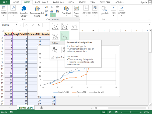
Scatter Chart contains 7 types of Column charts, Scatter, Scatter with Smooth Lines and Markers, Scatter with Smooth Lines, Scatter with Straight Lines and Markers, Scatter with Straight Lines, Bubble, and 3-D Bubble.
Scatter with Straight Lines
Let’s take an example and understand how we can use the Scatter chart in Excel.

Follow below given steps:-

Result:-


This is the way we can create Scatter Chart in Microsoft Excel 2010 and 2013.
The applications/code on this site are distributed as is and without warranties or liability. In no event shall the owner of the copyrights, or the authors of the applications/code be liable for any loss of profit, any problems or any damage resulting from the use or evaluation of the applications/code.