As the name suggests, Stock charts in excel is used to see high-low values of variables in a data set. As the name suggests, it is mainly used in the stock market to track the stocks of different companies or stock's high-low price on different dates/intervals. But there's no limitation. You can use them wherever you see fit. Basically, it can be used with any data that has high low values.
In excel, there are 4 types of Stock charts. They are found under waterfall and stock chart category in charts group of insert menu.
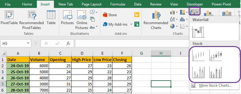
These are 4 types are:
Each stock chart type is used in a different scenario and they need different data arrangement.
High-Low-Close Stock Chart
This chart is used when we have Highest value, lowest value and the closing value. The y-axis represents the values and x axis has time or any series name.
The values are represented using small lines with a dot/marker.
The marker shows the closing value.
The line above the marker shows the high value and line below shows the low value. The length of line show the variation from closing value to low and high price.
Let's see an example of Excel High-Low-Closing chart to understand it.
Here I have some data of stock. Column A contains dates, B contains high prices, C contains low prices and D contains Closing prices.
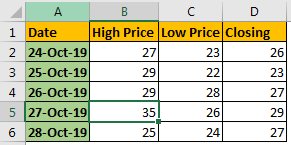
Now to plot High-Low-Closing chart in excel, follow these steps.
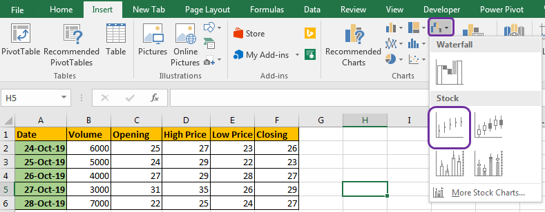

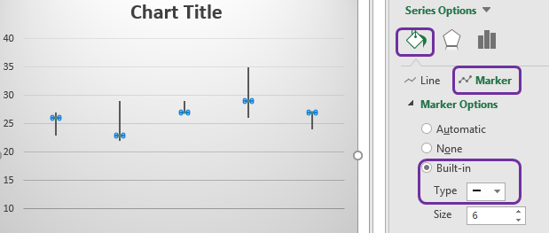
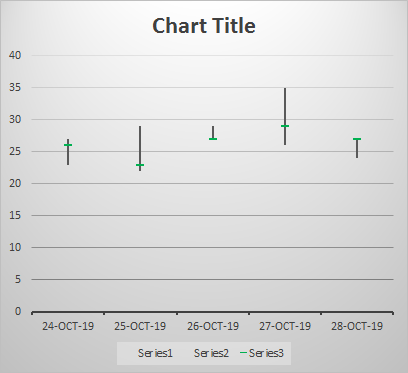
And the chart is ready.
Interpretation:
In above chart, if we look at first point line on 24 oct 2019, shows the lowest price and highest price. The green marker shows the closing prices.
The entire line show the variation in prices. Longer the line means higher instability, smaller lines indicate high stabilities.
Open-High-Low-Close Stock Chart
The Open-High-Low-Close stock chart is used when we want to see profit or loss on chart in the end of the day.
A small box starts from opening value, and ends at the closing value. A vertical line shows the the range between the prices has varied, using high value and low value.
Let's understand it by an example.
In above data, I have added an opening column.
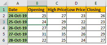
Now to plot Open-High-Low-Closing chart in excel, follow these steps.

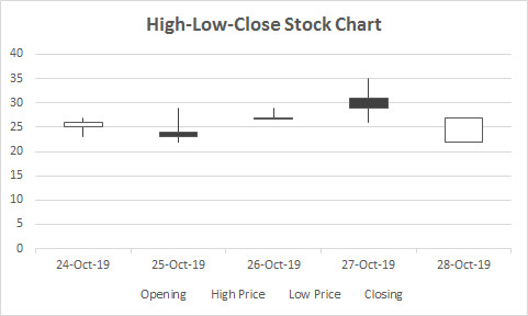
We have our chart. The default chart is good enough to interpret. If you want, you can format it as you like.
Interpretation:
Let's look at the first date. The opening value is 25 and closing value is 26. The small box on the graph represent this range. It starts from 25 and ends at 26. Since it is white, it represents profit in the end of the day.
The thin line shows the lowest price and highest price, same as the High-Low-Close Stock Chart.
On 25 oct 2019, the opening value is 24 and closing value is 23. It is shown as a block box on the diagram. The black represents depreciation.
Larger the box, larger the profit/loss in the end of the day.
Volume-High-Low-Close Stock Chart
When we have four variables, volume, high value, low value, closing value, we use Volume-High-Low-Close stock chart. Obviously!. It is also known as candle chart.
It is basically a column chart that shows volume, with a secondary axis that shows High-Low-Close chart.
Let's see an example.
I have prepared this sample data set to explain this chart type.

In column B we have Volume and the rest is the same as in previous examples.
Now to plot a Volume-High-Low-Close Stock Chart in excel, follow these steps:
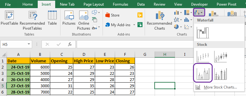

Interpretation:
The blue columns in the chart represent the volume. It is measured on the left y-axis. The High-Low-Close chart is represented on the right, y-axis.
On 24 Oct 2019, the volume was 6000, which is visualised using a blue column. The closing value was 26 which is shown using the maroon bar. The low value was 23 and the high value was 27. This is shown by a thin blank vertical line on that date.
Volume-Open-High-Low-Close Stock Chart
It is a combination of Column chart and Open-High-Low-Close Stock Chart.
When we have five variables, volume, opening value, high value, low value, closing value, we use Volume-Open-High-Low-Close stock chart. Obviously!.
It is basically a column chart that shows volume on primary axis, with a secondary axis that shows High-Low-Close chart.
To explain it, I have prepared an example data set.
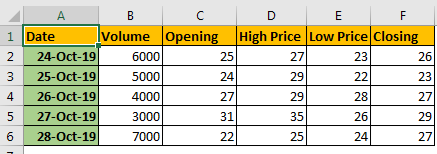
The B column has volume, C has opening and rest is same as early examples.
Now to plot a Volume-Open-High-Low-Close Stock Chart in excel, follow these steps:

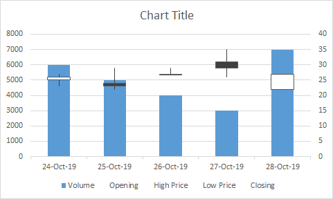
Now the chart is ready, let's interpret it.
Interpretation:
Let's look at the first date. The volume is 6000. It is shown using a blue column on the primary axis.
On the secondary axis, we are showing the Open-High-Low-Close chart. The opening value is 25 and the closing value is 26. The small box on the graph represents this range. It starts at 25 and ends at 26. Since it is white, it represents profit at the end of the day.
The thin line shows the lowest price and highest price, same as the High-Low-Close Stock Chart.
On 25 Oct 2019, the opening value is 24 and the closing value was 23. It is shown as a block box on the diagram. The black represents depreciation.
Larger the box, larger the profit/loss at the end of the day.
So yeah guys, this is how you use the stock charts in excel. These charts are frequently used to see end results. In the stock market field, people are used to it. You can use the excel stock chart in any kind of data that fits the criteria. There's no limation to use it only in stock-related data.
Feel free to ask any questions related to this or any other excel topic. The comments section is all yours.
Download file:
Related Articles:
Excel Sparklines: The Tiny Charts in Cell
Speedometer (Gauge) Chart in Excel 2016
Creative Column Chart that Includes Totals
4 Creative Target Vs Achievement Charts in Excel
Popular Articles:
The applications/code on this site are distributed as is and without warranties or liability. In no event shall the owner of the copyrights, or the authors of the applications/code be liable for any loss of profit, any problems or any damage resulting from the use or evaluation of the applications/code.