A secondary axis in excel is a marker on the right edge of the chart that measures a different value on the chart. A secondary axis is required when you have to compare two distinct types of series on the same charts, mostly whole values and percentages. Without any delay, let's start with practical use.
Example: Create a chart and add secondary axis in excel
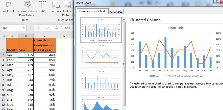
Here, I have a sales record of an XYZ company, in an excel sheet. Column A contains the name of months, Column B contains sales done in the adjacent month, and Column C contains the growth in comparison to last year's month.

Now, I am required to visualize this record on Excel 2016. To do so I follow these steps:

You have your chart. But something is not right? You can see that sales record on the chart but where is the growth bar. We can see the legend tagged below it is nowhere on the graph.

Actually, it is right there. But percentage values are so small (less than 1) in comparison to the sales that the columns of growth can't be seen. In this scenario, we need a separate axis that measures values on a percentage scale. To do so, we will add a secondary axis in excel 2016.
How to add a secondary axis in excel
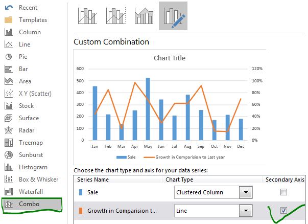
Follow these steps for adding a secondary axis in excel.


By default, the secondary axis is a line. But you can choose from the list chart types to use as a secondary axis. You can also create this chart by simply clicking the option available on the top of the chart.
Directly create a chart with a secondary axis in Excel
If you already know that you are going to need a secondary axis to visualize the data, you can use these steps to create a chart with a secondary axis in Excel.

And it is done. You have your chart ready with the secondary axis. It is a more elegant way to visualize the distinct type of series on the same excel chart. Rather than having two charts for two different types of values, now we have one chart that shows both of the series. We can compare them easily.
So yeah guys, this how you can add and use the secondary axis in excel. I hope I was explanatory enough to make this easier to grasp. If you have any doubts or queries regarding charting in excel or any other topic related to excel and VBA, comment in the comments section below.
Related Articles:
Creative Column Chart that Includes Totals | Most of the time we have two different charts for visualizing individual and totals data. This chart type can have an accurate and visually stunning column chart that can show total too that can be compared to totals of other series.
4 Creative Target Vs Achievement Charts in Excel | These 4 targets vs Achievement charts can make your presentation stand out.
Best Charts in Excel and How To Use Them | Charts are tools that are used to visualize complex data, and it best to know about the best charts excel offers to visualize different charts type.
Speedometer (Gauge) Chart in Excel 2016 | Learn how to create A speedometer chart in Excel 2016 and older versions.
Popular Articles:
50 Excel Shortcuts to Increase Your Productivity | Get faster at your task. These 50 shortcuts will make you work even faster on Excel.
The VLOOKUP Function in Excel | This is one of the most used and popular functions of excel that is used to lookup value from different ranges and sheets.
COUNTIF in Excel 2016 | Count values with conditions using this amazing function. You don't need filter your data to count specific value. Countif function is essential to prepare your dashboard.
How to Use SUMIF Function in Excel | This is another dashboard essential function. This helps you sum up values on specific conditions.
The applications/code on this site are distributed as is and without warranties or liability. In no event shall the owner of the copyrights, or the authors of the applications/code be liable for any loss of profit, any problems or any damage resulting from the use or evaluation of the applications/code.