Stacked charts are good for visualizing data as part of a whole. They are the same as stacked bar charts with only difference of orientation. The stacked bar chart is oriented horizontally, and stacked column chart is oriented vertically.
If you have a small number of categories to show, stacked column chart can be used for effective comparison of data. But when the number of categories increase stacked column chart gets complicated to read.
There are two types of stacked column charts. Let’s explore them one by one.
This is good for number comparison.
The stacked column chart is best for comparing data within the group. You can also use it to compare with all groups. Like you can compare one group with the other. But you can't compare the part of the group to the other group. Let’s see how.
Example:
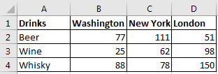
Here I have this data of drink consumption in different cities of world (this is just for example and numbers does not refer to any actual survey).

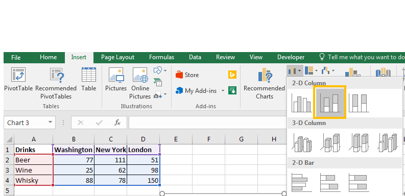
Now to plot a stacked chart in excel 2016, follow these steps:
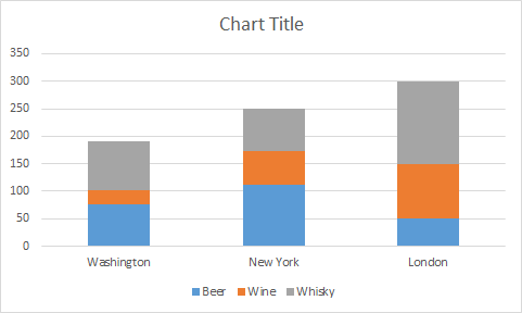
 3. You have your stacked chart.

Now we can see that total consumption of drinks is largest in London. We can easily compare individual drinks consumption in London. But if we want to compare the individual drink consumption of each drink with other groups, it gets hard. It would be better, if we had a 100% chart.
To compare percentage with other groups, we use 100% stacked chart. This can not be used to compare whole groups data with other but it can be used to compare parts of groups to other groups.
Example:
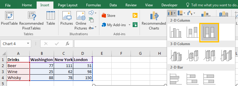
To plot a 100% stacked column chart in excel, follow these steps.
 3. The 100% stacked chart is ready.

Now we can see that total consumption of drinks as 100% and all the columns are equal but the parts are representing the percentage of each drink in the group . We can easily compare the individual drinks consumption with other groups and tell which type of drink is more or less consumed in which city.
So yeah guys, this is how you plot the stacked column chart in excel. You can check out some creative charts mentioned below. If you have any doubt regarding this article or any other excel related topic, do let me know in the comments section below.
Related Articles:
Excel Sparklines : The Tiny Charts in Cell
Speedometer (Gauge) Chart in Excel 2016
4 Creative Column Chart that Includes Totals
4 Creative Target Vs Achievement Charts in Excel
Popular Articles:
The VLOOKUP Function in Excel
How to Use SUMIF Function in Excel
The applications/code on this site are distributed as is and without warranties or liability. In no event shall the owner of the copyrights, or the authors of the applications/code be liable for any loss of profit, any problems or any damage resulting from the use or evaluation of the applications/code.