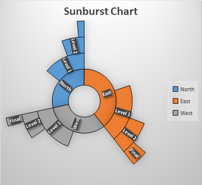
When we have hierarchical data, it's hard to represent it visually. In excel 2016, excel introduced two chart types to visualize hierarchical data. These two types are Treemap and Sunburst chart. In this article, we will learn how and when to use Excel Sunburst Chart.

A Sunburst chart looks like a donut chart, where the inner circle represents the highest hierarchy and outer circles represent lover level hierarchy. Due to the appearance of an exploding sun, it got the name Sunburst chart. Sometimes also called Starburst chart.
Just like pie and donut chart, the Sunburst chart is used to visualize part of the whole data. Each group is represented in a different color and subgroups are shown as a division of that part.
To understand it let's have an example.
Excel Sunburst Chart Example
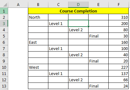
So to explain the use of the Sunburst chart in excel, I have prepared this simple hierarchical data.

A company is running a certification program for its employees. Each individual will attend 3 exams, Level 1, Level 2 and Final. The employees who pass the first level exam will able to attend the next exam.
In the above image, we can see that we have 310 employees in the North region. Out of 300, only 200 passed Level 1 then out of 200 only 80 passed Level 2, and 30 passed Final. The same goes for each region.
Now let's represent it visually.

And the chart is ready.

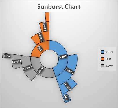
Use some predefined formattings to make the chart look like this.

Interpretation of Sunburst Chart
So, we have created a Sunburst chart. But how do we interpret it? It is somewhat like a pie/donut chart. The larger part holds most of the share of the total. In the above example, the north holds most of the total. Now, we can clearly see how much of the north passed level 1 and then from it level 2 and then final.
When to use Sunburst Chart over Treemap
The Sunburst chart is excellent when you multi-level hierarchy. The Treemap is good when you have 2 to 3 levels of the hierarchy.
Sunburst is easier to understand in comparison to the treemap chart. Visually attractive and explanatory.
Drawback Notes:
You need to prepare data in a special format. Some times it may be a headache.
The Sunburst chart is used to show data in percentage perspective, don't use it for magnitude representation.
It's hard to see data labels on this chart.
A lot of chart area is unused. Use that area to explain the chart.
So yeah guys, this is how you can use the sunburst chart to make attractive dashboards and rock the presentation. Let me know if you have any doubts regarding this topic or any other excel/VBA topic in the comments section below.
Related Articles:
Excel Sparklines: The Tiny Charts in Cell
Speedometer (Gauge) Chart in Excel 2016
Creative Column Chart that Includes Totals
4 Creative Target Vs Achievement Charts in Excel
Popular Articles:
The applications/code on this site are distributed as is and without warranties or liability. In no event shall the owner of the copyrights, or the authors of the applications/code be liable for any loss of profit, any problems or any damage resulting from the use or evaluation of the applications/code.
Hello,
I'd really be grateful if there would be a way to add percentage on each level. Is it poccible ?
Thanks alot in advance,
Hi Marion,
Yes, of course you can add a percentage on each level. You just need to arrange data in percentage terms instead of numbers. For example, your first level can have 100%, our of which 80% crossed. Now this 80% is 100% percent for next level and that can have 1-100% data. I hope it makes sense to you. If it doesn't help, let me know in the comments.