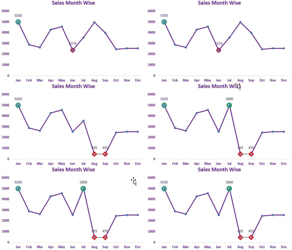

As they say, a picture worths a thousand words, this is true in all fields. Knowing the highest and lowest value in a data set is essential in almost all kind of reports. But in line and column Excel charts, it often gets difficult to identify, which value is highest and which value is lowest. It is always a good idea to highlight the key values on the graph so that the max and min values can easily be spotted visually.
In this article, we will learn how to highlight the top and bottom values on excel Line charts and Column Chart both.

Here I have a data set of sales of different months of a year in Excel Table. I want to have a line graph that highlights the top sales and bottom sales in the year.
Follow these steps:
1: Add Supporting Columns for Max and Min Values
To highlight maximum and minimum values in the excel line chart, we need to add two supporting columns. 1 to for Maximum and another for the minimum.
The Formula in Max column will be:
| =IF(MAX([Sales])=[@Sales],[@Sales],NA()) |
Note: Here we are using structured names. This property is available with Excel tables Read about it here in detail.
If you have a normal table then use the normal range formulas but it will not be dynamic.
| =IF(MAX(B3:B14)=B3,B3,NA()) |
This formula will return the maximum value in the relevant cell, all other cells in the column will be #NA.
Similarly, in the Minimum column, write this formula:
| =IF(MIN([Sales])=[@Sales],[@Sales],NA()) |
Finally, our table will look like this.

Now we are ready to insert a chart.
2: Insert a line chart with markers from the table
Select the data-range and go to insert --> Charts--> Line--> Line with markers

Now we have this chart:

You can see that the highest value on the line is highlighted with an orange dot and minimum value with a grey dot.
So the basic chart for highlighting the maximum and minimum value on the range is ready. You can use it as it is if you want. Or you can do a little bit of formatting to make your chart look attractive.
Why #NA? The reason we use #N/A instead of 0 or blank is to avoid 0 values markers. If we have used 0 or blanks, you will get markers at the bottom of the chart.
3: Formatting the Chart to Highlight Maximum Value and Minimum Value:
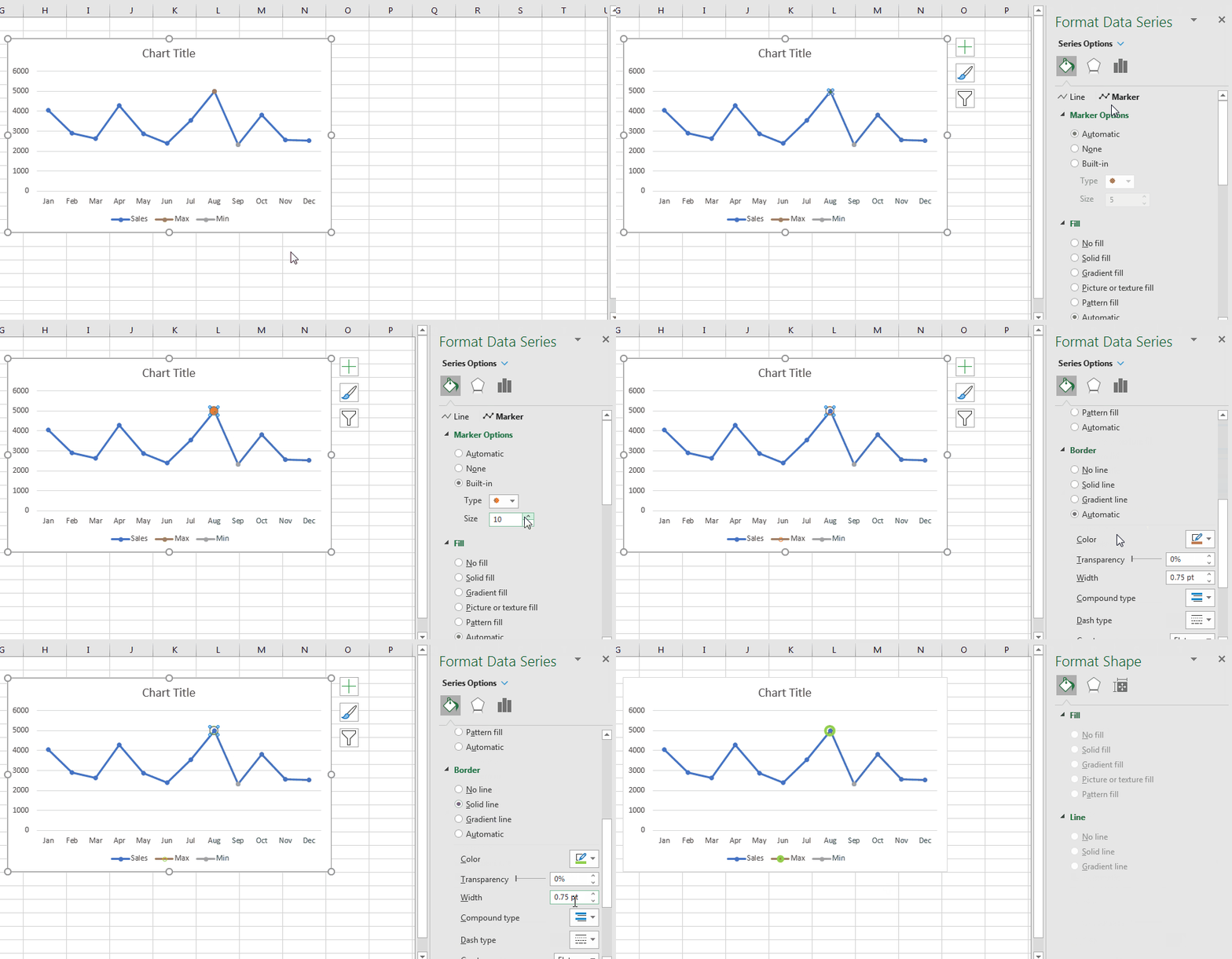
Right-click on the orange marker and click on the format series option.
In markers options, choose built-in. Choose an oval marker (you can choose any shape you like).
Increase the size of the marker. I increased the size of the Maximum Marker to 10.
From the Fill option, choose No-Fill.
From the border, choose a solid line and color of line Green. Thicken the line if you like.

Do the same for the minimum value data series and change the color of the border line to anything that depicts low. I have chosen red. Finally, your chart will look like something this.

Now you can do a little bit more formatting of components of the excel graph if you want or leave at it is. I have changed the colors to suit my dashboard.

To highlight the highest value in a bar or column chart we use almost the same technique as the excel line chart. The only difference is in formatting.
1: Select the Data and Insert a Column Chart or Bar Chart
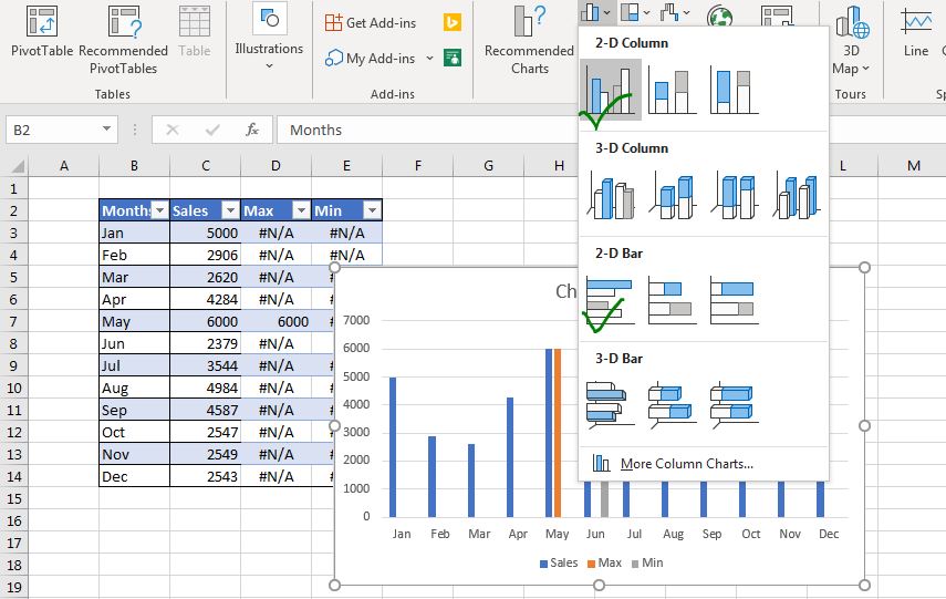
Select the entire data set, including the supporting columns. Go to insert tab --> Charts --> Clustered Column Chart or Clustered Bar Chart.

You can see an orange column and a grey column adjacent to the max and minimum values respectively.
2: Overlap 100% Max And Min Series
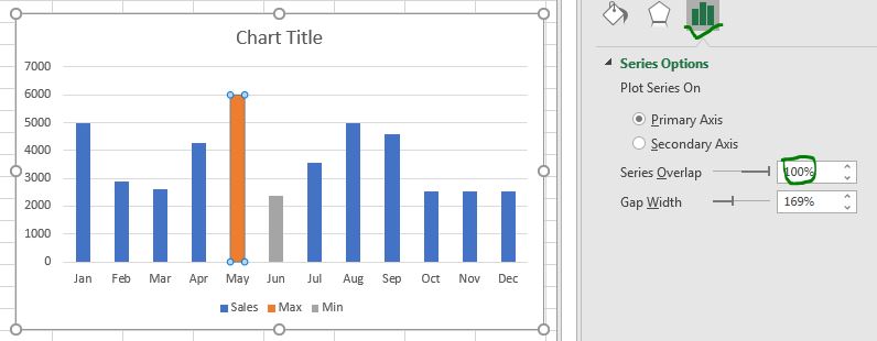
So the idea is to cover the Sales series with max and min series so that it looks like the max and min columns or bars are highlighted by different colors. But in reality, they are just hiding the actual series.
Right-click on the max series and click on the format series option. In series option, make the max series overlap value 100%. Do the same for the minimum series.

3: Decrease the Gap width to make columns look bulky
To make the columns a little bit thicker, reduce the gap width.

4: Show data labels of max and min values:
Select the max series individually --> click on the plus sign and check data labels. Do the same for the minimum series.
5: Format the chart to suit your dashboard:

Select the different segments of the chart and format it as per your requirements.
And it is done. You have your column chart ready that highlights the highest value and lowest values on the chart. You can download the template file to highlight the maximum and minimum values on the chart below.
![]()
So yeah guys, this how you can highlight maximum and minimum values on a graph in Excel to make it pop on screen. I hope I was explanatory and it is helpful for you. If you have any doubts regarding this article or any have other excel VBA related doubts, ask in the comments section below. We are eager to hear from you and w reply frequently to your comments.
Related Articles:
How to Insert A Dynamic Vertical Marker Line in Excel Line Chart | We can draw a vertical line on the chart manually but that just not smart. We would like to add vertical lines dynamically to mark a certain data point, say the max value.
How to Create Milestone Chart in Excel | A milestone chart shows the date or time when a milestone achieved in a graphical way. This graph must be easy to read, Explanatory, and visually attractive.
Pareto Chart and Analysis | The Pareto analysis states that your 80% problem is caused by 20% of factors. Or we may say that by working on only 20% of cases you can solve your 80% of problems. Fascinating, right? The method is also famous as the 80/20 rule
Waterfall Chart |This chart is also known as the flying bricks chart or as the bridge chart. It’s used for understanding how an initial value is affected by a series of intermediate positive or negative values.
Excel Sparklines: The Tiny Charts in Cell | The Sparklines are the small charts that reside in a single cell. Sparklines are used to show trends, improvement, and win-loss over the period. The sparklines are charts but they have limited functionalities as compared to regular charts.
Creative Column Chart that Includes Totals | To include the total of the clustered column in the chart and compare them with another group of the columns on the chart is not easy. Here, I have explained, how to smartly include totals in the clustered column chart.
4 Creative Target Vs Achievement Charts in Excel |Target vs Achievement charts is very basic requirement of any excel dashboard. In monthly and yearly reports, Target Vs Achievement charts are first charts the management refers too and a good target vs Achievement chart will surely grab attention of management
Popular Articles:
50 Excel Shortcuts to Increase Your Productivity | Get faster at your task. These 50 shortcuts will make you work even faster on Excel.
The VLOOKUP Function in Excel | This is one of the most used and popular functions of excel that is used to lookup value from different ranges and sheets.
COUNTIF in Excel 2016 | Count values with conditions using this amazing function. You don't need to filter your data to count specific value. Countif function is essential to prepare your dashboard.
How to Use SUMIF Function in Excel | This is another dashboard essential function. This helps you sum up values on specific conditions.
The applications/code on this site are distributed as is and without warranties or liability. In no event shall the owner of the copyrights, or the authors of the applications/code be liable for any loss of profit, any problems or any damage resulting from the use or evaluation of the applications/code.