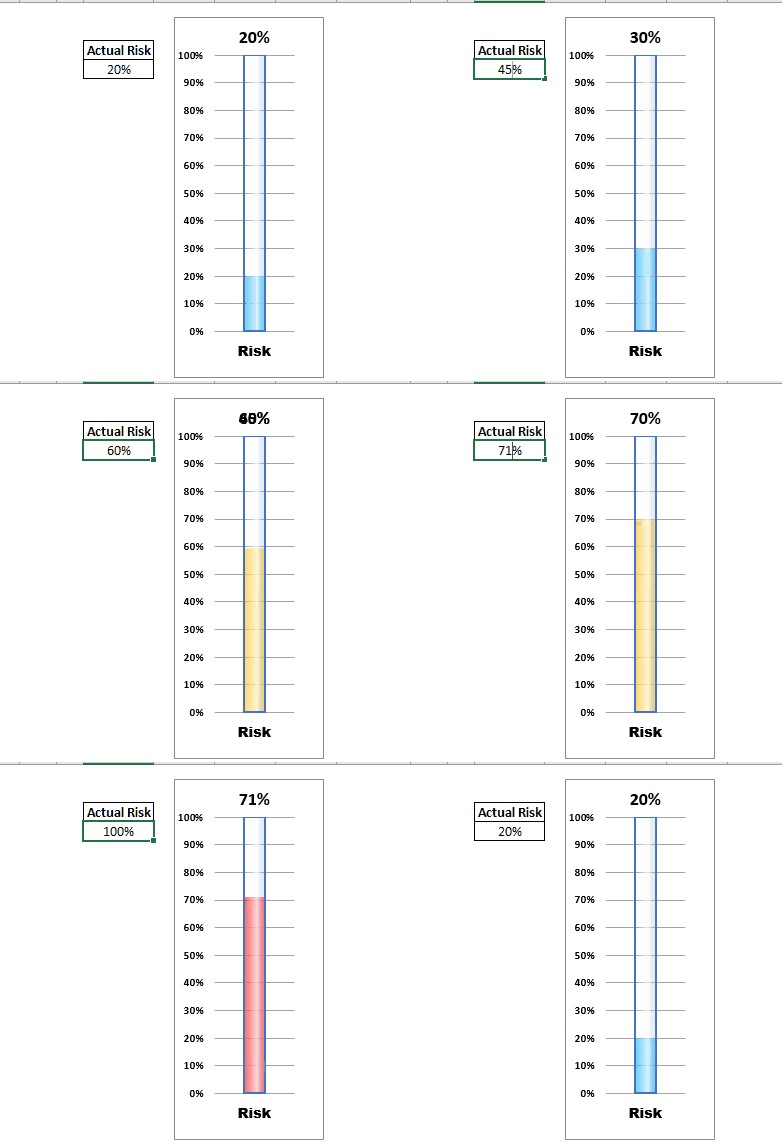
Let's say you have created a report that monitors the risk or goal achievement in Excel. Most of the times it is in percentage value. You can have a normal bar chart to visualize this information but how cool will it be if you can show it on a Thermometer like Excel Graph. Even cooler, if the chart changes color when the value of risk or goal increases or decreases.
Yes! we can do this in Excel. And generating a color goal thermometer graphic in Excel using Advanced Charts is quite easy than you think. So let's get started.
The thermometer chart is an advanced excel chart that needs the preparation of data. So first, we need to prepare a small table as shown below. The below table contains dummy data. We will replace this with some formulas latter.

In the table above, the Low, Medium, and High values will be used to create the chart and Shell will be used to create the container of the mercury in the thermometer. The Actual Risk in cell E2 is the value that we want to reflect on the Excel Thermometer graph.
So let's start.
Step 1: Select B4:E4 and insert a clustered column chart.
We need a clustered column chart to create the thermometer like the graph in excel. Since we want to change the color of the bar in a thermometer in three conditions, we have created three categories. The fourth one is for the shell of the thermometer.
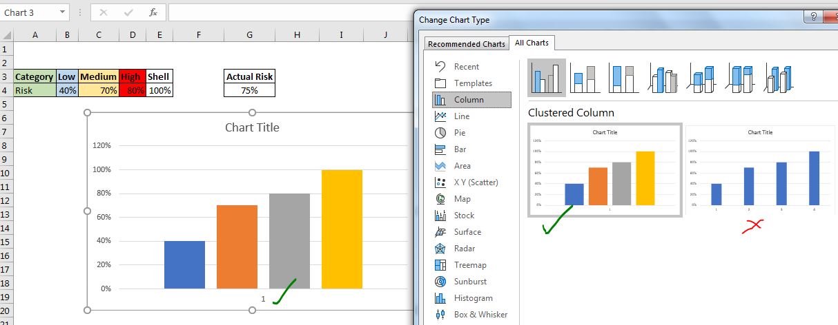
Now select the dummy data in Cell B4:E4 and Go to insert --> Charts --> Column Charts. Choose the Clustered Column Chart.

Make sure that you insert the clustered column chart that has all series under 1 category. If you get the all the series as different categories, do this.
--> Right-click on the chart area and click on the "Select Data" Option.
--> In the "Select Data Source" dialog, click on the "Switch Rows/Column". Hit Ok.

Finally, you should have a chart that looks like this.

Step 2: Color the three series as per your requirement.
Now we need to format these three series to indicate the risk. I color the Low series as Blue, Medium as Amber, and High as bright Red. The fourth Shell series should be formatted as "No Fill" and border should be used to make it look like a container.
Right-click on "Low" data series --> choose "Format Data Series" --> "Fill and Border". Here select solid fill. Choose a blue color.
Repeat the same process for each data series and choose the appropriate color.
For the "Shell" Data Series, choose no fill and choose a solid border.

Step 4: Increase Series Overlap to 100%
Select a series, go to series formatting --> Series option. Increase the Series Overlap to 100%. This will make all the series to cover each other.

Step 5: Select the Left Axis and Adjust it's Upper Limit to 100%
The next step is to format the Left axis. Select it, go to formatting --> Axis Option. Set Maximum Bound to 1.0 from 1.2.
 Step 6: Reduce the Graph Width
To make the chart look like a thermometer graph, reduce the width of the chart. Select the chart from any corner and move the mouse to the other edge of the chart to reduce the width. Finally, it should look like this.

Step 7: Make The Chart Functional
The chart is ready. It looks like a thermometer already. But it does not behave like one. Nothing happens when we change the value in the Actual Risk Cells. Of course, the chart is linked to other cells B4:E4. And the data in these cells are dummy data. We need to make it dynamic.
Write these formulas in Cell B4, C4, and D4 respectively.
In Low (B4):
| =IF(G4<=40%,G4,"") |
In Medium (C4):
| =IF(AND(G4>40%,G4<=70%),G4,"") |
And in High (D4):
| =IF(G4>70%,G4,"") |
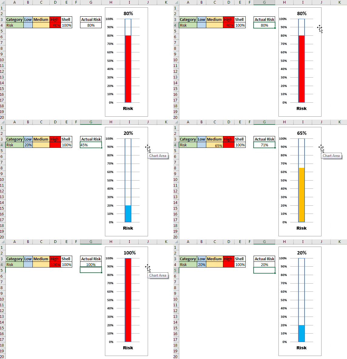
And it is done. We have our chart working properly. When you change the data in Cell G4, the graph changes dynamically.

Step 8: Remove legends, horizontal axis. Name the Chart and Finalize the Formatting.
This step is optional but important for presentation. Make the thermometer chart a little nicer and cleaner. Remove nonrequired things like legends. Add a link to the risk percentage.
Insert a Text Box in Chart. Select it. Click into the formula bar and give a link to the Cell G4. Now it will show the data of G4 in on the chart.
Finally, you will have the thermometer chart functioning properly on the excel sheet.

You can see in the above gif that as we change the risk or goal in cell G4, it is picked by other cells according to the given condition. At one time, only one cell holds the data. The Thermometer takes this data and shows that series only, making it look like a color-changing thermometer.
In the thermometer chart at the beginning, I have done detailed formatting and editing to make a glass-like thermometer. I have set the transparency of each color. Used gradient fills for the shell of the thermometer.
Download Thermometer Chart/Graph Here
Note: Place the source data (A3:E4) where it is not visible to the user since it does not need to be seen. Your risk or goal can be a calculated or imported value.
So yeah guys, this how you can create a color-changing thermometer chart in Excel. You can download the template of this advanced excel chart below. I hope it was explanatory and useful to you. If you have any doubt regarding this advanced chart or you have any other excel chart, formula, function, etc. related query, ask in the comments section below. We reply to the queries frequently.
Related Articles:
How To Create Speedometer (Gauge) Chart in Excel | Excel Speedometer or Gauge graph is one of the most popular chart types that attract managers. It’s easy to understand. It visualizes achievement or growth rate creatively.
How to Create Milestone Chart in Excel | A milestone chart shows the date or time when a milestone achieved in a graphical way. This graph must be easy to read, Explanatory, and visually attractive.
Creative Column Chart that Includes Totals | To include the total of the clustered column in the chart and compare them with another group of the columns on the chart is not easy. Here, I have explained, how to smartly include totals in the clustered column chart.
4 Creative Target Vs Achievement Charts in Excel |Target vs Achievement charts is a very basic requirement of any excel dashboard. In monthly and yearly reports, Target Vs Achievement charts are the first charts the management refers too and a good target vs Achievement chart will surely grab the attention of management.
How to Highlight When Line Drops or Peaks in Comparison Excel Chart | To compare two series in Excel chart and highlight the low and peak areas, we can use this advanced excel chart.
Popular Articles:
50 Excel Shortcuts to Increase Your Productivity | Get faster at your task. These 50 shortcuts will make you work even faster on Excel.
How to Use The VLOOKUP Function in Excel | This is one of the most used and popular functions of excel that is used to lookup value from different ranges and sheets.
How to Use COUNTIF in Excel 2016 | Count values with conditions using this amazing function. You don't need to filter your data to count specific value. Countif function is essential to prepare your dashboard.
How to Use SUMIF Function in Excel | This is another dashboard essential function. This helps you sum up values on specific conditions.
The applications/code on this site are distributed as is and without warranties or liability. In no event shall the owner of the copyrights, or the authors of the applications/code be liable for any loss of profit, any problems or any damage resulting from the use or evaluation of the applications/code.