
A waffle chart is a square grid chart that fills up the percentage to visualize data points, as you can see in the image above. It is many times compared with a pie chart, a square pie chart.
A pie chart can have multiple data points, so can a waffle chart but it gets hard to read. I prefer only one or two data points to make an impact on the dashboard.
A waffle chart is easy to read and understand, even for new users. Anyone can just see the waffle chart and interpret it without much guidance.
Excel does not provide a Waffle Chart in Chart menu. You will need to work a little bit to create a Waffle Chart in Excel. If you just want to use it, download the template of the excel waffle chart below.
Do you want to know, how I created this creative chart in Excel? So, what are we waiting for? Let's get started with an Example.

As you can see in the image above, we have some registered users and active users. We are calculating the percentage of these users by dividing active users with total users.
Now to create the waffle chart in Excel, follow these steps.
Step 1: Create a Grid of 10 x 10 on the Excel sheet. Fill them from 1% to 100%.
This is the first and most important step for creating a good waffle chart. Choose an area for a waffle chart on an excel sheet. This area should have 100 cells in a 10 x 10 manner. Fill them with a number from 1% to 100%. Adjust the font size and column width to make them look like a good grid. See the image below:

The size of the text doesn't matter as they will not be visible anyway. We'll make them invisible later.
Step 2: Select the Whole Grid And Conditionally Format as Mentioned Below:
So, we have our grid ready. Select it. Go to Home --> Conditional Formatting --> Highlight Cell Rules --> More Rules.

The new formatting rule dialog box will open. From the option available, select the "Less than or equal to" option. In the last input box, give the reference of the Active Users %, which is in this example is B4.

Now, click on the format button.
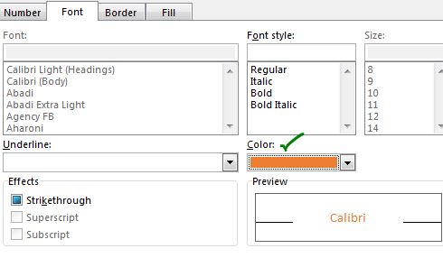
--> In the Font tab, choose the color you want to fill the cell with. We will choose the same color to fill the cell so that the text in cell gets invisible. So, choose the color appropriately.

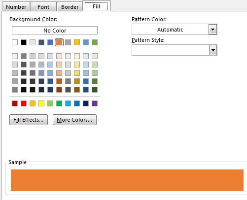
--> In the Fill tab, choose the same color as you chose for the font.

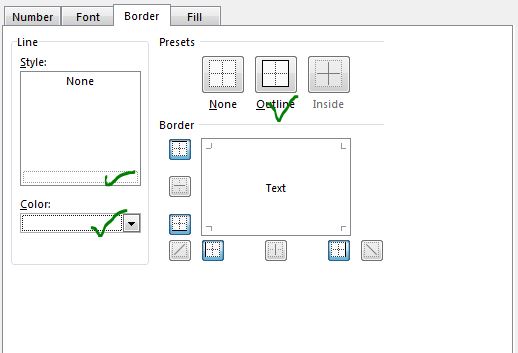
--> In the Border tab, choose the white color and 'Outline' style.

Hit the OK button.
And now you have a chart that looks like something this.

It has started to take the form.
Step 3: Select the Whole Grid And Conditionally Format the Cells Above the Percentage.
So currently, we have done the conditional formatting for the Active percentage. And it is working nicely. But we still have those numbers visible that are greater than the active percentage (B4). Let's format them too but with a different color. A lighter version of the color we used above will give a good look.
So, select the entire range again and go to:
Conditional Formatting --> Highlight Cell Rules --> Greater Than.
A greater than dialog box will open. Give the reference of B4 (active%).
--> Click on With dropdown and select custom format.

--> In the Font tab, choose the light orange color. The same goes for the Fill.

--> For the border, you can again choose the white color with outline style, as we did before.
Now our Waffle Chart or Squire pie chart is practically ready.

Step 5: Finishing the Waffle grid chart in Excel.
The chart is ready. We just need to make some final editing to make it look more elegent.
--> To make the chart look more structured, wrap the chart in the border. Leave one row and column on each side and apply the Outside Border (excel shortcut key is CTRL+SHIFT+ &).
Now our waffle chart looks more elegant and meaningful.

Step 5: This is optional. The chart is ready to be used. But some may still find it hard to get the actual value. For them, we can show data points on the chart.
Insert a Text box on the chart area.
While having selected the text box, click on the formula bar. Here, give reference to the B4 (Active%). Adjust the font size, color, and alignment.
And walla, we have our Waffle chart ready.

We can multiple series that are part of the whole, in a waffle chart. But I don't recommend using more than 3 series in one Waffle Chart. If you will have more series, the chart will make less sense to the user.
But if you still got to create a waffle chart for more than one series, this how you do it.
Example: Create A Squire Grid Chart to Show Region-wise Active Percentage.
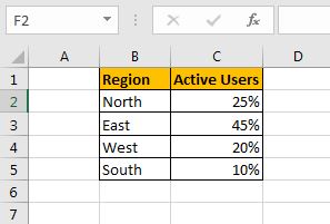
Here, I have a percentage of active users, divided by the regions. The Sum of all regions is 100%.

Step 1: Add a Column for Cumulative Percentage.
We need a column to add with the table above that will have the cumulative sum of each region.
The Cell D2 will have the formula
| =C2 |
and Formula in Cell D3 will be
| =D2+C3 |
copy down the cell D3 to D5.
The last cell should be 100%. If it is not, check again the data and formula.

Step 2: Create the grid as we did in the previous example.

Step 3: Conditionally Format The Grid As Described Below:
From the previous example, we need to format the cells of the grid by rule "Cell less than or equal to". So let's get started.
--> Select the whole grid and go to Home --> Conditional Formatting --> Highlight Cells Rules --> More Rules
Here from the dropdown, select the "Less than or equal to" option. In the text box next to it, give the reference of D5 (100%).
( Note: We need to format these squires in reverse order.)

--> Next choose the formatting for these cells for the south region. Similarly, as we did previously.
When you hit ok, it will color the entire grid with that color. Because all of them are less than or equal to 100%.

--> Now, again select the entire grid and go to the same conditional formatting option (less than or equal to) and this time give reference of D2 (West Cumulative %).

Now this squire pie chart shows 10% (actual South active percentage) on the chart. But shows 90% of the west (cumulative % of the West).
--> Repeat the above steps for each region.
-->Select the grid and go to conditional formatting option 'Less than or equal to' and give reference of D3 for the east. Choose the suitable color you need.


And it is ready. You can create legends by coloring cells and naming them for the easier chart reading.

You can now use it to depict the coverage by each region. But I still recommend using a single series in this chart type. You can divide this chart into 4 regions waffle chart.

So yeah guys, this how you can create a waffle chart in excel. This is not an advanced excel chart (it's not even a chart) but works amazing and shows the data with accuracy. I hope you liked it. If you have any doubts regarding this chart or have doubts about any Excel/VBA related topic, ask me in the comments section below.
Related Articles:
Creative Chart to Show Most Busy Time Excel: This chart is similar to the waffle chart but shows the density of data in a grid. The higher values are colored with a darker color and lower values are shown with a lighter color. This chart can be used in Excel Dashboards...
Fragmented Circular Progress Chart in Excel | In this article, we will learn how to create a fragmented circular chart in excel. By fragments, I mean a circular chart (doughnut or pie) that is divided into equal parts and progress is shown by highlighting these fragments
How to Create Color Changing Thermometer Chart in Excel | You can have a normal bar chart to visualize information but how cool will it be if you can show it on a Thermometer like Excel Graph. Even cooler, if the chart changes color when the value of risk or goal increases or decreases.
How To Create Speedometer (Gauge) Chart in Excel | Excel Speedometer or Gauge graph is one of the most popular chart types that attract managers. It’s easy to understand. It visualizes achievement or growth rate creatively.
How to Create Milestone Chart in Excel | A milestone chart shows the date or time when a milestone achieved in a graphical way. This graph must be easy to read, Explanatory, and visually attractive.
Creative Column Chart that Includes Totals | To include the total of the clustered column in the chart and compare them with another group of the columns on the chart is not easy. Here, I have explained, how to smartly include totals in the clustered column chart.
4 Creative Target Vs Achievement Charts in Excel |Target vs Achievement charts is a very basic requirement of any excel dashboard. In monthly and yearly reports, Target Vs Achievement charts are the first charts the management refers too and a good target vs Achievement chart will surely grab the attention of management.
How to Highlight When Line Drops or Peaks in Comparison Excel Chart | To compare two series in Excel chart and highlight the low and peak areas, we can use this advanced excel chart.
Popular Articles:
50 Excel Shortcuts to Increase Your Productivity | Get faster at your task. These 50 shortcuts will make you work even faster on Excel.
How to Use The VLOOKUP Function in Excel | This is one of the most used and popular functions of excel that is used to lookup value from different ranges and sheets.
How to Use COUNTIF in Excel 2016 | Count values with conditions using this amazing function. You don't need to filter your data to count specific value. Countif function is essential to prepare your dashboard.
How to Use the SUMIF Function in Excel | This is another dashboard essential function. This helps you sum up values on specific conditions.
The applications/code on this site are distributed as is and without warranties or liability. In no event shall the owner of the copyrights, or the authors of the applications/code be liable for any loss of profit, any problems or any damage resulting from the use or evaluation of the applications/code.