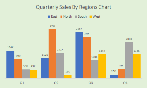
Creating a sales chart by region and quarter is an important task for any business analyst. In this article we will learn how to create a sales column chart by quarters, with columns clustered by region.
Preparing Data For Clustered Charts
From the source data, prepare a report that shows the sales done in different regions in different quarters of the year. You can use a pivot report or formulated report.
The report should look something like this.

Now select the whole report. Go to the Insert tab in ribbon.In charts group find 2D column chart. Select the clustered column chart.

And it is done. You have a chart that shows the sales done in different quarters in clustered regions. But does this look meaningful? Na… So let's format it so that you can present this chart in a meeting.

Formatting the Quarterly Chart
So currently we have the clustered columns too apart from each other. Let's reduce the gap width.
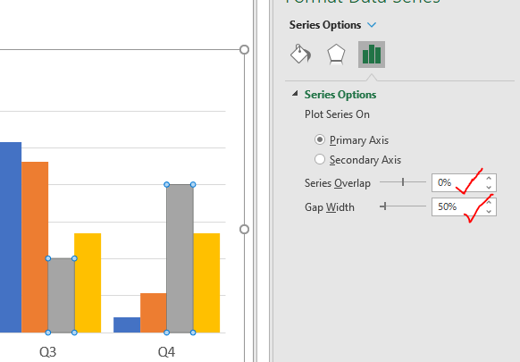
Right click on any column in the chart and click on format data series. A side bar will open in Excel for the formatting of the chart.
Click on the Series Option. Here, reduce the series overlap to 0. Create a gap width between clusters 50%.

Now our quarterly chart looks a little bit better.
We can compare the columns to each other but it is still hard to know which region has done how much sales in each quarter. For that we need to have the data labels. So let's,
Add Data Labels to Chart
Click on the plus sign on the right side of the chart, and check the data labels. The data labels will appear on top of the columns. You can adjust the label positions using more options. I want them on top.

But the numbers are too large to show on the chart, so let's abbreviate the numbers by thousands.
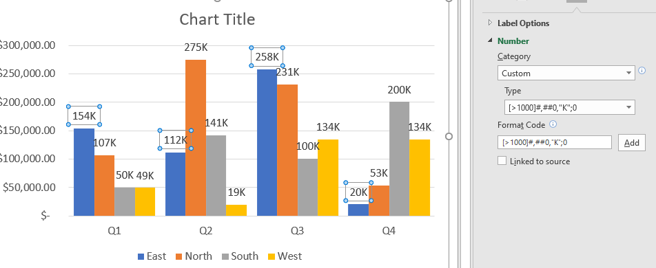
Select any data label. Go to the Labels option for formatting. Here, expand the numbers option. In the category, select custom. Now in the Code write this:
| [>1000]#,##0,"K";0 |
Click on the Add button.
This will add K to represent thousands. This will be done for the series you have selected. To apply on every series, select each of the series and use select this custom formatting from type
Reduce the font size if it still doesn't fit the cluster of columns.

Change the colors of the bar if you like.
Now the chart is almost ready to present. A few more things we need to clean. We don't need the axis anymore as we have data labels. Nor do we need horizontal lines. This brings us to…
Cleaning the Chart
Select the axis and hit the delete button. The axis is now gone for good. Similarly, delete the grid lines from the chart. We don't need them.

Adjust the Legends
The legends are currently shown at the bottom of the chart. I want them on top. To do so,
Select the legends, go to the formatting option of legends. Here check the top. Now all the regions are shown on the top of the chart

Name the Chart Appropriately
This is really important. A describing name for the chart is really important to deliver the information accurately. To do so, select the Chart Title text box. Now write the name. For this example, the name of the chart should be "Quarterly Sales By Regions Chart".

Change the background of the chart if you like. Now the chart is ready to present in the meetings or to be used in a dashboard.

You can check out this chart that shows the total of clusters along with the cluster columns in one single chart. You can use this chart to show quarterly sales by region and impress everyone around you.
I hope this chart tutorial helps you. If you have any questions regarding this article or any other questions related to excel/VBA, let me know in the comments section below. I'll be really happy to help you through.
Till then keep learning, keep Excelling.
Related Articles:
10+ Creative Advanced Excel Charts to Rock Your Dashboard | These creative charts can make you stand apart from the crowd. These charts can be used for different types of reports. Your dashboard will be more expressive than ever.
How to Save and Use an Excel Chart Template | It is important to save chart templates for repetitive charts to save time and energy. To save chart templates in excel, follow these steps.
4 Creative Target Vs Achievement Charts in Excel : These four advanced excel charts can be used effectively to represent achievement vs target data. These charts are highly creative and self explanatory. The first chart looks like a swimming pool with swimmers. Take a look.
Best Charts in Excel and How To Use Them : These are some of the best charts that Excel provides. You should know how to use these charts and how they are interpreted. The line, column and pie chart are some common and but effective charts that have been used since the inception of the charts in excel. But Excel has more charts to explore…
Excel Sparklines : The Tiny Charts in Cell : These small charts reside in the cells of Excel. They are new to excel and not much explored. There are three types of Excel Sparkline charts in Excel. These 3 have sub categories, let's explore them.
Change Chart Data as Per Selected Cell : To change data as we select different cells, we use worksheet events from Excel VBA. We change the data source of the chart as we change the selection or the cell. Here's how you do it.
Popular Articles:
50 Excel Shortcuts to Increase Your Productivity | Get faster at your task. These 50 shortcuts will make you work even faster on Excel.
How to use Excel VLOOKUP Function| This is one of the most used and popular functions of excel that is used to lookup value from different ranges and sheets.
How to use the Excel COUNTIF Function| Count values with conditions using this amazing function. You don't need to filter your data to count specific value. Countif function is essential to prepare your dashboard.
How to Use SUMIF Function in Excel | This is another dashboard essential function. This helps you sum up values on specific conditions.
The applications/code on this site are distributed as is and without warranties or liability. In no event shall the owner of the copyrights, or the authors of the applications/code be liable for any loss of profit, any problems or any damage resulting from the use or evaluation of the applications/code.