In this article, we will learn how to create Bar chart and overlay chart in Excel.
Overlay function is used to show two different values on the same plot.
Let’s know this with an example.
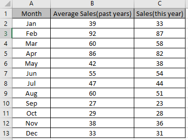
Select the cells to be graphed and make a bar chart on this.
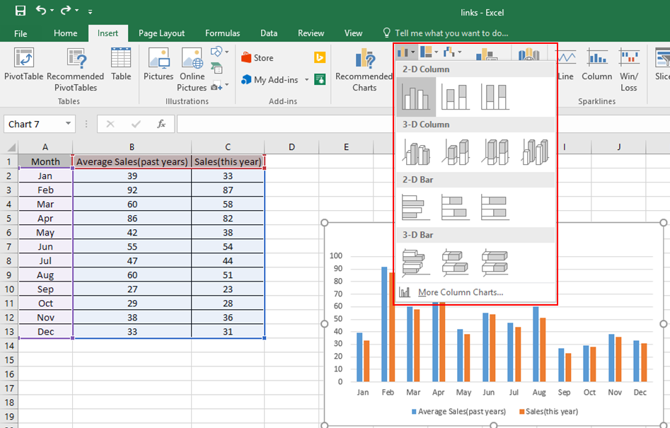
Select the bar plot of anyone from the orange or blue.
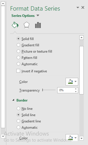
This will appear on the right side of your worksheet.
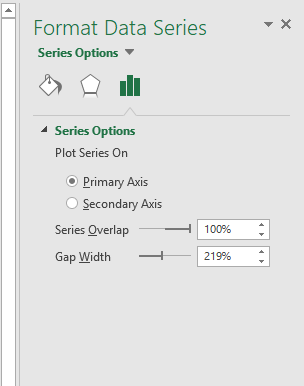
Customization can be done here.
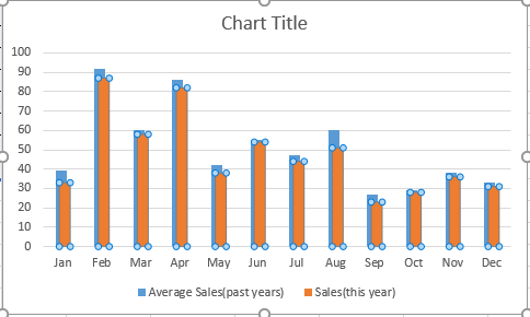
This is an overlay function on the bar chart.
Hope you understood how to add overlay function on the bar chart in Excel 2016. Find more articles on charts here. Please share your query below in the comment box. We will assist you.
Popular Articles:
50 Excel Shortcuts to Increase Your Productivity
How to use the VLOOKUP Function in Excel
The applications/code on this site are distributed as is and without warranties or liability. In no event shall the owner of the copyrights, or the authors of the applications/code be liable for any loss of profit, any problems or any damage resulting from the use or evaluation of the applications/code.