This Dashboard gives us a detailed description of all the KPIs involved in the process or business. Customization is possible in this dashboard. This dashboard is a very useful tool to analyze the 7 year trends depending on the KPIs of any process
Let us understand the dashboard in detail
There are a total of 4 sheets in the excel file. (Report, Raw Data, Settings and Formulas)
Let us understand all the tabs in detail.

Report Tab:
Under the report tab all the KPIs are displayed
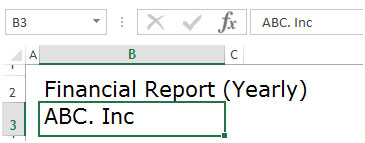
You can insert your company name in cell B3
You can select the report year from cell H2 dropdown
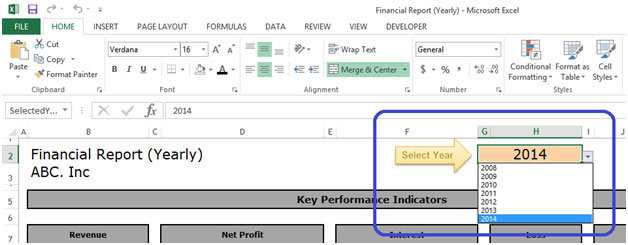
Once you select the report year from the dropdown menu, automatically all the KPIs would be refreshed accordingly
Below are the Key Performance Indicators
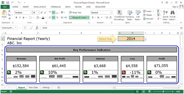
We have Revenue, Net Profit, Interest, Loss and Profit as indicators in Key Performance indicators
Here the data would be displayed in numbers and in traffic lights symbols which would be automatically indicated. Also the trend would be shown in a column graph
If KPI gets increased compared to previous year than traffic light would be displayed in Green
![]()
If KPI gets equal compared to previous year than traffic light would be displayed in Yellow
![]()
If KPI gets decreased compared to previous year than traffic light would be displayed in Red
![]()
Also this dashboard has other Indicators like KPIs, Selected Year, Previous Year, % Change and Yearly Trend

KPIs - Reflect all the process indications
Selected Year –Displays the year that is selected by the user in cell H2.
Previous Year –Displays the previous year of the selected year
% Change –Displays the change of KPI data in comparison of selected year to previous year. This column also shows % change using traffic lights
5 – Yearly Trend – Displays the 5 years yearly trend in graphical view
Raw Data Tab:
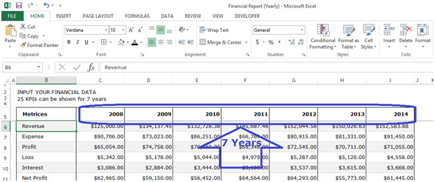
In this tab we can input 25 KPIs for 7 years
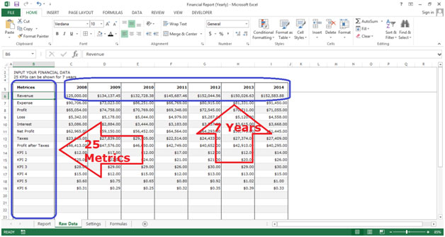
Under the Raw Data Tab we have 8 columns (Metrics name and 7 Years Data)
Metrics –Displays all the metrics that are selected

7 Years –We need to insert data for 7 years
Settings Tab:
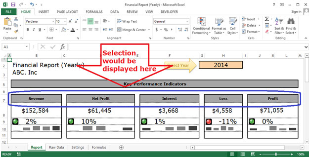
Under this tab we can select 5 KPIs that would be displayed in the report tab in Key Performance Indicators section

We need to select from the dropdown menu as shown below

The selection would be displayed as shown below
Settings Tab:
In this tab there are 2 sections (KPI calculations and All KPIs calculations)
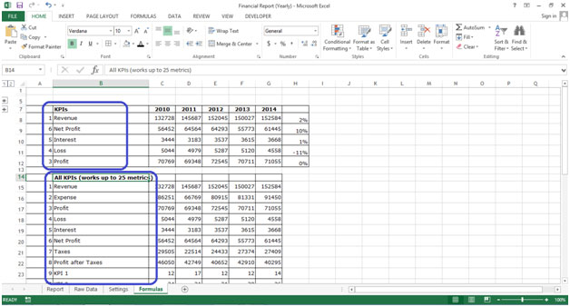
In KPIs section 5 KPIs are displayed which wewe had selected in settings tab

Calculations are displayed here according to the selection which we have made in settings tab

If you liked our blogs, share it with your friends on Facebook. And also you can follow us on Twitter and Facebook.
We would love to hear from you, do let us know how we can improve, complement or innovate our work and make it better for you. Write us at info@exceltip.com
The applications/code on this site are distributed as is and without warranties or liability. In no event shall the owner of the copyrights, or the authors of the applications/code be liable for any loss of profit, any problems or any damage resulting from the use or evaluation of the applications/code.
Great dashboard just one question when the expenses of any year is less than the previous year the traffic light should be shown as green and not as red as the expense is less and hence a gain pls clarify
Could you please share it
Could you please share it?
Looks nice. A comment I see repeatedly for these templates is: where is the file so that it can be used as a resource or starting point by others? Or are articles like this only to show off what someone did once?
You can find this template in Excel 2013. Open up excel, click on new, select template and scroll down the list, or you can search by typing in the search field "financial analysis". The template is awesome and very useful. good luck.
Hi Admin,
this is also good tools to see KPI..would you able to share it?
thanks,
Bono
This is good. It can be reviewed to accommodate a complete report or major kpi from combination of reports. How can i get a copy?
nice