In this article, we will learn How to create Charts with floating up and down bars in Excel.
Scenario :
Many of us, when working with charts, would like to show the data range as bars. This range can either be expressed using the bars under bar charts or adding the up/down bars in chart. Bar charts in Excel stack the data in horizontal bars where we need to change the orientation of the axis to view the data range in vertical bars. So we choose to create a chart with adding up/down bars in the chart. Learn how to solve these kinds of problems with any chart below.
How to solve the problem?
For this we will be using an attribute of an Excel chart which is Up/Down bars. This option enables the chart to view the data range in floating up down bars. Floating bars in the chart is a good way to compare data range in one chart. Understand how to create an Excel chart with floating bars with an example and explanation stated below.
Example :
All of these might be confusing to understand. Let's understand more about charts and explore its features with this example. Here firstly we will be creating a chart and then we will be editing it till we get a chart representing the data as bars.

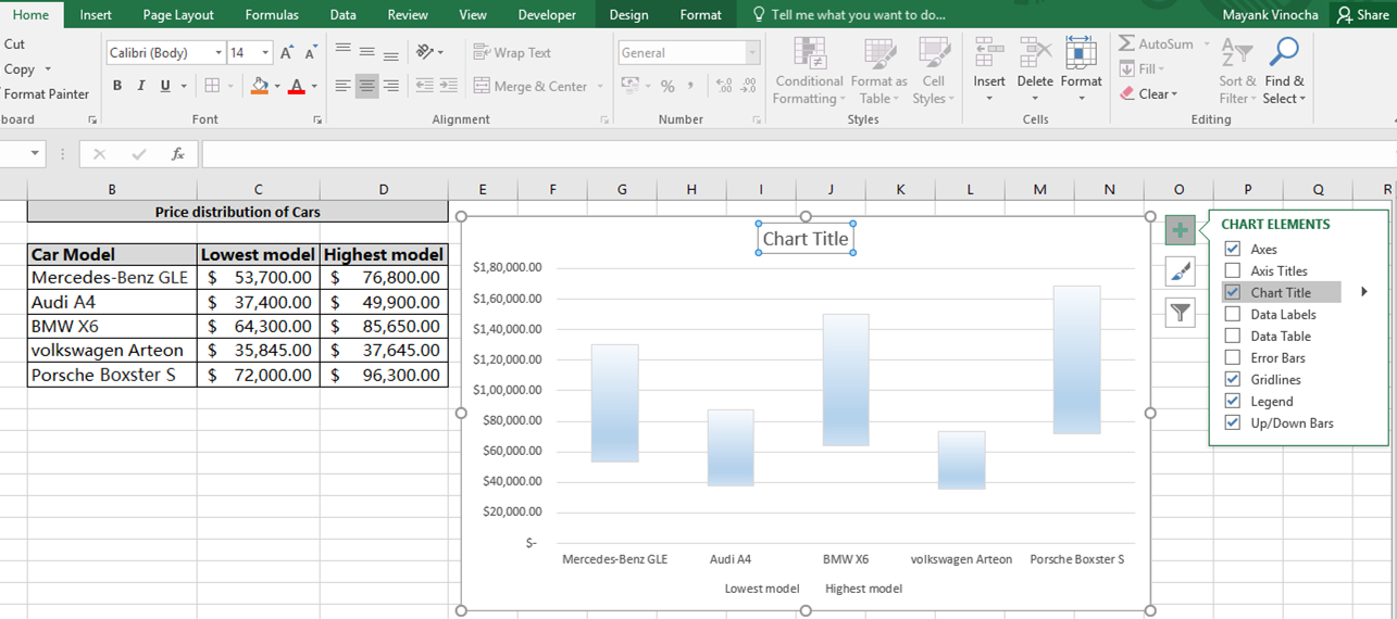
Here we have data of Price distribution of Cars to compare their price with each other. Follow the steps below which will guide you through the chart step by step.
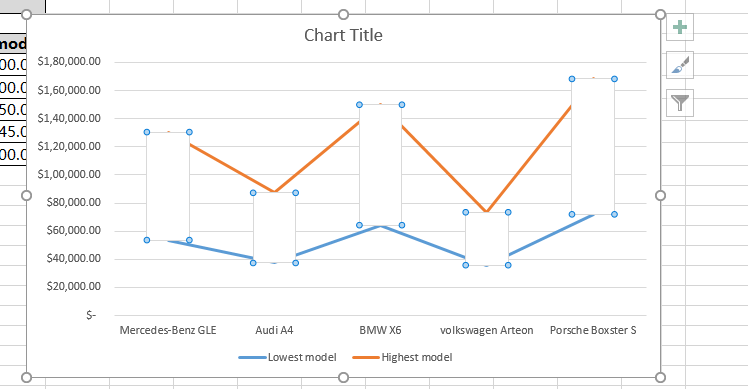
First of all we will select the data and choose a type of chart which describes the data as required. Below is a line graph showing orange and blue lines, blue for the price of the lowest model and orange for the price of the highest model.

Now look for the plus sign (+) on the top right of the chart. Click the plus option to get a drop down list showing the details.

Click the Up/Down bars option. This feature will represent the data range as bars as shown below.

Now This chart needs some finishing touches. Fill the chart with color by double clicking on bars as shown in the above image. Format Up bars panel will appear on the right of the sheet.

Fill up bars with different texture or colour from this panel.
Now we need to edit the lines in the chart. So we double click the orange line and select the No line option from the Format Data Series panel.

We will perform the same task for the other line, if required. Double click the blue line and fill No line from the Format Data Series panel.

Add Chart title if not added. Name the chart and your chart is ready.

This is a chart with floating up and down bars as price range bars for different car models. Customize your graph with different texture bars, fill colours and edit background settings and many more things.
Note : For any graph to represent data, we need to be sure which chart illustrates the best representation of the data required.
Hope this article about Column charts with floating up down bars in Excel is explanatory. Find more articles on different types of charts and their corresponding advanced charts here. If you liked our blogs, share it with your friends on Facebook. And also you can follow us on Twitter and Facebook. We would love to hear from you, do let us know how we can improve, complement or innovate our work and make it better for you. Write us at info@exceltip.com
Related Articles:
Best Charts in Excel and How To Use Them : These are some of the best charts that Excel provides. You should know how to use these charts and how they are interpreted. The line, column and pie chart are some common and but effective charts that have been used since the inception of the charts in excel. But Excel has more charts to explore.
How to use Stacked Column Chart in Excel : The stacked column chart is best for comparing data within the group. The column chart is oriented vertically. Learn how to use the column chart in Excel.
Perform Clustered Column Chart in Excel : The clustered column chart is a column chart that visualizes the magnitude of data using vertical bars. Compare two variables using the Clustered Column Chart. Learn how to perform Clustered Column Chart in Excel.
10+ Creative Advanced Excel Charts to Rock Your Dashboard : These creative charts can make you stand apart from the crowd. These charts can be used for different types of reports. Your dashboard will be more expressive than ever.
Popular Articles:
How to use the IF Function in Excel : The IF statement in Excel checks the condition and returns a specific value if the condition is TRUE or returns another specific value if FALSE.
How to use the VLOOKUP Function in Exceln : This is one of the most used and popular functions of excel that is used to lookup value from different ranges and sheets.
How to use the COUNTIF Function in Excel : Count values with conditions using this amazing function. You don't need to filter your data to count specific values. Countif function is essential to prepare your dashboard.
How to Use SUMIF Function in Excel : This is another dashboard essential function. This helps you sum up values on specific conditions.
The applications/code on this site are distributed as is and without warranties or liability. In no event shall the owner of the copyrights, or the authors of the applications/code be liable for any loss of profit, any problems or any damage resulting from the use or evaluation of the applications/code.