
As I started writing this article, I was confused about how to name this Excel Article. Anyway, how to show the busiest time of the site in Excel, this is the best I came up with.
This is not an actual excel chart. It is a conditional formatting of cells. The google analytics show the busiest time on different days of the week in a chart like below.
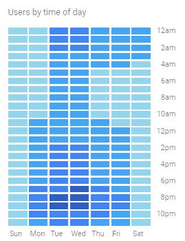
How do we create such a creatively advanced chart in Excel? The answer is not an Excel chart but Conditional Formatting. How? Let's explore with an example.
Here, I have the data for site visits to my site ExcelTip.com in Excel.

Create a similar data set and follow these steps:
Step 1: Select the data range B3:F11. Do not select the headers.
Step 2: Go to Home --> Conditional Formatting --> Color Scales.
Here you will be shown some default color scales to be used directly. You can select any of the options you like. And it will be half ready. You can jump to the step...
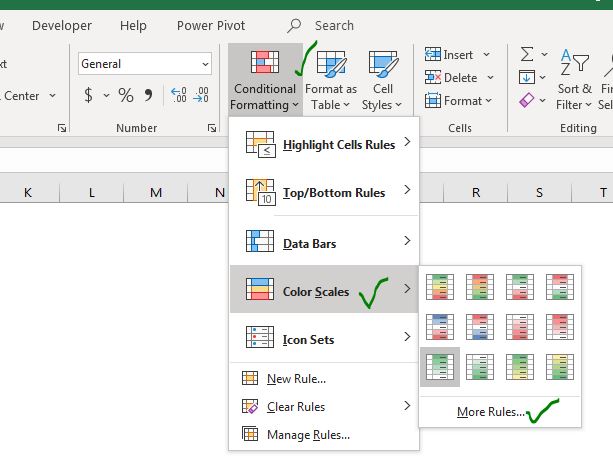
Step 3: But I want to use the Dark and Light Blue combination which is not in default options. So you click on 'More Rules'. Here you can see the Format Style option.
Choose the 3-Color Scale option. For the Lowest Value, choose a light blue (close to white) color.
For Midpoint, choose a fair blue color.
For the Highest Value choose a dark blue color. Hit the OK button.

Now we have a grid chart that looks like something this:
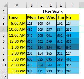
Step 3: Make the text invisible: The chart is almost ready but we have the numbers visible yet. We need them to make this chart work but we don't need them to be seen. So, select the data range B3:F11 and press Ctrl+F1 shortcut to open cell formatting.
--> On numbers tab, click on custom.
--> At the place of 'General', write three semicolons (';;;') and hit OK. See the image below. All the content in the selected cells will now be invisible. The data is still there but no one can see them in the cells.
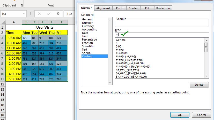

Now you can easily tell which hour on which day was most busy. In the chart above it is 12 to 1 PM looks most busy.
Step 8: Format the Grid to Make this Chart More Elegant: The chart is practically ready but it does not look that much good as in google analytics.
Select the range, go to Home --> Borders --> Line Color. Choose a white color. Now apply this border on the whole table. Remove Extra formating.
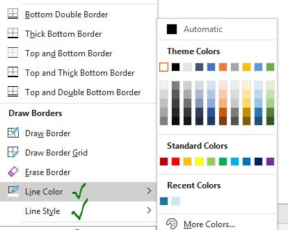
Now your chart will look like this. (I have increased the border thickness from the same menu)
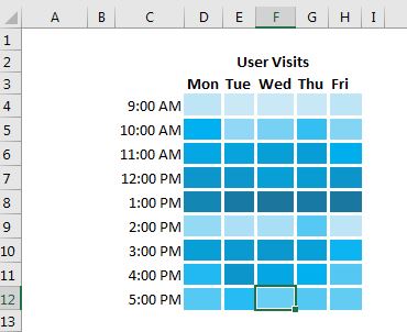
To make it look more organized, create a black border around the used area leaving one row and column on each side.
Fill this area with a light background color. And finally, your creative advanced excel 'chart' is ready to rock the dashboards and presentations.

And it is ready. The numbers are still there. You can see them in the formula bar. These numbers here are hardcoded, but they can be dynamic numbers that are being calculated directly from some data source. This kind of chart will give you visually digestible information. With numbers, it would be hard to get such information from the data.
You can download the template chart below.
So yeah guys, this how you can create a chart that shows the density of a data visually without using any actual advanced excel chart. It can be dynamic or static.
I hope it was explanatory enough and it is useful for you. If you liked it, let me know in the comments section below. If you have any doubts regarding this article, ask that too in the comments.
Related Articles:
Fragmented Circular Progress Chart in Excel | In this article, we will learn how to create a fragmented circular chart in excel. By fragments, I mean a circular chart (doughnut or pie) that is divided into equal parts and progress is shown by highlighting these fragments
How to Create Color Changing Thermometer Chart in Excel | You can have a normal bar chart to visualize information but how cool will it be if you can show it on a Thermometer like Excel Graph. Even cooler, if the chart changes color when the value of risk or goal increases or decreases.
How To Create Speedometer (Gauge) Chart in Excel | Excel Speedometer or Gauge graph is one of the most popular chart types that attract managers. It’s easy to understand. It visualizes achievement or growth rate creatively.
How to Create Milestone Chart in Excel | A milestone chart shows the date or time when a milestone achieved in a graphical way. This graph must be easy to read, Explanatory, and visually attractive.
Creative Column Chart that Includes Totals | To include the total of the clustered column in the chart and compare them with another group of the columns on the chart is not easy. Here, I have explained, how to smartly include totals in the clustered column chart.
4 Creative Target Vs Achievement Charts in Excel |Target vs Achievement charts is a very basic requirement of any excel dashboard. In monthly and yearly reports, Target Vs Achievement charts are the first charts the management refers too and a good target vs Achievement chart will surely grab the attention of management.
How to Highlight When Line Drops or Peaks in Comparison Excel Chart | To compare two series in Excel chart and highlight the low and peak areas, we can use this advanced excel chart.
Popular Articles:
50 Excel Shortcuts to Increase Your Productivity | Get faster at your task. These 50 shortcuts will make you work even faster on Excel.
How to Use The VLOOKUP Function in Excel | This is one of the most used and popular functions of excel that is used to lookup value from different ranges and sheets.
How to Use COUNTIF in Excel 2016 | Count values with conditions using this amazing function. You don't need to filter your data to count specific value. Countif function is essential to prepare your dashboard.
How to Use the SUMIF Function in Excel | This is another dashboard essential function. This helps you sum up values on specific conditions.
The applications/code on this site are distributed as is and without warranties or liability. In no event shall the owner of the copyrights, or the authors of the applications/code be liable for any loss of profit, any problems or any damage resulting from the use or evaluation of the applications/code.