A beautiful, and easy to understand chart always make your excel dashboard stand out. Excel Speedometer or Gauge graph is one of the most popular chart types that attract managers. It’s easy to understand. It visualizes achievement or growth rate creatively.
I read many articles about how to create the Speedometer graph in excel, but none of them were explaining it easily. This article focuses on an easy explanation about creating a speedometer graph in excel. So, sit tight, and let’s get started.
And yes, you can download the file below.
Here, I have to show everyday target achieved in speedometer chart.
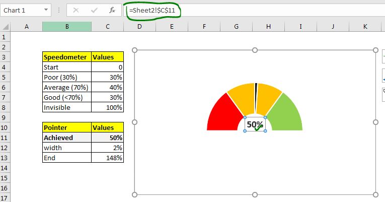
1: Speedometer will have markers such as Poor, Average, and Good. We need to prepare as shown below. The first marker is 0 for the starting point. Next is for poor performance which is to 30%. The next marker is for average that is from 31% to 70%. Its value is 40% (70%-30%). The next marker is good that is for >70%. Its value is 30% (70%-40%). The last tag is 100% and it will be invisible in the chart.
The invisible part should be equal to some of the markers. 30+40+30=100.

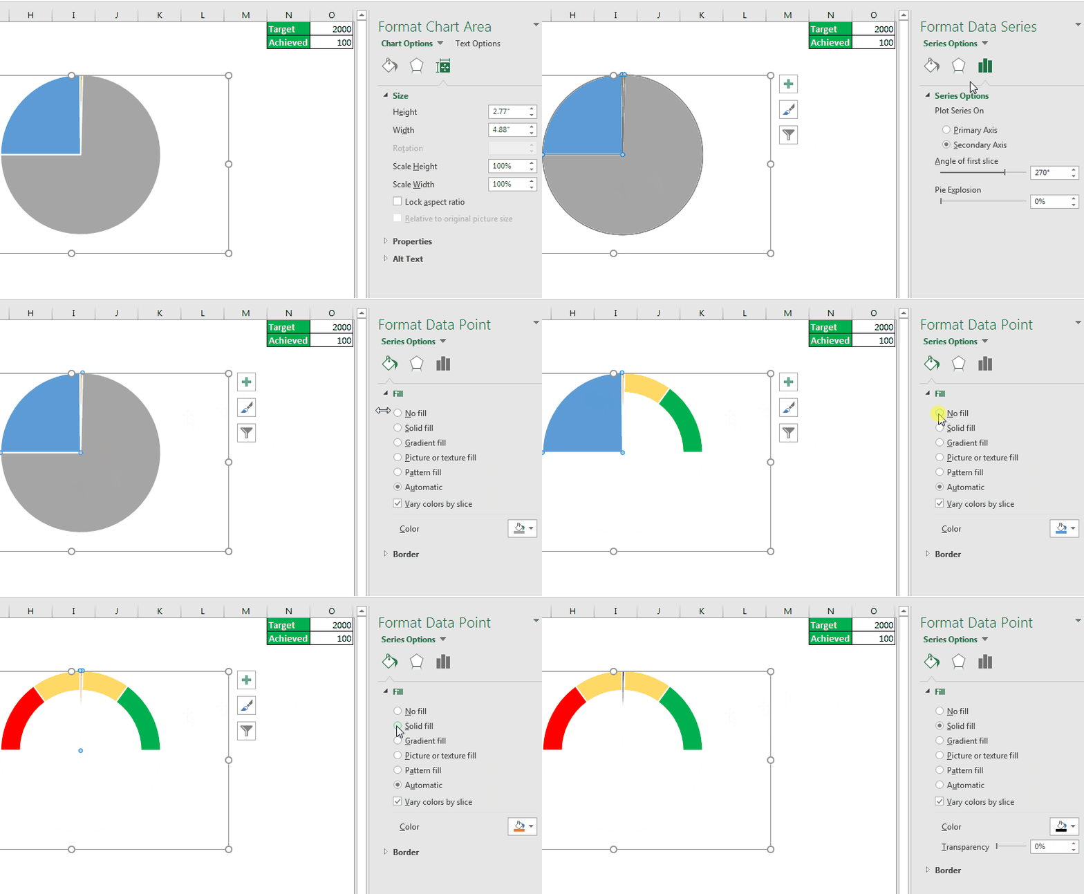
2: Now select the markers and go to Insert --> charts --> Donut and plot a donut chart.

3: Right on the donut chart and click on the format data series.


4: Now we need the needle that will show how much target is achieved. Prepare this data.

The 50% is an achievement point that will be shown on the speedometer or gauge. Of course, it is meant to change. 2% is pointer width. It is for the thickness of the needle in the speedometer. The End is a calculated value that is equal to (200% - (Achieved+width)).
5: Now right-click on the chart, and click select data.

6: In Legend Entries (Series): click on Add. In the series name: click on pointer. It is optional, you may leave it. In the Series Value, give reference to the data we prepared.


Add a text box or shape. Click text box, go to the formula bar and click on. Write = and give reference to achievement.

Now, whenever the achievement changes needle will move. But you may not want to show this data to the end user. It is better to place this data into the sheet where it is not visible to the end-user. Let's place this data at the Z column.


Your speedometer is ready. You can now formate it to suit you or your organization.

So now you have a gauge chart now to rock your excel dashboard and PowerPoint reports. Hope this was helpful. If you want to learn more creative chart in excel, keep in touch. If you have any other chart ideas, do share them in the comment box below.
Related Articles:
How to Add Shade to Curve Line in Excel Chart | In google analytics and other online tools, you must have seen line charts. In these charts, you can see the shaded area under the curves. This shading looks cool, doesn't it? The question is, can we do this in Excel? How can we shade the area under the curve chart?
How to Highlight Maximum and Minimum Data Points in Excel Chart| Knowing the highest and lowest value in a data set is essential in almost all kind of reports. But in line and column Excel charts, it often gets difficult to identify, which value is highest and which value is lowest.
How to Insert A Dynamic Vertical Marker Line in Excel Line Chart | We can draw a vertical line on the chart manually but that just not smart. We would like to add vertical lines dynamically to mark a certain data point, say the max value.
How to Create Milestone Chart in Excel | A milestone chart shows the date or time when a milestone achieved in a graphical way. This graph must be easy to read, Explanatory, and visually attractive.
Waterfall Chart |This chart is also known as the flying bricks chart or as the bridge chart. It’s used for understanding how an initial value is affected by a series of intermediate positive or negative values.
Excel Sparklines: The Tiny Charts in Cell | The Sparklines are the small charts that reside in a single cell. Sparklines are used to show trends, improvement, and win-loss over the period. The sparklines are charts but they have limited functionalities as compared to regular charts.
Creative Column Chart that Includes Totals | To include the total of the clustered column in the chart and compare them with another group of the columns on the chart is not easy. Here, I have explained, how to smartly include totals in the clustered column chart.
4 Creative Target Vs Achievement Charts in Excel |Target vs Achievement charts is very basic requirement of any excel dashboard. In monthly and yearly reports, Target Vs Achievement charts are first charts the management refers too and a good target vs Achievement chart will surely grab the attention of management
Popular Articles:
50 Excel Shortcuts to Increase Your Productivity | Get faster at your task. These 50 shortcuts will make you work even faster on Excel.
How to Use The VLOOKUP Function in Excel | This is one of the most used and popular functions of excel that is used to lookup value from different ranges and sheets.
How to Use COUNTIF in Excel 2016 | Count values with conditions using this amazing function. You don't need to filter your data to count specific value. Countif function is essential to prepare your dashboard.
How to Use SUMIF Function in Excel | This is another dashboard essential function. This helps you sum up values on specific conditions.
The applications/code on this site are distributed as is and without warranties or liability. In no event shall the owner of the copyrights, or the authors of the applications/code be liable for any loss of profit, any problems or any damage resulting from the use or evaluation of the applications/code.