The Trendline is used in Excel to display its equation and get the slope of the trendline. To visualize the general trend in your data, while plotting a chart. We will insert to use Trendline in a chart with an example
Here we have Agents and their Sales amount.

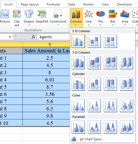
Select the data to be used in Chart

Go to INSERT tab > Column Chart. Select the type of chart, you want.

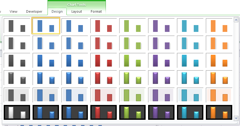
Now choose the Design of your output chart from Design option.

Go to Layout > Trendline. Choose the type of trendline from the options as shown below.

The White line in the graph is the Trendline of your chart as shown in the snapshot below.

Hope you understood how to use trendline in Excel. You can perform these tasks function in Excel 2016, 2013 and 2010. Explore more articles on Charts and its uses. Please write your comments in the comment box below. We will help you.
Popular Articles:
50 Excel Shortcuts to Increase Your Productivity
How to use the VLOOKUP Function in Excel
The applications/code on this site are distributed as is and without warranties or liability. In no event shall the owner of the copyrights, or the authors of the applications/code be liable for any loss of profit, any problems or any damage resulting from the use or evaluation of the applications/code.