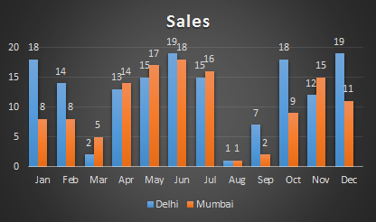
What is the Clustered Column Chart?
The clustered column chart is a column chart that visualizes the magnitude of data using vertical bars. It is majorly used to show multiple variables of data in one chart. It is easy to compare two variables using the Clustered Column Chart.
How a Clustered Column Chart Different From Column Chart?
Although the clustered column chart is a column chart, it is slightly different from a simple column chart. A column chart is used to represent one variable against one other variable. For example, total sales in each month of the year. While Clustered Chart is used visualize multiple variables of data. For example, total sales of two or more cities in each month of the year.

When to Use Clustered Chart?
Use Clustered Column Chart when you need to compare multiple variables. Try to keep only a few variables. Too many variables will make clustered chart too dense and it will not be easy to make sense out of it.
How To Create a Clustered Chart in Excel?
It’s easy to create a clustered chart in excel. First prepare your data. Here I have prepared sales data of two cities by month.
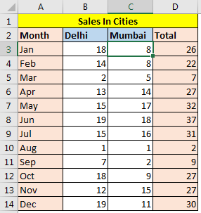
Now I want to compare both cities sales in each month. And the best way to compare data is using clustered chart column chart or bar chart. Follow these step to plot clustered chart in excel.

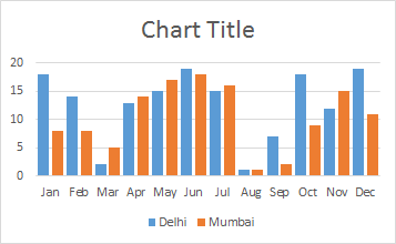
The two cities are shown in two different colours. But still, we can’t clearly see the month grouping. It looks to crowded. Let’s make some space among the months so it easy to differentiate the months. We need to group the columns by month.
How to Insert space between groups of columns?
To make space between groups of columns in chart, follow these steps.
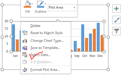
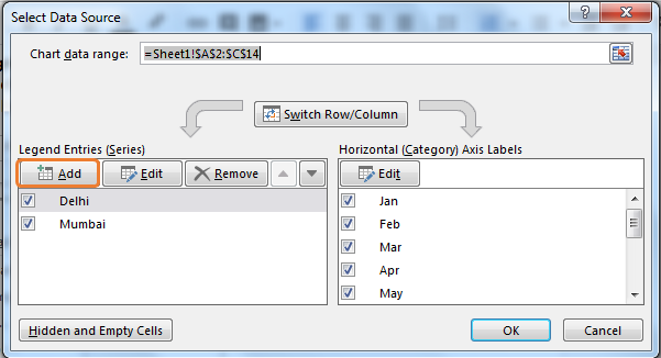
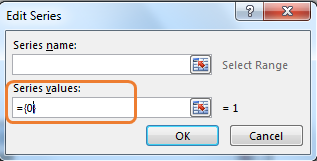
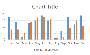
To make it even better, reduce the gap width and Series Overlap to 0%. To do so..

Rename the chart title to “Sales”.
Add Data Labels to Clustered Chart
Well, it’s not required since you can visually see the difference but still, If you want to see the magnitude of each column then you should add data labels to the chart. To add data labels to the clustered chart, follow these steps:
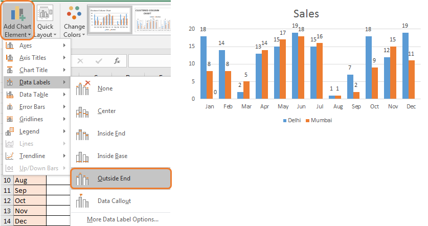
Your clustered column chart is ready. To beautify this clustered chart, you can use formatting option or just use pre-designed chart style provided in Excel 2016. Choose the one you like.
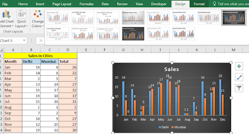
Finally, you are ready to rock the presentation with your self-explanatory clustered charts.
Include Total Column Clustered Charge Creatively
In the above chart, we don’t have a total column. Because it is foolish to compare variables to their sum. But you may want to compare total sales of different months. In that case, this kind of clustered chart will be a good option.
Isn’t it beautiful and creative? We can compare each city's data in separate months and totals of months too in one single chart. To make this kind of chart click here.
So yeah guys, this is how you plot a cluster column chart in excel. In the same way, you can plot a clustered bar chart. The only difference would be the orientations of the bar. Here the bars are vertical and called columns. In the bar chart, they are horizontal and called clustered bar chart.
If you have any query regarding charts in excel or anything related to excel and VBA, feel free to ask me in the comments section below.
Related Article:
Creative Column Chart that Includes Totals
Create Overlay Chart in Excel 2016
Perform Pareto Chart and Analysis in Excel
Perform Waterfall Chart in Excel
Excel Sparklines : The Tiny Charts in Cell
Speedometer (Gauge) Chart in Excel 2016
Popular Articles :
50 Excel Shortcut to Increase Your Productivity : Get faster at your task. These 50 shortcuts will make you work even faster on Excel.
How to use the VLOOKUP Function in Excel : This is one of the most used and popular functions of excel that is used to lookup value from different ranges and sheets.
How to use the COUNTIF function in Excel : Count values with conditions using this amazing function. You don't need to filter your data to count specific values. Countif function is essential to prepare your dashboard.
How to use the SUMIF Function in Excel : This is another dashboard essential function. This helps you sum up values on specific conditions.
The applications/code on this site are distributed as is and without warranties or liability. In no event shall the owner of the copyrights, or the authors of the applications/code be liable for any loss of profit, any problems or any damage resulting from the use or evaluation of the applications/code.