In previous tutorial, we learned how to plot a clustered chart in excel. It was an Sales in Months chart of different cities. The chart that we created didn’t have total’s column. Because comparing total data with individual data is not reasonable.

However we are interested in comparing totals. One obvious solution is to plot a different chart for total only. But thats just not creative. In this article, we will learn how to creatively include totals column in chart. We will show cities columns within Total’s Column. How? Let’s see.
Create Chart With Total Columns Containing Part Columns
Here I have the data of sales done in different months in different months of year in two cities. There can be more, but Here I am just taking 2.
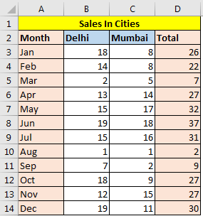
Now let’s make the chart in by following these steps:
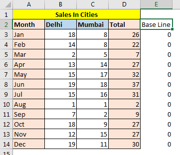

You will see the normal clustered column chart. The totals chart is tallest in each group since it is sum of other columns.

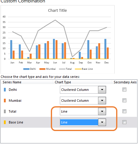
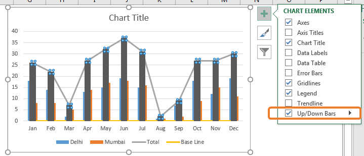


These black columns represent the total sales in each month. We can easily compare total sales of months but we have now lost the cities data. We want those columns too.
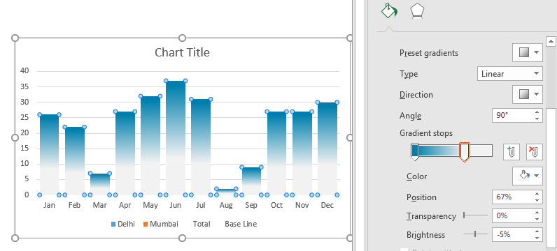
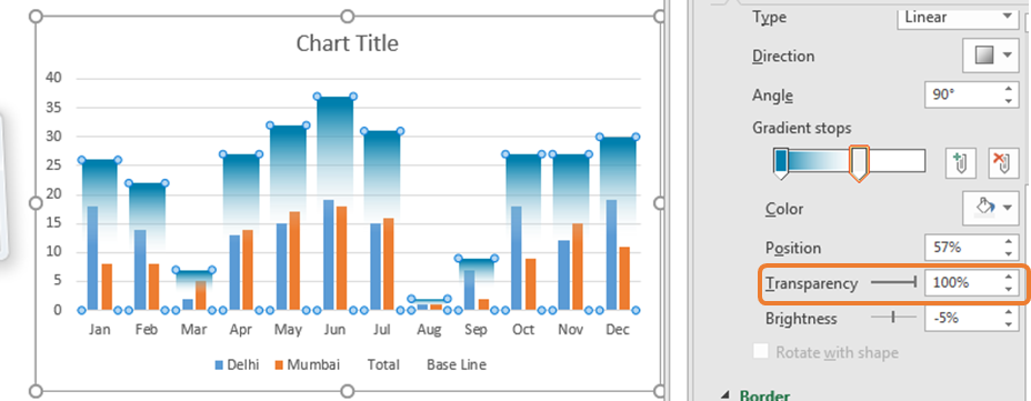

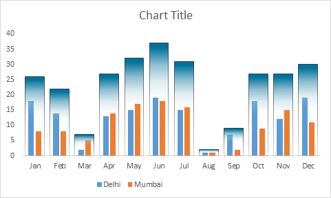
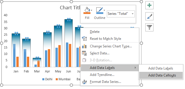
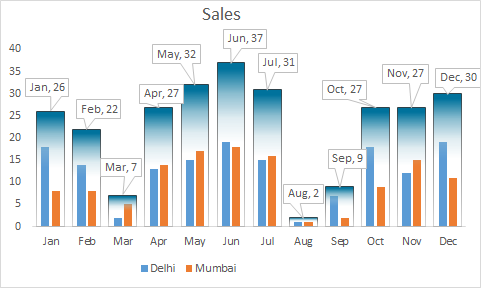
It is done. Now you can compare total sale in each month and sales in different cities in each month, in one chart. You can download this chart template here.
By doing some extra formatting you can make this column chart stand out in the presentation.
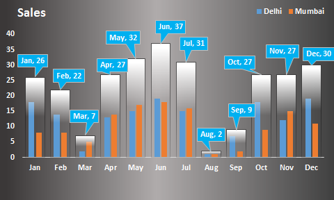
So yeah, this how you can create a clustered column chart that shows totals and makes sense. We will make more creative charts in future if you want. Let me know what you think about this chart in the comments section below.
Download file:
Related Article:
Creative Column Chart that Includes Totals
Create Overlay Chart in Excel 2016
Perform Pareto Chart and Analysis in Excel
Perform Waterfall Chart in Excel
Excel Sparklines : The Tiny Charts in Cell
Speedometer (Gauge) Chart in Excel 2016
Popular Articles :
50 Excel Shortcut to Increase Your Productivity : Get faster at your task. These 50 shortcuts will make you work even faster on Excel.
How to use the VLOOKUP Function in Excel : This is one of the most used and popular functions of excel that is used to lookup value from different ranges and sheets.
How to use the COUNTIF function in Excel : Count values with conditions using this amazing function. You don't need to filter your data to count specific values. Countif function is essential to prepare your dashboard.
How to use the SUMIF Function in Excel : This is another dashboard essential function. This helps you sum up values on specific conditions.
The applications/code on this site are distributed as is and without warranties or liability. In no event shall the owner of the copyrights, or the authors of the applications/code be liable for any loss of profit, any problems or any damage resulting from the use or evaluation of the applications/code.