
A milestone chart shows the date or time when a milestone is achieved in a graphical way. This graph must be easy to read, explanatory, and visually attractive. This chart can be used to track project development, major achievements, etc. Sadly, Excel does not provide any built-in milestone chart but we can create one using line chart in Excel.
So, without any delay let's learn how to create a milestone chart in Excel.
I want to create a milestone chart to visualize the major achievements on the timeline in Excel. I have an Excel table that records these achievements ascendingly.

Now follow these steps to create a milestone chart in Excel.
1: Add two supporting columns Height and Axis for chart use.
Height will be used for the marker lines and Axis will be used as an axis. The values of the Height column will be alternating -1 and 1 and the values of the Axis column will be 0 for each row. See the image below.

You can put values manually in the Height and Axis column if you want. I have used formulas to make the milestone chart dynamic. The formula in the Height column cells is used to put alternating 1 and -1, only when column C has an achievement in it is:
| =IF(C3="","",IF(D2<0,1,-1)) |
if you have excel 2019 or 365 then you can use IFS formula:
| =IFS(C3="","",D2>0,-1,D2<0,1) |
The formula to put 0 in column Axis only when column milestone has a milestone in it.
| =IF(C3<>"",0,"") |
2: Select the Column Height and Axis Columns and insert a line chart with markers.
In this step, just select the new supporting columns and select a line chart with markers. Go to Insert-->Charts--> Line Chart--> Line With Markers.
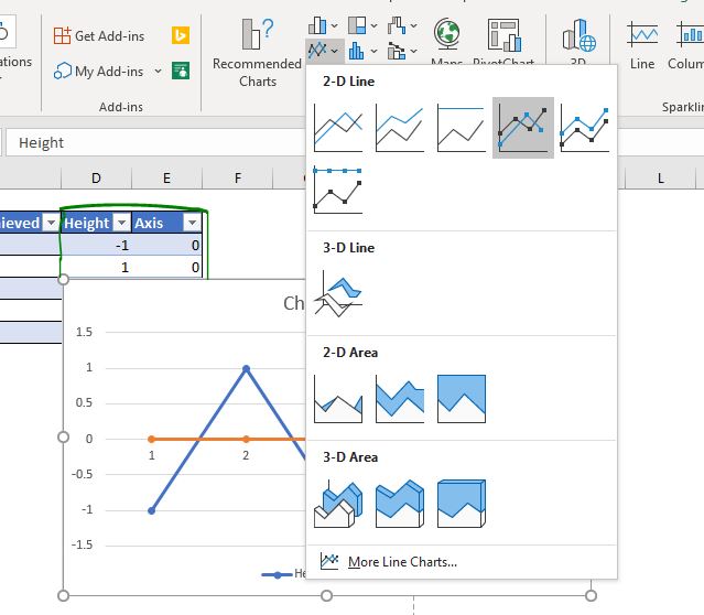
This will insert a line chart that will look like this.
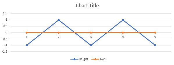
3. Remove grid lines, left axis, and legends. Leave only lines on the chart area. The milestone chart that is used to track project management, does not need vertical axis, grid lines or legends. So we removed them from the chart. You may use the chart title to title your chart appropriately.
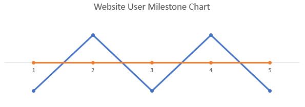
3. Right-click on the blue line--> Format Data Series--> From line formatting option, Select No Line.
In the milestone chart, we don't need this blue line to be shown. We make it invisible from the line formatting option.

4: While having the markers of the blue line selected, click on the plus sign and check the error bars option.
Now we need those markers that connect these markers with the axis. For this, we use the error bars.

5: Format the error bars to connect with the axis. The error bars are not touching the axis yet. We need to make them touch the timeline axis. Right-click on the error bars and click on the format error bars.
In the vertical Error Bar options, Select the minus option. In the Error amount option, select the percentage and make it 100.0%.

Now it has started to look like a milestone chart.
6: Add milestone texts as data labels on the chart. Our chart is almost ready. Now select the markers and click on the plus sign. Check the Data labels option.
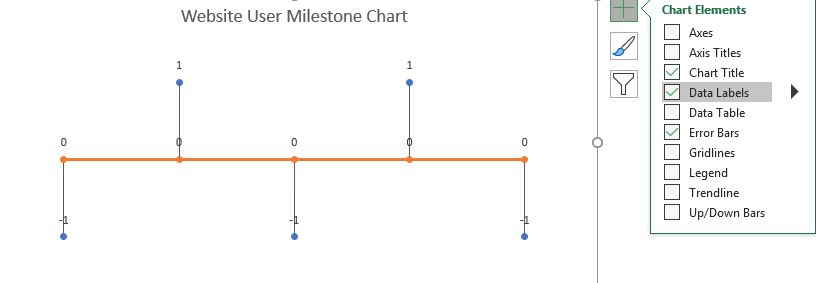
Now select the data labels of height and goto data labels formating. In labels option, uncheck value and check value from series. An input box will open. Select the range of milestones. In this example, it is C3:C7.
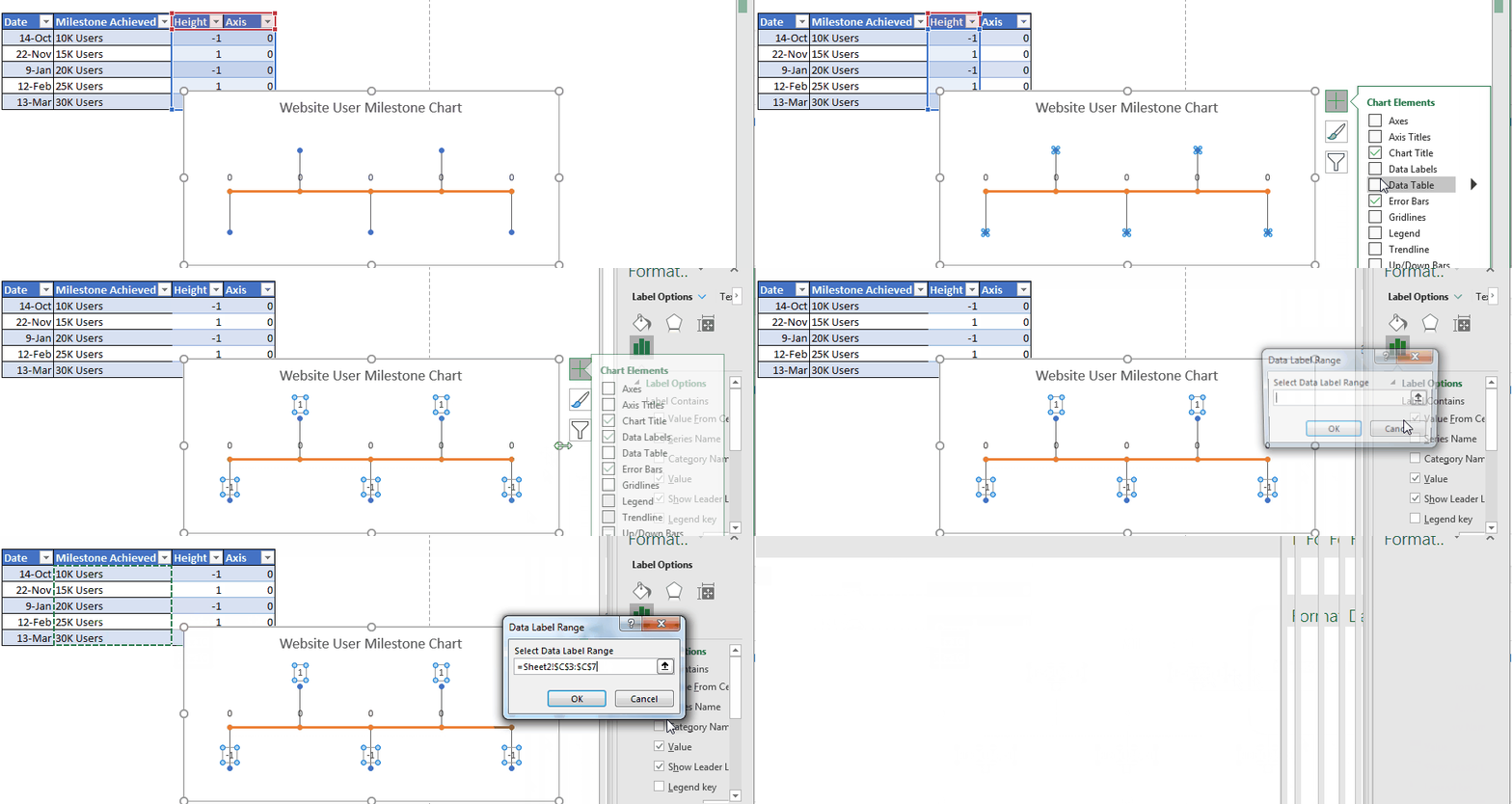
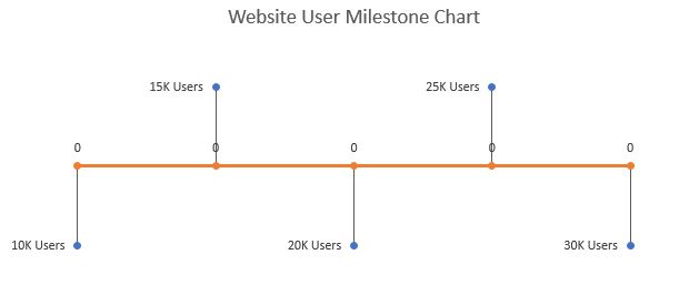
Align the data labels to left. Now it will look like something this.
Note: This feature is available in Excel 2013 and above versions. In older versions of Excel you have to type the name of milestones manually.
7: Add Dates on the timeline axis as data labels: As we added the data labels for the milestone, let's add the data labels to the timeline axis. Select the data labels of the timeline and repeat the steps above. In data labes range select the dates. In this example, the range is B3:B7. Align the labels below.
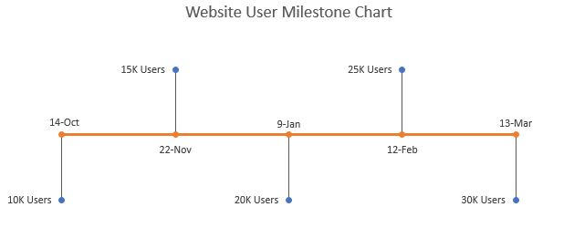
Aur milestone chart is ready. You may use this as it is if you want. Or using some formatting, you can make this chart a little bit attractive.
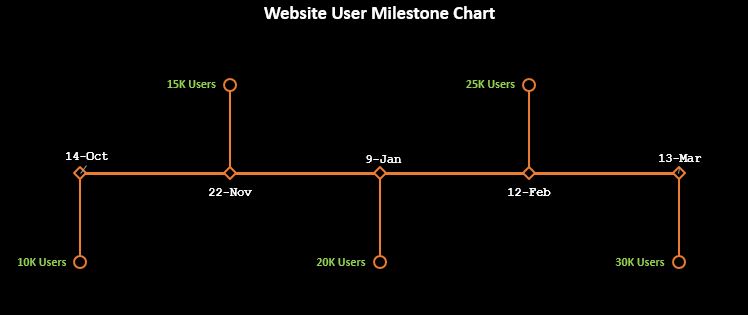
In the above chart, I have just formatted the lines, dots, text, and background to match a theme. You can do this from the formatting options.
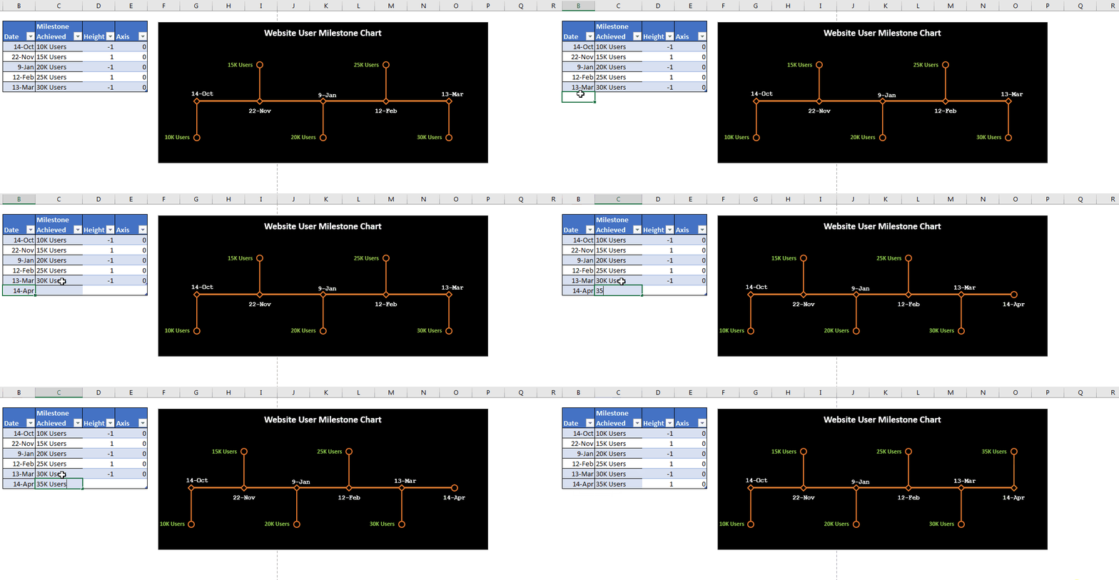
Since we have used an Excel Table, the chart will dynamically include newly added data automatically.
You can download the template for the milestone chart in excel below:
I hope it is useful for you. I tried to be as explanatory as possible. If you liked it, let me know in the comments section below. If you have any doubts regarding this article or have any other Excel/VBA related query, ask that to in the comments section below.
Related Articles:
Insert A Dynamic Vertical Marker Line in Excel Line Chart | We can draw a vertical line on the chart manually but that just not smart. We would like to add vertical lines dynamically to mark a certain data point, say the max value. And in this article, we will learn how to insert a dynamic vertical line
Pareto Chart and Analysis | The Pareto analysis states that your 80% problem is caused by 20% of factors. Or we may say that by working on only 20% of cases you can solve your 80% of problems. Fascinating, right? The method is also famous as the 80/20 rule
Waterfall Chart |This chart is also known as the flying bricks chart or as the bridge chart. It’s used for understanding how an initial value is affected by a series of intermediate positive or negative values.
Excel Sparklines: The Tiny Charts in Cell | The Sparklines are the small charts that reside in a single cell. Sparklines are used to show trends, improvement, and win-loss over the period. The sparklines are charts but they have limited functionalities as compared to regular charts.
Creative Column Chart that Includes Totals | To include the total of the clustered column in the chart and compare them with another group of the columns on the chart is not easy. Here, I have explained, how to smartly include totals in the clustered column chart.
4 Creative Target Vs Achievement Charts in Excel |Target vs Achievement charts is very basic requirement of any excel dashboard. In monthly and yearly reports, Target Vs Achievement charts are first charts the management refers too and a good target vs Achievement chart will surely grab attention of management
Popular Articles:
50 Excel Shortcuts to Increase Your Productivity | Get faster at your task. These 50 shortcuts will make you work even faster on Excel.
The VLOOKUP Function in Excel | This is one of the most used and popular functions of excel that is used to lookup value from different ranges and sheets.
COUNTIF in Excel 2016 | Count values with conditions using this amazing function. You don't need to filter your data to count specific value. Countif function is essential to prepare your dashboard.
How to Use SUMIF Function in Excel | This is another dashboard essential function. This helps you sum up values on specific conditions.
The applications/code on this site are distributed as is and without warranties or liability. In no event shall the owner of the copyrights, or the authors of the applications/code be liable for any loss of profit, any problems or any damage resulting from the use or evaluation of the applications/code.