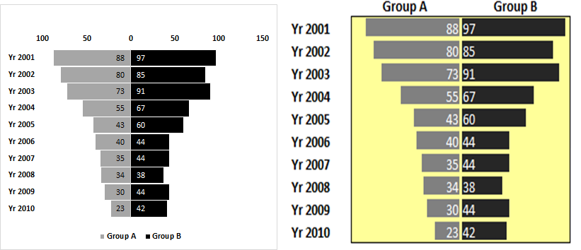
Tornado or funnel chart is basically a bar chart of decendingly sorted data. It looks like a funnel or tornado, from which it gets its name.
In this chart, one group's data is shown on the left side of the axis and other group's data is shown on the right side of the axis. This makes it easy to compare these groups.
There are many ways to create a tornado or funnel chart in excel, but in this article, we will discuss two easiest methods of creating the funnel chart.
Let's start with the Bar Chart method.
Here I have this sample data.

In A2 to A11, we have year. In B2:B11 we have Group A's record and in C2:C11 we have B's record. It is already sorted Ascendingly by year.


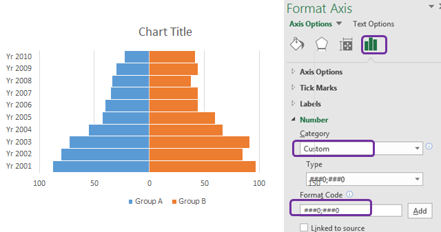
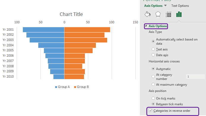
Correct the Y-axis: Right-click on the y-axis. Click on the format axis.
In labels, click on label position drop-down and select low.

Now the chart looks like this.


And it is ready. With a little bit of beautification or according to your theme, you can create this kind of chart.

The above chart is easy to understand and interpret. This was the excel chart method for creating a tornado chart. Let's look at the conditional formatting method.
To create a tornado chart using conditional formatting, we will use the same data. We will convert group A's values into negative numbers.
Next, we will sort the table smallest to largest with respect to group A's data.
Finally, data will look like this.

Now follow these steps to create a tornado chart in excel.

For negative numbers, the default color is red and the direction of data bars is right to left.


So the chart is ready. As I told you the red color for negative numbers is the default. But we don't have negative numbers actually. We just converted them into negative numbers so that the direction of bars is apposite.
So, how do we change the color of group A's Bars? Follow these steps:


And it is done. The color of the bar is changed as we wanted.

With a little bit of formatting, it can look like this.

Tune the chart: The problem with the above chart is that group A and B's bars are not relatable. In the group, A maximum value is 88 (or say -88 as a minimum) and all other bars size is created in reference to that. In Group B, the maximum value 97 and its bars are created in reference to that. Hence the bars are not comparable.
To make them comparable, we need to have the largest value for both groups of the same magnitude. So if we add -100 for A and 100 for B to and then use data bars, they will become comparable.
To do so, follow these steps.


The Excel Tornado chart is ready. There are many other ways of creating a tornado chart. But these were my favorite and I wanted to share it with. Do you guys have any special chart types? Let me know in the comments section below. If you have any doubts about any excel VBA topic, ask that too.
Related Articles:
Excel Sparklines : The Tiny Charts in Cell
Speedometer (Gauge) Chart in Excel 2016
Creative Column Chart that Includes Totals
4 Creative Target Vs Achievement Charts in Excel
Popular Articles:
The applications/code on this site are distributed as is and without warranties or liability. In no event shall the owner of the copyrights, or the authors of the applications/code be liable for any loss of profit, any problems or any damage resulting from the use or evaluation of the applications/code.