The Box and Whisker chart was invented by John Tukey in 1977. The graph was initially called Boxplot. Since then, it is being used in statical plotting and graphing. In this article, we will learn how to create a box and whiskers chart in excel.

The Box and Whiskers chart is used in analytics to visualise mean, median, upper bound and lower bound of a data set. It comes under statistical charts category.
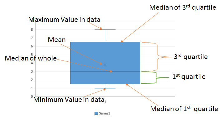
A Box and Whiskers plot consists a box. The box itself represents the first range between first and 3rd quartile. a line dividing the box into 1st quartile and 3rd quartile. The line itself is median of the whole data set. The bottom line of box is median of first quartile and upper line of box is median of other half (3rd quartile).
An x or cross represent the mean of data.
Any value that goes beyond the 1st and 3rd quartile is represented as whiskers. They are basically minimum (0th percentile) and maximum (100th percentile) value in data.

Let's see an example to understand it.
Box and Whiskers Chart with Simple Numbers
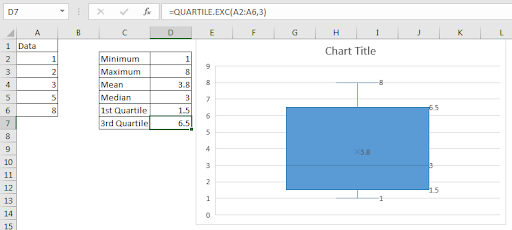
To understand the the box plot in excel, here a I have a simple number series in range A2:A6.

This data is sorted but it does not need to be. To make it easy to understand, I have sorted it already.
Now let's learn, how to make a box and whisker plot in excel.
Follow these steps how to create a boxplot in excel:


Interpretation of Box and Whiskers chart in excel:
So Now we have the box and whisker plot in excel. But what is the interpretation of this chart. Let's see.
The bottom line that is connected with box is representing the minimum value in data set. Which is clearly 1 but you can use MIN function to calculate so.
Similarly the upper line connected with a perpendicular line with the box is maximum value in data. Which is clearly 8 but you can use MAX function to calculate this statistic in excel.
The little x in the box is the mean of data. Which is 3.8. You can use the AVERAGE function to calculate so.
The box itself represents the range between the first quartile and the third quartile. The bottom line of box in median of first quartile (exclusive). You can use QUARTILE.EXC function to get it.
The upper line of box is median of the 3rd quartile (exclusive). Which is 6.5. This can be calculated using below formula.
The line that divides the box is median of whole data. Which is clearly 3 here. But you can use MEDIAN Function to confirm it.
So important and common statistics like Minimum, Maximum, Mean, Median, 1st and 3rd Quartile of data is easily shown in this excel chart. We didn't need to do any calculation or data arrangement to get this statistical plot. Excel does all the work in background.

Now the question arrives, what we should do if have multiple series of values. Let's see an example of that too.
Box and Whiskers chart with multiple series
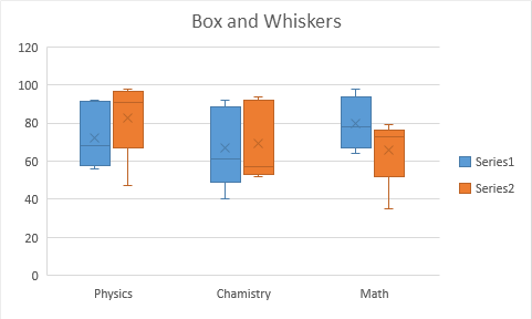
So here I have results of multiple tests conducted in class 11th and 12th. The subjects are Math, Physics, and Chemistry.

So here I have 3 groups and 2 series. Not that the data is not sorted. Let's plot a box and whiskers plot. I already told how to make a box and whisker plot in excel, so I am not repeating that. Just select the data and follow the steps mentioned above. You'll have a box and whiskers chart in excel looking like this.

The blue boxes represents 11th classes's statistics in all three subjects. The orange boxes are for 12th class to show the same statistics.
Benefits of Boxplot or Box and Whiskers chart:
So yeah guys, this what Box and Whiskers chart is. We learned how to create Boxplot in excel 2016. Before excel 2016, it was not easy to create a boxplot in excel. We had to do a lot of work to get a useful and accurate box and whiskers chart. In excel 2016, the box and whiskers chart was introduced like many other chart types.
Ok. If you have any doubts regarding this article or any other excel vba topic, do let me know in the comments section below.
Related Articles:
Excel Sparklines : The Tiny Charts in Cell
Speedometer (Gauge) Chart in Excel 2016
Creative Column Chart that Includes Totals
4 Creative Target Vs Achievement Charts in Excel
Popular Articles:
The applications/code on this site are distributed as is and without warranties or liability. In no event shall the owner of the copyrights, or the authors of the applications/code be liable for any loss of profit, any problems or any damage resulting from the use or evaluation of the applications/code.
Hi
I only have the descriptive statistics for a data series (not the underlying data). How could I use Excel 2016 box and whisper chart, just supplying the Minimum, Q1, Median, Q3 and Maximum?
Hi Jeremy,
Yes, you can do it. You just need to arrange the data in the proper manner. Arrange the data in the below sequence.
MAX
Q3
Median
Q1
MIN
Now use the box and Whiskas chart. (Note: The mean of the data will be (sum of these numbers)/5, so ignore the mean on the chart.)