

About Dashboard:
Dashboard is the source to present the analyses in one report. To prepare the dashboards we use the different types of chart to present the numbers and graphic picture for the better understanding.
In this article we can see the charts analyses:-
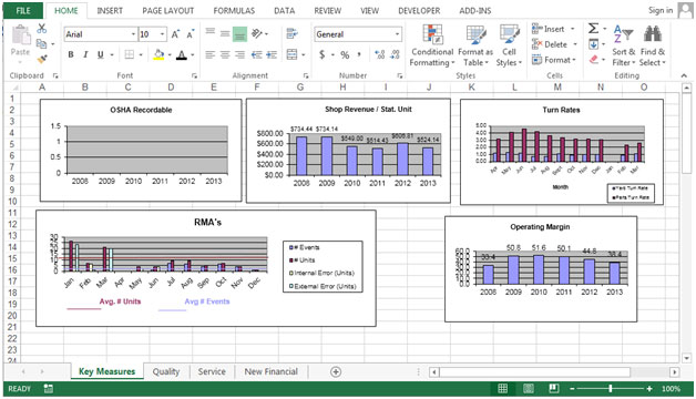
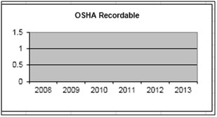
This chart presenting the yearly report of OSHA recordable.

Column chart is presenting the yearly report of Shop revenue / Stat Unit.

Column chart is presenting the monthly report of Turn rates. Blue column is representing the yard turn rate and red column representing to parts turn rate.


Column chart used to comparison yearly report to operating margin report.

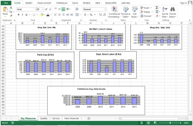
In this chart shop stat unit represented year wise.

In this chart shop Net Mat’l. cost (%sales)represented year wise.
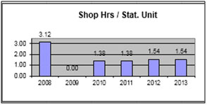
In this chart shophrs / Stat. Unit represented year wise.
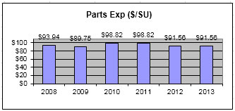
In this chart parts exp ($/SU) represented year wise.

In this chart Dept. Direct Labor ($/SU) represented year wise.

In this chart field service Avg. Daily Income ($) represented year wise.
The applications/code on this site are distributed as is and without warranties or liability. In no event shall the owner of the copyrights, or the authors of the applications/code be liable for any loss of profit, any problems or any damage resulting from the use or evaluation of the applications/code.


It was a positive conversation and each day since then he has made an effort to come and speak to her about his success of the day.
Do you have a download link for this dashboard?
Thank you ahead for your work.