About Dashboard:
This dashboard shows company’s financial summary by region, industry, product by quarter & year-wise.
Financial dashboards support business owner and provide a quick overview that is required to monitor the health and opportunities of the business. Dashboards of this type focus on high-level measures of performance, and forecasts.
This review is for the business owner who needs an intuitive financial dashboard on a daily basis, but more so, needs the ability to forecast and run scenarios to grow a company.
There are several ways in which you can visualize financial data to understand the company’s goal. In October, Excel Forum team launched a dashboard, competing in which you are asked to visualize financial data using sample data. The challenge has generated a huge thrill around the community and fetched 118 incredible entries.
Thanks everyone for participating and making this a huge learning experience for everyone. Excel Forum team has learned several useful dashboard and charting tricks.
In this article, we will show you the steps on how to create this dashboard.
Let us see how the Dashboard made by RedAftershock looks:

We have divided this dashboard into 6 sections of information. Let us take a look at each one separately.
Section1:
In this section,the left part of the screen contains few form controls & slicers which provides flexibility for the viewer to select any region, industry, product, year-wise & quarter-wise.

The middle portion of the screen shows the selected filtered parameters.

Section2:
This section covers the right portion of the screen, which is also updated as the information is selected from region, industry, product, quarter or year.

It also updates the viewer about who ranks 1st vs. other regions & other products in total sales.
Section3:
The below picture shows sales revenue product rankings vs.region.

Section 4:
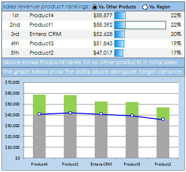
The below picture shows sales revenue product rankings vs. other products.

Section 5:
The below picture shows yearly industry sales revenue comparison by region, product & quarter through conditional formatting & chart.

Section 6:
The last section covers break even/what if analysis on revenue, cost of goods sold, gross profit, fixed cost %, income taxes %.

Using this dashboard we can get a clear view of the financial industry;and thus we can get the information from various points of view.
Download Dashboard
The applications/code on this site are distributed as is and without warranties or liability. In no event shall the owner of the copyrights, or the authors of the applications/code be liable for any loss of profit, any problems or any damage resulting from the use or evaluation of the applications/code.
Amazing Stuff
Great stuff thanks for sharing
Thank you for your sharing. Thanks to this article I can learn more things. Expand your knowledge and abilities. Actually the article is very practical. Thank you!
ludo king
thanks guys , for sharing such wonderful post and conversation too. thanks for being so suggestive.
It’s amazing…excellent presentation…….atomization …calculation analysis… you are champion boss
Thanks to share this GREAT GREAT dashboard
I agree, this dashboard is Exceptional with excellent dynamic functions!! It is a more complicated template that simplifies the global aspect of the company's team performance. Good color choices. I’m interested to know how the data is collect and stored on a larger scale.
1. How is the overall data collecting?
2. Is the data in one spreadsheet/template, or pulled systemically?
3. Do you need several sheets to collect and house all the input data?
I spent about half an hour reverse engineering the design of this dashboard. Many cool things going on here. I definitely picked up a couple of tricks from this. Very nicely done.
Really Cool!! Thanks for sharing.