To add a fancy line in a Presentation we use the “Rept” formula along with a symbol so that it shows the symbol repetitively in a cell. We use this function to prepare the Incell Chart in Microsoft Excel.
In this article we will create 3 type of charts. We call the 1st and the 2nd charts as Bar charts and the 3rd chart would be the Dot chart.
First we prepare the 1st Chart
Let’s take an example and understand how we can present the data with decorative lines.We have sales data from the range C4 to G13. In which column C contains Agent list and column D contains working months.
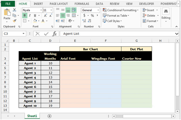
To prepare the fancy line presentation follow below given steps:-
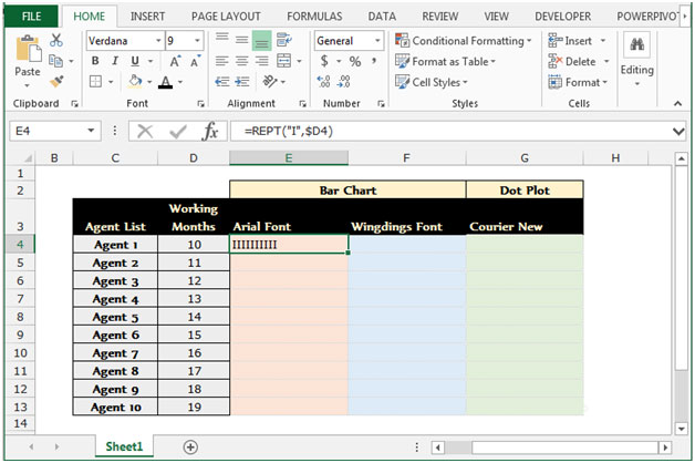

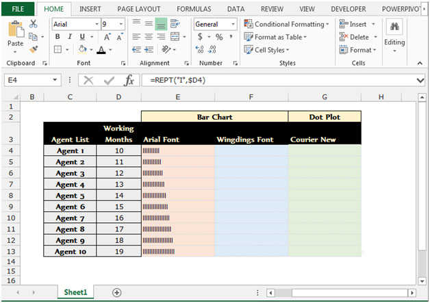
This is all about the Bar Chart by using the Arial font.
Note: In this formula “I” will repeat on the basis of numbers which are available in the related cell.
To prepare the 2nd bar chart follow below given steps:-
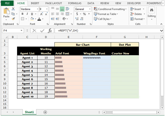

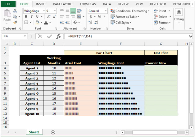
Note: Wingdings font style is displays the above symbol in place of “n”.
3rd type of Incell chart by using the font “Courier New Style”.
Follow below given steps to create the Dot chart.


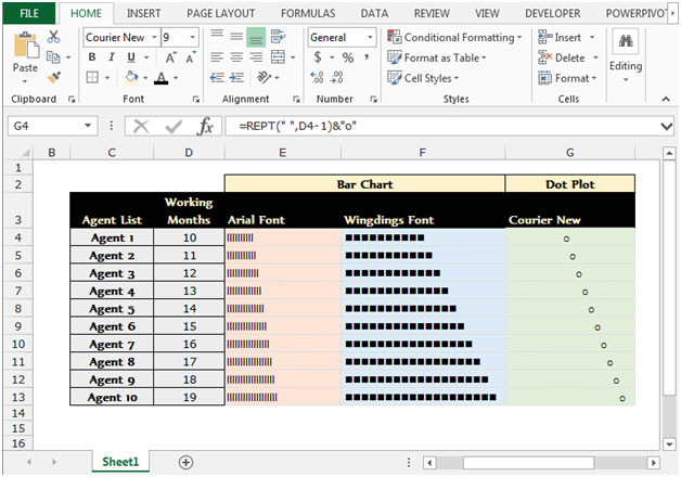
This is all about how we can add a fancy line in our presentation report using Microsoft Excel’s Formulae.
If you liked our blogs, share it with your friends on Facebook. And also you can follow us on Twitter and Facebook.
We would love to hear from you, do let us know how we can improve, complement or innovate our work and make it better for you. Write us at info@exceltip.com
The applications/code on this site are distributed as is and without warranties or liability. In no event shall the owner of the copyrights, or the authors of the applications/code be liable for any loss of profit, any problems or any damage resulting from the use or evaluation of the applications/code.