Pivot Tables are one of the most powerful features in excel. Even if you are a newbie, you can crunch large amounts of data into useful information. Pivot Table can help you make reports in minutes. Analyse your clean data easily and if the data is not clean, it can help you to clean your data. I don’t want to bore you, so let's jump into it and explore.
It's simple. Just select your data. Go to Insert. Click on the Pivot Table and it's done.

But wait. Before you create a pivot table, ensure that all columns have a heading.
If any column heading is left blank, the pivot table will not be created and will go through an error message.
Requirement 1: All columns should have a heading to get started with Pivot Tables in Excel

You should have your data organised with proper heading. Once you have it, you can insert the pivot table.

To insert a pivot table from the menu, follow these steps:
1. Select your data range
2. Go to the insert tab

3. Click on the Pivot Table icon.

4. Create a Pivot Table option box will appear.

5. Here, you can see the data range that you selected. If you think that this is not the range you want to select, directly resize your range from here, instead of going back and selecting data again.
6. Next, you can select where you want your pivot table. I recommend using the new worksheet but you can also use the current worksheet. Just define the location in the Location box.
7. Now if you are done with the settings, hit the OK button. You will have your pivot table in a new sheet. Just select your fields for summaries. We will see how we create a summary of data using the pivot table but first let's get the basics clear. In this excel pivot table tutorial, you will learn more than you expect.

This is a sequential keyboard shortcut is to open the Create Pivot Table option box.
Hit the Alt button and release it. Hit N and release it. Hit V and release it. Create a Pivot Table option box will open.

Now just follow the above procedure to create a pivot table in excel.
One thing I like most about Microsoft Excel is that in every new version of Excel they introduce new features but they don’t discard the old features (like MS did with win 8. It was pathetic). This allows the old users to work normally on new versions as they used to work on older versions.
If you sequentially press ALT, D and P on the keyboard, Excel will open create a pivot table wizard.

Select the appropriate option. The selected option in the above screenshot will lead us to create a pivot table as we created before.
Hit Enter or click Next if you want to check your selected range.

Hit Enter again.

Select a new worksheet or wherever you want your pivot table to Hit Enter. And it's done.

Now you know how to insert a pivot table. Let's gear up to make reports using pivot tables in minutes.
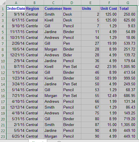
We have the data for the stationary order.

The column fields are:
Order Date: Date of Order (Obviously)
Region: The region of order in the country
Customer: Name of customer (what else can it be)
Item: Ordered Item
Unit: Number of units of an item ordered
Unit Cost: Per unit cost
Total: Total cost of the order (unit*unit cost).
To create reports using pivot tables we will use
Pivot Table Fields: Contains the list of names of columns in your data.

Pivot Areas: These 4 areas are used to show your data in a mannered way.

FILTERS: Put fields here from which you would like to apply filters in your report.
COLUMNS: Put the fields here that you want in your columns in the report: (It's better to show than explain)

ROWS: Drag fields that you want to show raw wise as in the above image, I have shown Region in ROWS.
VALUES: Select a field to get Count, Sum, Average, Percentage (and many more) etc. you will want to see.
Now using the above information, we have prepared this quick pivot report that shows from which region how many orders are placed for each item.

Now that you understand your data and Pivot fields (after all you are smart), let’s answer some questions related to this data using the pivot table quickly.
The pivot table is initially blank, as shown in the image below.
You need to select fields (column names) in appropriate areas to see the summary or details of that field.
Now, to answer the above question, I will select Item (select any column, just make sure that it does not have blank cell in between) in value fields.
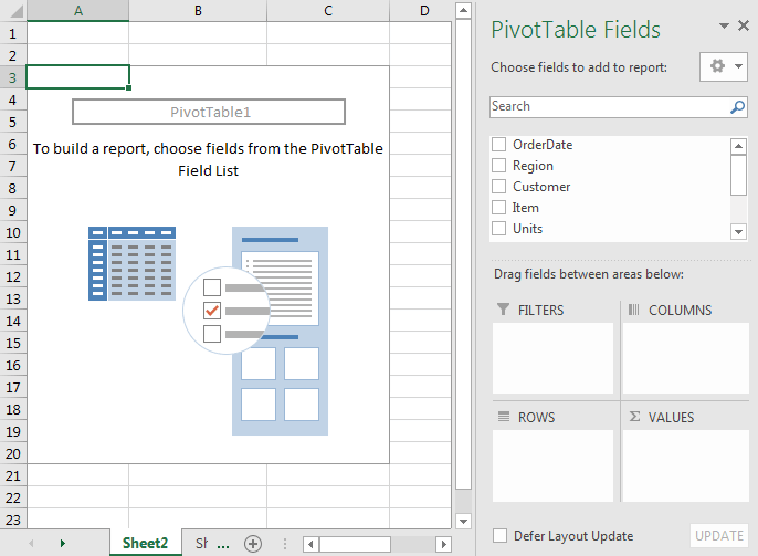
Select Item from the field list and drag it into the Value field.

We have our answer. Pivot tables tells me that there are a total of 43 orders. This is correct.
Now that I have selected OrderDate in the Values area, it shows 42. This means OrderDate has a blank cell since we know that the total number of orders is 43.
Pivot Table can help you find incorrect information in the data.
Most of the time our data is prepared by data entry operators or by users which are usually irregular and need some cleaning to prepare accurate report and analysis.
You should always clean and prepare your data in a mannered way, before you prepare any reports. But sometimes only after preparing the report do we get to know that our data has some irregularity. Come, I’ll show you how…
Now to answer this question:
Select Region and drag it to Rows Area and Item to Values Area.
We will get a Region-Wise divided data. We can answer from which region how many orders have come.
There are a total of 4 regions in our data according to the pivot table. But wait, Notice that Central and Centrle region. We know that Centrle should be Central. There is an irregularity. We need to go to our data and do data cleaning.
To clean data in the region field we filter out the incorrect region name (Centrle) and correct it (Central).
Now get back to your pivot data.
Right click anywhere on the pivot table and click on Refresh.
Your report has now been updated.

Now, you can see that there are only 3 regions in fact.

Sometimes you will need reports like the above image. This makes it easy to see your data in a structured way. You can easily tell from which region how many items are ordered. Let’s see how you can do this.
Move Region and Item to ROWS area. Make sure the region is at the top and items at the bottom as shown in the image.
Drag Item for Value Area.
As a result you will get this report.
It will do. But sometimes your boss wants to report in tabular form without subtotals. To do this we need to format our Pivot Table.
Follow these steps:
1. Click anywhere on your pivot table.
2. Go to the Design Tab.

3. Click on the Subtotals menu.
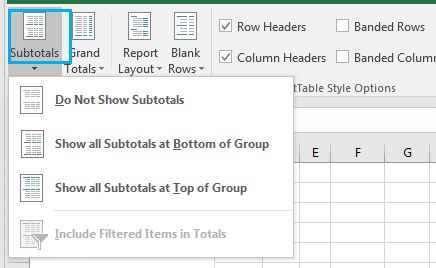
4. Click on Do Not Show Subtotals.

You can see that there are no subtotals now.
Fine. But it is still not in tabular form. Regions and Items are shown in one single column. Show them separately.
Now to show Regions and Items in different columns, follow these steps:
1. Click anywhere on the Pivot Table
2. Go to the Design Tab
3. Click on Report Layout.

4. Click on the Show for the Tabular Form option. Finally you will have this sophisticated view of your report.

Now we know the total number of orders placed for each item from each region. It is shown in the Count of Items columns.
Please change the column name to Orders.
It looks better now.
To answer this question we need a sum of Units. To do so, just move the Units field to Values. It will automatically sum up the number of units for each item. If a column in the Pivot Table contains values only, the Pivot Table by default shows the sum of those values. But it can be changed from a value field setting. How? I’ll show you the latter.
In our sample data the price of one item is different for different orders. For example, see Binders.
I want to know the average cost of each item in Pivot Table. To find this out, drag Unit Cost to Value Field. It will show Sum of Unit Cost.
We don’t want Sum of Unit Cost, we want Average of Unit Cost. To do so...
1. Right Click anywhere on the sum of the Unit Cost column on the Pivot Table
2. Click Value Field Settings
3. Based on the available Options, select Average and hit OK.
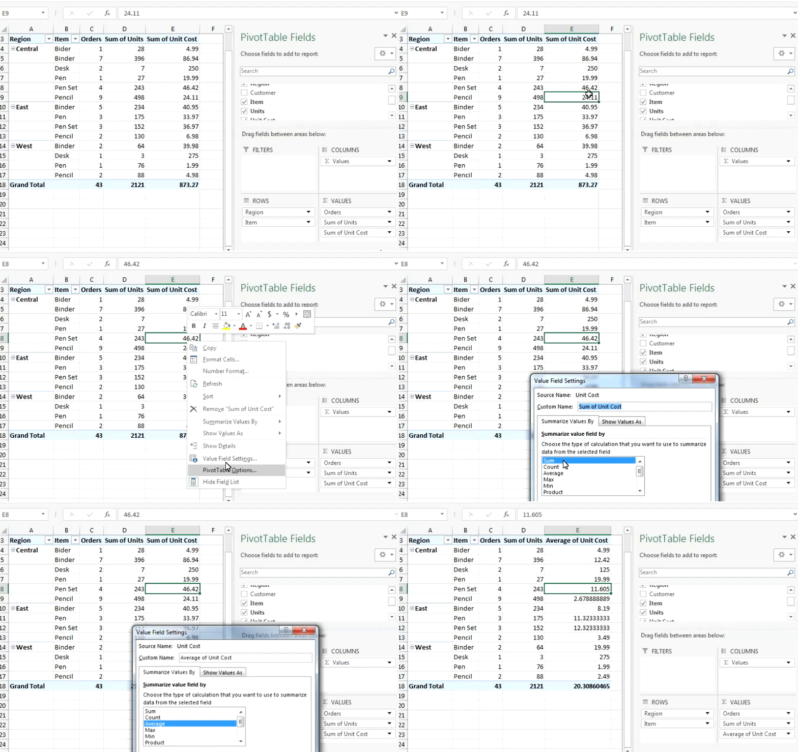
Finally, you will have this Pivot Report:
One of the most useful functions of the Pivot Table is its Calculated Fields. Calculated fields are fields that are obtained by some operations on available columns.
Let's understand how to insert Calculated Fields in Pivot Table with one example:
Based on our data, we prepared this report.
Here, we have Sum of Units and Total Cost. I just moved the total column to the Values field and then renamed it to Total Cost. Now I want to know the average price of a unit of each item for each region. And that would be:
Let's insert a field into the pivot table that shows the average price of each item region wise:
Follow these steps to insert a calculated field into the Pivot Table
1. Click anywhere on the Pivot Table and go to Analyze Tab

2. Click on Fields, Items, & Sets in calculation group.

3. Click on Calculated Fields.
You will see this input box for your calculating field:

4. In the name input box write the Average Cost or anything you like, excel won't mind. In the formula input box, write and hit OK.
You can write this manually from the keyboard or you can double click the field names listed in the Fields area to perform operations.

5. You have your calculated field added now to your pivot table. It is named as the Sum of Average Cost but it's not a sum. Excel just runs the default function to name the column (like a ritual). Rename this column and limit the decimal digits shown.

And there you have a calculated field. You can make it as complex as you want. For the sake of an example I took this simple average operation.
You have this pivot report prepared.
Now I want this report to be divided yearly. See the snapshot below.
We have a column on Order Date. Move OrderDate field to Rows on the Top.
It looks nothing like the required report. We need to have group dates year wise.
Now to group a field in Excel Pivot Table, follow these steps:
1. Right click on the field you want to group.

2. Click on Group. You will have this option box for customisation. Since this is a data column, Excel shows us the grouping accordingly. You can choose your starting and ending date.

3. Choose for years and hit OK. You’ve done yearly grouping in the Pivot Table of Excel.
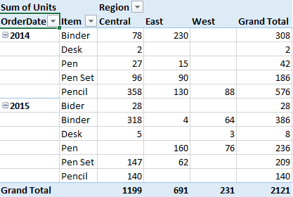
Slicers were introduced in Excel 2010 as an addIn. In Excel 2013 and 2016 it is available by default just like filters.
Slicers are nothing but filters. Unlike Filters, Slicers shows all available options right in front of you. It makes your dashboard more interactive.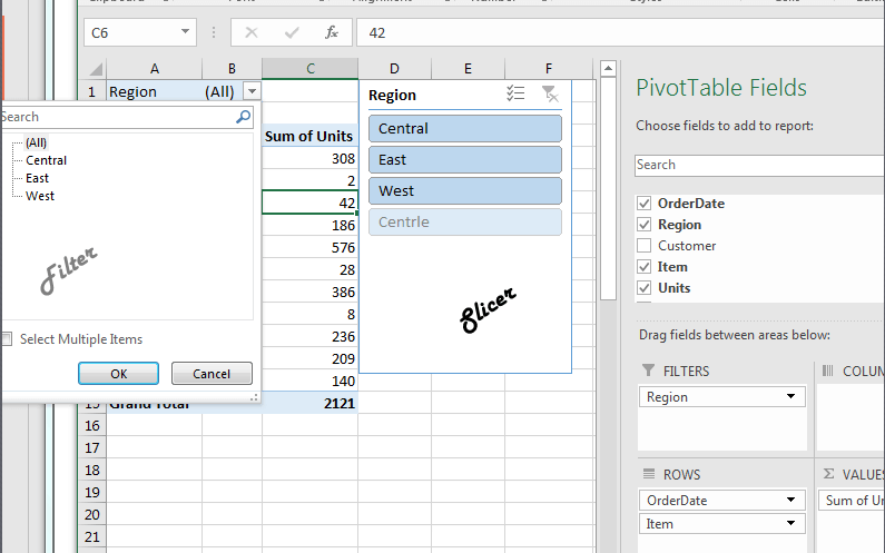
Pivot Table Slicers is easy to add. Follow these steps:
1. Click anywhere on the pivot table and go to the Analyze tab.

2. Click on Insert Slicer. You will have a list of fields for your data. Select as many as you want.

3. For this example, select Region and hit OK.
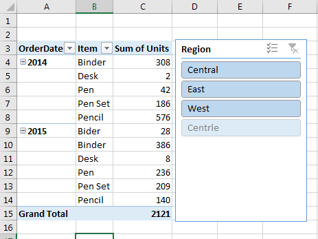
You have added Slicer to your report. Now apply the filter with just one click.

This is one of my favorite functionality Excel Pivot Tables. This new functionality only works with dates. Using this, you can visually select a time span to filter your data.

To Insert a Timeline curser, follow these steps:
1. Click anywhere on the Pivot Table and go to the Analyze tab.

2. Click on the Insert Timeline from Filter Group. All columns containing time values in sourced data will be listed in an option box to choose from. Here we only have one. So yeah...

2. Choose your options/s and hit Enter or click OK. It's done and you have your pivot table timeline right in front of you.
You can choose to show it daily, monthly, quarterly or yearly. I’ve chosen Monthly here.

In this article I’ve covered the most important and useful functionalities of Pivot Table. We explored new features of Pivot Table in Excel 2016 and 2013. We learned about the classic use of a pivot table that was run in Excel 2007, 2010 and older. They are still useful. If didn’t find your answer related to your pivot table here, ask in the comments section.
There are many other functions that are yet to be explained. We learn advanced Pivot Table function in next article. Till then Excel at everything.
The applications/code on this site are distributed as is and without warranties or liability. In no event shall the owner of the copyrights, or the authors of the applications/code be liable for any loss of profit, any problems or any damage resulting from the use or evaluation of the applications/code.