About Dashboard:
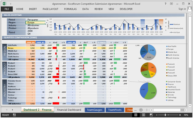
This dashboard showscompany’s financial summaryon industry estimated Vs. actual revenue, revenue by region, estimated revenue.
This review is for business owner who needs an intuitive financial dashboard on a daily basis, but more so, needs the ability to forecast and run scenarios to grow a company.
In today’s world there is a huge pressure on the management to provide faster and transparent information which helps in determining company’soverall performance. It tracks financial datawhich helps to see the growth from various perspective of the industry.
There are several ways in which you can visualize financial data to understand the company’s goal. In October month, Excelforumteamhas launched a dashboard competing in which you are asked to visualize financial data using sample data. The challenge has generated a huge thrill around the community and fetched 118 incredible entries.
In this article, we will show you the steps on how to create this dashboard.
Let us see the how Dashboard made by Dirk Grannemanlooks:

We have divided this dashboard into 4 sections of information. Let us take a look at each one separately.
Section1:
In this section,we will see sales overtime. There are five drop down lists which can be used view the report from different selections.
We can view the chart by period, region, industry& product.

The above chart is dynamic in nature & will change as we select the change the selections in drop down lists.
Section2:
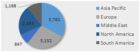
This section is picture of table which shows quarter comparison by all the regions.

The below picture shows the selected period information using pie chart.

Section3:
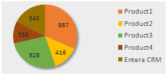
This section is picture of table which shows quarter comparison by all the products.

The below picture shows the selected period information using pie chart.

Section 4:
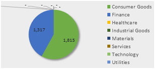
This section is picture of table which shows quarter comparison by all the industry.

The below picture shows the selected period information using pie chart.

Using this dashboard you can get a clear view of the financial industry and we can get the information from various point of view.
The applications/code on this site are distributed as is and without warranties or liability. In no event shall the owner of the copyrights, or the authors of the applications/code be liable for any loss of profit, any problems or any damage resulting from the use or evaluation of the applications/code.
Nice
Dear Sir,
Would greatly appreciate if you could send me a copy of your great dashboard to my email address. Many thanks in advance.
Michael
Hi,
Can you send me this dashboard to my email, Thanks & appreciated
excellent article and must want to have more details.