About Dashboard:
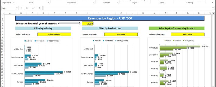
Finance Dashboard is used to present the fiscal performance. This dashboard used to show how much revenue was generated in the year, quick ratio, and short term assets. The idea behind the dashboard of any executive officer is that just by "looking" you can get information about the need to drive the business forward.
Basically financial dashboard provide the information about the company’s performance. Through this dashboard we can analyze the company’s performance and growth. On the basis of financial analysis management take the decisions for the Company’s growth and take the appropriate decision about the goals and targets to the company.
Below shown dashboard is presenting the Financial Analysis.
Drop Down List- Year, All Industries, Products, Sales Person

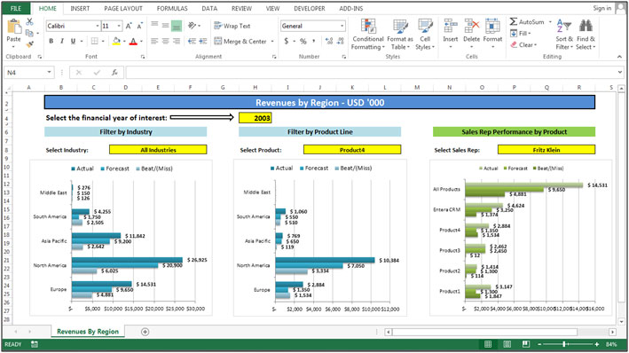
In above shown picture we have 4 drop down lists. 1st drop down list is available to select the year, 2nd filter is available to select the industry, 3rd drop down list available to select the products, and 4th drop down list is available to select the sales person.
When we will select the year after that we can select the Industry, Product, and Sales person. The analysis will present the report for the selected year.
Chart:- Actual Vs Estimated by Industry
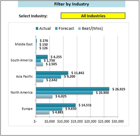
In the above shown chart used we used Bar Chart and made it into an interactive chart. We can select the department from the drop down list and graph will get changed accordingly.
This chart is presenting the graphic picture of the performance of every department. We can analyze that the chart is about the comparison in between actual achievement vs estimated sales which was forecasted by the industry.
Chart:-Product Analyses
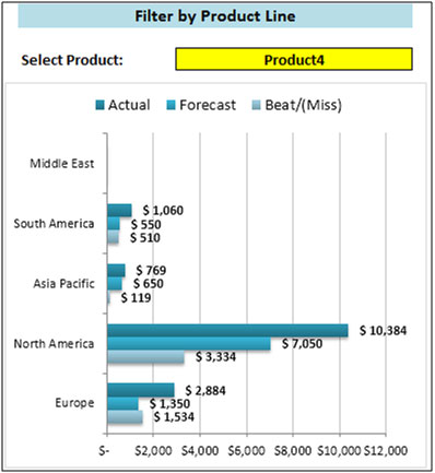
In the above shown chart we used Bar Chart and made it into an interactive chart. We can select the product from the drop down list and graph will get changed accordingly.
This chart is presenting the graphic picture of the performance of every product. We can analyze that the chart is about the comparison between actual Achievementvs estimated sales which was forecasted by the industry.
Chart:- Sales Rep Performance by Product
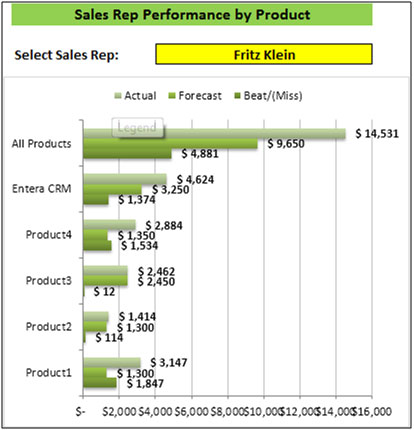
In the above shown chart we used Bar Chart and made it into an interactive chart. We can select the Sales Rep from the drop down list and graph will get changed accordingly.
This chart is presenting the graphic picture of the performance of every sales rep. We can analyze that the chart is about the comparison between actual Achievement vs estimated sales which was forecasted by the industry.
The applications/code on this site are distributed as is and without warranties or liability. In no event shall the owner of the copyrights, or the authors of the applications/code be liable for any loss of profit, any problems or any damage resulting from the use or evaluation of the applications/code.