About Dashboard:
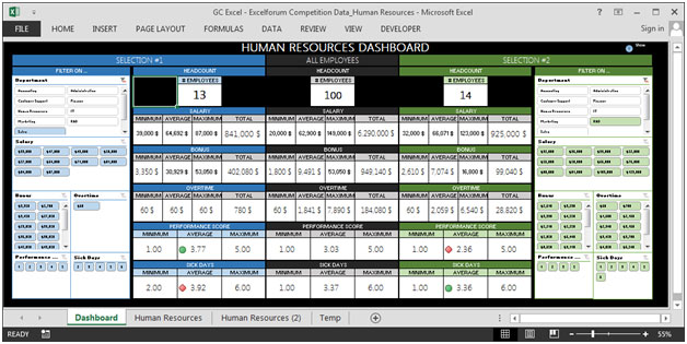
This dashboard visualizes various employee and HR related information. It contains basically 2 sections from which we can use slicers to filter down the information in which we are interested in results. There is user form, shown in a clever way that it takes less space on the screen & at the same time shows the relevant information which otherwise will take lots of space on the screen.
It allows HR managers and senior management to quickly view employee statistics including headcount, payroll breakdown, number of employees by salary, salary distribution, average sick days, and total departments.
HR Dashboard can be designed in different ways and used for different things, but it’s mainly developed & designed keeping in view the important metrics.
There are several ways in which you can visualize HR data to understand the objectives. In October, ExcelForum team launched a dashboard competition in which you were asked to visualize sample data. The challenge has generated a huge thrill around the community and fetched 118 incredible entries.
In this article, we will show you the steps on how to create this dashboard.
Let us see how the Dashboard made by GC Excel looks:

We have divided this dashboard into 4 sections of information. Let us take a look at each one separately.
Section1:
This section shows Show/Hide Help, seen at the top right corner. You can click on this button to understand how this dashboard works.
![]()
This is how the dashboard looks:

You will find lots of information, like there are slicers used to filter down the requirement. If we click on the 3 headcounts, then the user form will appear on the screen & we will get employee information like full name, hire date, salary, bonus, overtime, department, sick days, and performance score.Refer below snapshot:

This is a very nifty way of showing so much information in less space.
Section2:
In this section, we will cover the left portion of the screen, which provides flexibility to filter by department, salary, bonus, overtime, performance score & sick days.The right portion shows the headcount of the selected department. It also shows minimum, maximum & average of salary, bonus, overtime, performance score & sick days.

Section3:
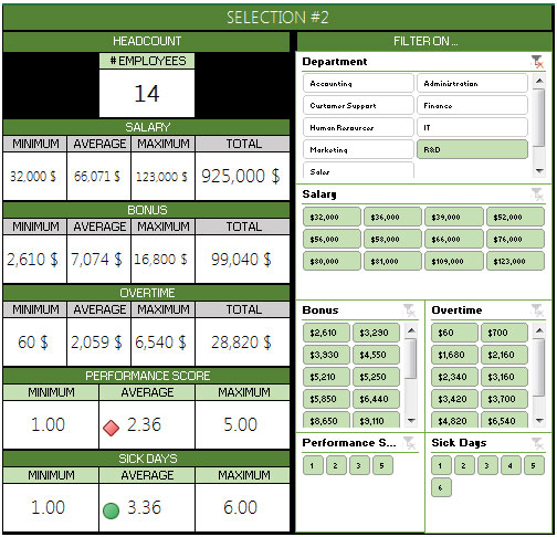
The below picture is a mirror copy of the previous section except the green color. The idea behind this approach is to provide the viewer the flexibility of comparison between two selections like department, salary, performance, etc. against all employees’ data.

Section4:
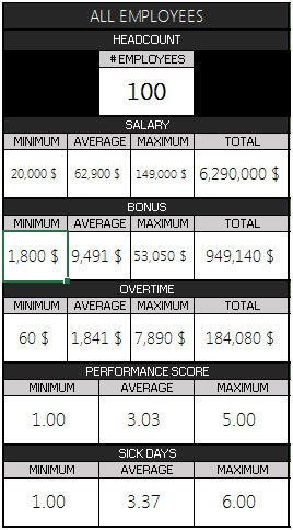
This section holds all employees’ data with regards to headcount. The below is a picture of the static table that shows minimum, maximum & average of salary, bonus, overtime, performance score & sick days.

Using this dashboard we can get a clear view of the Human Resource;and thus we can get the information from various points of view.
The applications/code on this site are distributed as is and without warranties or liability. In no event shall the owner of the copyrights, or the authors of the applications/code be liable for any loss of profit, any problems or any damage resulting from the use or evaluation of the applications/code.