About Dashboard:
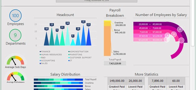
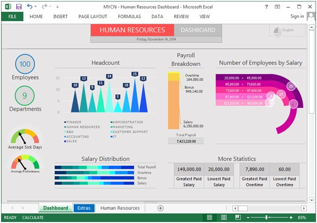
This dashboard visualizes various employee and HR related information. It allows HR managers and senior management to quickly view employee statistics including headcount, payroll breakdown, and number of employees by salary, salary distribution, average sick days, and total departments.
HR Dashboard can be designed in different ways and used for different things, but it’s mainly developed & designed keeping in view the important metrics.
There are several ways in which you can visualize HR data to understand the objectives. In October, Excel Forum team launched a dashboard, competing in which you are asked to visualize data using sample data. The challenge has generated a huge thrill around the community and fetched 118 incredible entries.
Thanks everyone for participating and making this a huge learning experience for everyone. Excel Forum team has learned several useful dashboard and charting tricks.
In this article, we will show you the steps on how to create this dashboard.
Let us see how the Dashboard made by MayconLuiz (MYCN) looks:

We have divided this dashboard into 7 sections of information. Let us take a look at each one separately.
Section1:
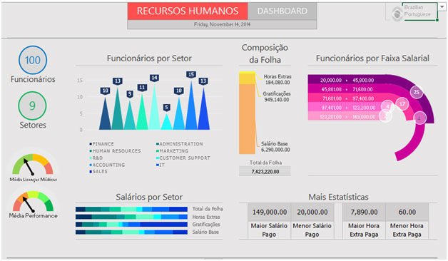
On the top right-hand corner, you will come across the language dropdown. It allows the viewer to select the preferred language. There are two options: English & Brazilian Portuguese

On the selection of Brazilian Portuguese, the data will be interactively updated.

This is a useful technique for the users who are dealing with clients all over the globe. With this feature, they have to click on the language from the dropdown list & all the information of the dashboard will be updated.
Section2:
In this section, we will cover the left portion of the screen.The number of employees, departments, average sick days & average performance is shown in the below picture.

Section3:
The following picture showsthe headcount of all the departments through 3D column chart.

Section4:
This section highlights on Salary Distribution using stacked bar chart for Total Payroll, Overtime, and Bonus& Salary.

Section5:
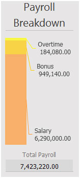
The following picture helps you in identifying the payroll breakdown in terms of Overtime, Bonus & Salary through column chart.

Section 6:
This section covers information on the number of employees by salary through Doughnut Chart.

Section 7:
In the last section, there are more statistics shown like greatest & lowest paid salary and greatest & lowest overtime paid.

Using this dashboard we can get a clear view of the Human Resource and thus we can get the information from various points of view.
The applications/code on this site are distributed as is and without warranties or liability. In no event shall the owner of the copyrights, or the authors of the applications/code be liable for any loss of profit, any problems or any damage resulting from the use or evaluation of the applications/code.
Wow, I liked your dashboard very much. I hope you do mind that I use it for my post on linkedin where I am talking about HR Analytics. I will credit the picture to you and to exceltip.com.
Nice work. Would appreciate.
wow..i like it..nice color combo
Clean layout and delightful colors