About Dashboard:
This dashboard shows company’s sales by person, customer, product, and region month-wise.
There are 3 dynamic charts, 1 table & 1 map. These all are controlled & linked by slicers.We can select any combination of person, customer or product to choose from & automatically all the charts, table & map gets filtered and updated dynamically.
The slicer feature gives the flexibility to select the product & show the total sales customer-wise.The same information can be seen in the chart. Use of slicers will help you in comparing two products at an amount of time for all the customers.This also provides flexibility to select the customer & show the total sales product-wise.
This helps in tracking the overall sales performance of the organization. If you want to track conversion rate by team, you’ll be able to identify the strengths and weaknesses in the sales process. The key focus of this dashboard is to show sales credibility& management visibility.
There are several ways in which you can visualize sales data to understand the market trends and sales performance. In October, Excel Forum team launched a dashboard, competing in which you are asked to visualize data using sample data. The challenge has generated a huge thrill around the community and fetched 118 incredible entries.
In this article, we will show you the steps on how to create this dashboard.
Let us see how the Dashboard made by Karivaan looks:

We have divided this dashboard into 6 sections of information. Let us take a look at each one separately.
Section1:
The following picture contains 3 slicers, which are updating all the related information in charts, table & map.

From the above slicers, we can select any combination of person, product & customer & all the related data will be shown. Slicers give flexibility to the end user.
Section 2:
This section shows top customers by product & region.

Section 3:
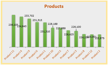
The below chart provides all the products’ sales.

Section 4:
The following chart covers sales per month information.

Section 5:
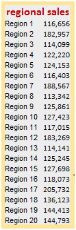
The following picture provide regional sales information in detail. This table gets updated as we select sales person, customer & product from slicers.

Section 6:
The below is a picture of a map, which is related with the selection of the parameters in slicers.

This keeps on updating dynamically as we select different options from slicers.
Using this dashboard we can get a clear view of the Sales industry;and thus we can get the information from various points of view.
The applications/code on this site are distributed as is and without warranties or liability. In no event shall the owner of the copyrights, or the authors of the applications/code be liable for any loss of profit, any problems or any damage resulting from the use or evaluation of the applications/code.
They change automatically, but you should not change the dashboard-sheet values manually. This does not lounch Makro1 which colours the map.
You can test by selecting only one product to show.
If you test by changing one region value to 0, you must manually run makro1 too. Remember that regionvalues are actually formulas. When changing formula to value, you lose that part of formula for good. Return the formula as it was.
The map colour changed for me. I went to the Sales Dashboard worksheet and changed all the values for region 1 to 0 and then refreshed the pivot table on the Region tab. This then updated the map colour for Region 1.
I thought the map colours will change automatically when the numbers change - they don't.
When I put Region 20 down to 0 - it didn't change to pale.