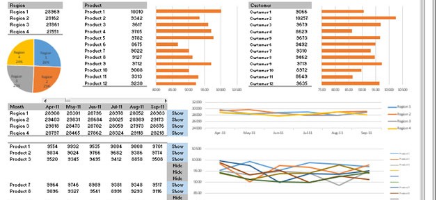
About Dashboard:
This dashboard shows company’s sales by region, product, customer & sales analysis, month wise.
There are 5 dynamic charts as well as 5 dynamic tables. We can track conversion rate by the team; you’ll be able to identify the strengths and weaknesses in the sales process. The key focus of this dashboard is to show sales credibility and management visibility.
There are several ways in which you can visualize sales data to understand the market trends and sales performance. In October month, Excel Forum team has launched a dashboard wherein you are asked to visualize data using sample data. The challenge has generated a huge thrill around the community and has fetched 118 incredible entries.
In this article, we will show you the steps on how to create this dashboard.
Let us see the how Dashboard made by Sc0oby looks:

We have divided this dashboard into 7 sections of information. Let us take a look at each one separately.
Section1:
This section contains a drop-down list of months that can be used to see dynamic charts & tables updated automatically after the selection from the drop-down list.

We can change the drop down selection to view charts & tables to be dynamically updated as per the selection.
Section2:
The following picture shows region-wise details through a table & chart,showing the results on the basis of the selection in drop-down list.

Section3:
The following picture shows product-wise details through a table & chart,showing the results on the basis of the selection in drop down list.

Section4:
The following picture shows customer-wise details through table & chart, showing the results on the basis of the selection in drop down list.

Section5:
The following picture contains a scrollbar which is linked with the below table & chart. Currently, the table & chart can show 6 months data at one point of time. The scrollbar can be used to view the other months’ data.

Section6:
The below picture contains a table anda chart. Both are dynamically controlled by the scrollbar. This section shows region-wise sales.

Between table & chart there are drop downs which provide freedom for us so that we can have the option to show or hide for the selected region.

Section7:
The below picture contains a table and a chart. Both are dynamically controlled by the scrollbar. This section shows product-wise sales.

Between table & chart, there are drop downs that can be used to provide liberty to us so that we can show or hide the selected product.
Using this dashboard,wecan get a clear view of the Sales industry,and we can get the information from various points of view.
Download Dashboard
The applications/code on this site are distributed as is and without warranties or liability. In no event shall the owner of the copyrights, or the authors of the applications/code be liable for any loss of profit, any problems or any damage resulting from the use or evaluation of the applications/code.