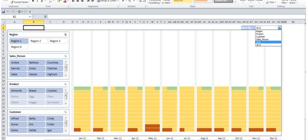
Sales Performance: - Every company has a product they need to sale it to increase the business and to return the expenditures of company. So sales is played very important role to increase the business and that is why we had to focus on their performance. Ultimately when sales will improve the company will grow.
Sales performance dashboard is useful to analyze the performance of sales. By using the sales performance dashboard we can see the individual performance and make improvement in the performance on the basis of data, it will help us to forecast the next vision of targets and achievement and managing the things like how we can improve the sales and how we can generate the revenue etc.
Objective: The purpose of the dashboard is to understand visually, the sales, filtered (by factors such as Region, Salesman, etc.) and grouped (by factors such as year, customer, etc.).
The Data:
=> The original data was not very descriptive. I have given valid names for ‘Sales Persons’, ‘Products’ and ‘Customers’.
=>Each ‘Sales Person’ has made certain amount of sales. To make a meaningful comparison, I have taken the maximum sales as 1500 and calculated the percentage of each sale made against it. I have distributed the data into 3 categories:
1. 10 % to 40 % - Below Average (shown by brown color)
2. 41 % to 80 % - Ok. Can do better (shown by light orange color)
3. > 80 % - Close to actual target of 1500 (shown by green color)
Dashboard: The dashboard is used to help the User ‘drill-down’ (in terms of sales persons, customers and products) and find the count (according to categories) in terms of number and color.
The dashboard was created using a 17-inch monitor. User may have to scroll when viewing in a smaller monitor.
The Dashboard:
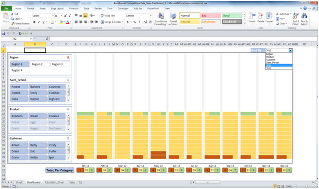
Visual Components of the Dashboard.
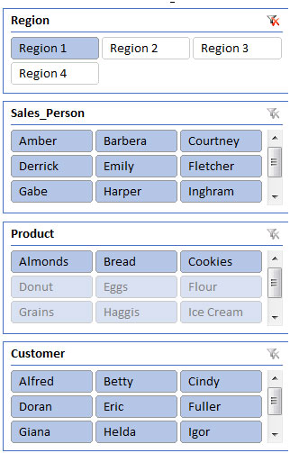
1.Slicers: The slicers help analyze the data by 4 categories – ‘Region’, ‘Sales Person’, ‘Product’ and ‘Customer’.
2. The Grid: When you click a slicer or choose the column you want the sorted data to be shown, the grid will change accordingly.
Below the grid, you will see square boxes in colors brown, light orange and green. The numbers in these are what you get after clicking one or more elements in the slicer (and/or choosing the column you want the data to be sorted against.
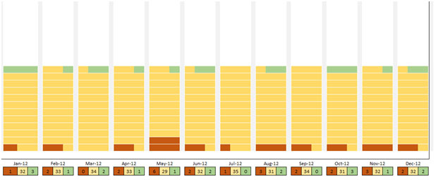
Once you choose the column to sort by, the columns appear in the bottom and the totals for the values chosen in the slicer for the column are calculated into 3 categories (10 % to 40 %, 41 % to 80 % and > 80% and the grid reflects these counts by the colors)
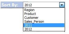
3.Sort By column
You have an option to present the sort the data got after you have chosen items in the slicers. This is a drop down with values. Possible values are:
Examples on Usage:
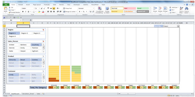
1. For ‘Region 1’, for sales person ‘Courtney’, find the quantity of sales of Almonds, Bread and Cookies made to customer Cindy and sort by product first and then by year 2011
By Product
By Year
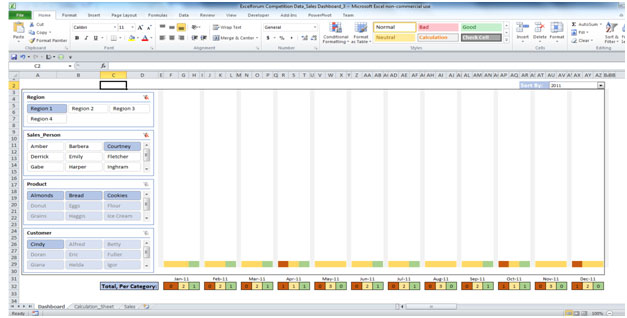
Analysis: The Sales people have mostly been above average in their sales of products to customers.
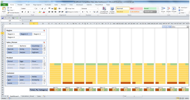
2. For ‘Region 2’, for sales persons (except Amber and Barbera), for products (Donut, Eggs and Flour), across customers, by Year 2011 and 2012.
by year 2011
By year 2012
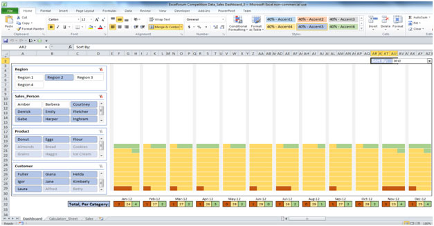
Analysis: The Sales people have mostly been above average in their sales of products to customers, with a few ‘higher’ sales indicated by green color.
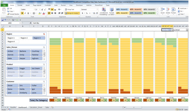
3. When analyzing data for Region 3, sorting the data by sales person, we see the below
Note:
1. When clicking a ‘Slicer’, after the grid is displayed, the focus rests in cell B2.
2. When choosing a value from drop-down list, after the grid is displayed, the focus rests on cell AR2.
Exception
The grid can show counts of sales up to 81. Should you choose multiple regions, the count goes above 81. In this case, we see an error message and the grid is cleared of pre-painted color.
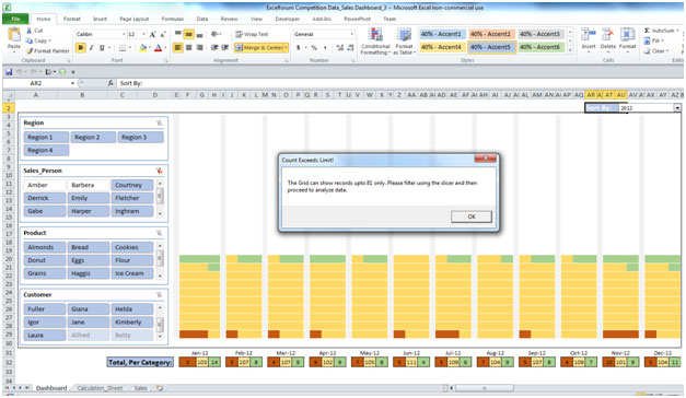
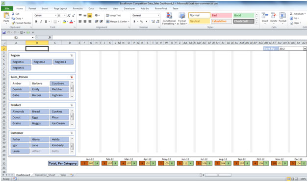
We then de-select all regions and choose one region and sub-filters in other slicers. Then, we analyze the data.
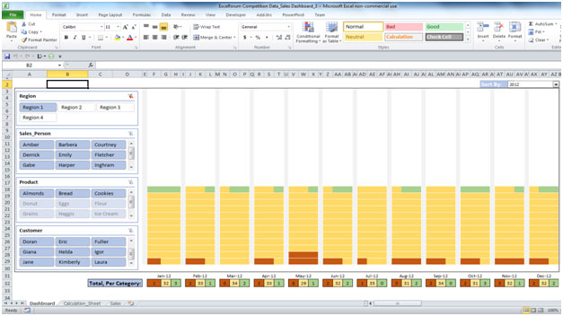
Data for region 1
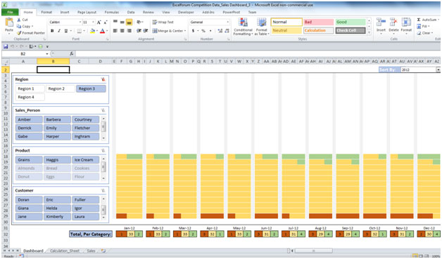
Data for region 3
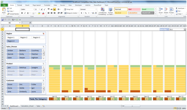
Data for region 4
The applications/code on this site are distributed as is and without warranties or liability. In no event shall the owner of the copyrights, or the authors of the applications/code be liable for any loss of profit, any problems or any damage resulting from the use or evaluation of the applications/code.
Please can you send it to my mail thank you