About Dashboard:
Sales Performance: - Every company has a product which they need to sell increase the returns. Ultimately if sales improve, the company will grow
Sales performance dashboard is a useful tool to analyze the performance of sales. By using the sales performance dashboard we can see individual performance and make improvements in the performance on the basis of data.It helps us to forecast the next vision of targets and achievements and managing things like improving the sales and how to generate more revenue etc.
The Dashboard shown below is useful to analyze sales performance in every field.

Tabs:- To select the Branch

![]()
In the dashboard we have 4 tabs, 1st is to select the Monthly summary, 2nd is to select the Michigan Branch, 3nd tab is to select the California branch and 4rd is to select the Membership.
Scroll bar is present to change the month, when we scroll it, the month and the charge accordingly change.
When we select the Michigan Branch, we will get the analysis related to this branch for sales performance.
Let’s click on Michigan Branch and have a look at what kind of analysis is present here:-


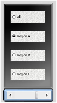
These are the radio buttons where we can select aregion to see the sales performance for that particular region and also we can see the performance for all the regions.
Charts: - Equipment Sales

The above displayed column chart is representing the report of Equipment Sales analysis month on month. Through this graphic analysis we can evaluate in which month we achieved good sales.
Charts: - Non-Medical Sales

The above shown column chart is representing the report ofNon-Medical Sales analysis month on month. Through this graphic analysis we can evaluate in which month we achieved good sales.
Charts: - Region Wise Monthly Performance

In the above shown Pie chart is representing the report for the all regions contribution on the monthly basis. Through the chart we can easily understand and analyze that how the Regions are contributing in the business in every month.
Charts: - Average Product Amount Sold

Through the above shown chart we can analyze the monthly performance according the average product amount sold on monthly basis.
To go back the main summary click on Monthly Summary.
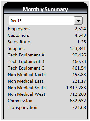
On the Monthly page we have 4 analysis. 1st is about the Medical Equipment sales on monthly basis, 2nd is about the Non-Medical sales on monthly basis, 3rd is about the Technical Equipment sales on the basis, and 4th analysis is to show details such as Employees, Customers, Sales Ratio, Supplies, Tech Equipment A, B, C, Non-Medical status zone wise, Commission, Transportation.
Chart:- Medical Equipment

Chart:-Non-Medical Equipment

Chart:-Technical Equipment Sales


When we click on Membership tab we get the analysis about contributionsof every branch month wise in terms of sales.
After presenting the report using the line chart we can see that it is very easy to understand how the branches are performing and contributing to achieve the sales.

Download Dashboard
The applications/code on this site are distributed as is and without warranties or liability. In no event shall the owner of the copyrights, or the authors of the applications/code be liable for any loss of profit, any problems or any damage resulting from the use or evaluation of the applications/code.
Hello,
Am very Happy to see this kind of wonderful charts..
and very eager to learn... Here the tutorial shows only the charts/graphs.. but it is good if you explain how this is done step by step..
Thanks,
Pennaiah
Bangalore-india
Hello Please share Dashboard related to Hospitality Industries
Thanks
Where is my dashboard its not good but it should be in least at least. All dashboards are too good its good for all....keep it up....
Hi Kedar,
We have received very good entries and hence it took time for us to write descriptions and upload all at same time. We are in process to upload the descriptions for few dashboards. All the dashboards will be up soon today.