About Dashboard:
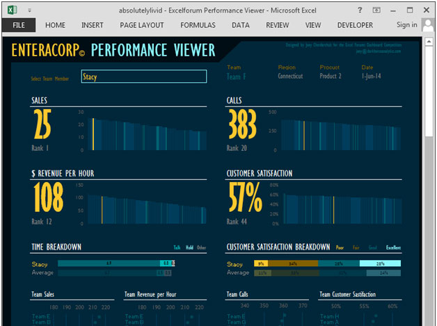
This dashboard shows the team performance of each team member by sales, calls, revenue per hour, customer satisfaction, time breakdown, product, region& ranking.
The dashboard focuses on total transparency of performance by the team, which helps the management in taking quick decisions.
There are many ways in which you can visualize team performance data to understand the achievements by various team members. In October, Excel Forum team launched a dashboard, competing in which you are asked to visual data using sample data. The challenge has generated a huge thrill around the community and fetched 118 incredible entries.
In this article, we will show you the steps on how to create this dashboard.
Let us see how the Dashboard made by Absolutelylividlooks:

We have divided this dashboard into 11 sections of information. Let us take a look at each one separately.
Section1:
The following picture contains drop down list of team members from which we can select any team member & all the related information will get updated dynamically.

The following picture contains team name, region, product, date of the selected team member.

Section2:
The following picture shows the selected team member’s rank by sales performance.

Section3:
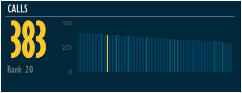
The following picture shows the selected team member’s rank by calls.

Section4:
The below picture shows selected team member’s rank by revenue per hour.

Section5:
The below picture shows selected team member’s rank by customer satisfaction.

Section 6:
The following picture shows time breakdown of selected team member by talk, hold & other parameters.

Section 7:
The following picture shows customer satisfaction breakdown of selected team member by poor, fair, good & excellent parameters.

Section 8:
The following chart shows the team sales & the selected team member’s team is highlighted in yellow color. If we change the team member,&if that team member belongs to a different team than that team will be automatically highlighted in yellow color.

Section 9:
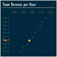
The following chart shows the team revenue per hour for the selected team member’s team, highlighted in yellow color.

Section 10:
The following chart shows the team calls graph for the selected team member’s team, highlighted in yellow color.

Section 11:
The following chart shows the team customer satisfaction graph for the selected team member’s team, highlighted in yellow color.

Using this dashboard we can get a clear view of the Team Performance;and thus we can get the information from various points of view.
The applications/code on this site are distributed as is and without warranties or liability. In no event shall the owner of the copyrights, or the authors of the applications/code be liable for any loss of profit, any problems or any damage resulting from the use or evaluation of the applications/code.
Fantastic dashboard. I like it. Congratulations and thanks for the opportunity to download it.
I like it! Great way to present so much info. Now if only there were a way to find out who the top salespersons are without going through each one, it would be perfect.