About Dashboard:
Team Performance: - A company always works in teams, and every team has a different team leaders who handled the team members. Teams always work in unity, every person has different skills in different areas. If we work as team every team member should equally contribute to achieve the targets but usually some members perform very well and few members perform very low. Through analysis done through the dashboards we can see the performance of every employee in each and every area.
Basically team performance dashboard works for analyzing the team’s performance. By using the team performance dashboard we can see individual performances and make improvements in the performance on the basis of data. It will help us to forecast the next vision of targets and achievements and managing things like how we can improve sales, how we can generate revenue etc.
Below shown dashboard is useful to analyze the team’s performance in every field.

Let’s understand the dashboard:-

In this tab we can select the Team, product as per the analysis area.

In this tab we can see the Revenue generation.

In this tab we can see the sales from 31st May.

In this tab we can see the CSAT from 31st May.

In this tab we can see the Calls from 31st May.

In this table we can see the Region wise performance detail in terms of Revenue, Revenue Share, CSAT%, Total sales, and Sales per hour, Average hours Login, Talk time, and Hold time.

3DPie chart is used to show the team wise contribution in revenue generation. We can easily identify that which team had contributed very high between all the teams, and which team has contributed very low

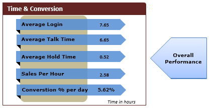
In this picture we can see the all call Time and conversion details such as Average Login, Average talk time, Average hold time, sales per hour, and conversion % per day.

In this table Top 5 performers and bottom 5 performers are represented according to revenue sharing, Conversion rate, CSAT%, Total Sales and sales per hour, Average Login time, Talk time, and hold time.
The applications/code on this site are distributed as is and without warranties or liability. In no event shall the owner of the copyrights, or the authors of the applications/code be liable for any loss of profit, any problems or any damage resulting from the use or evaluation of the applications/code.
Thank you guys..
Hi Admin - Looks like the the download dashboard link is word doc...can you please check..
Very nice Dashboard. Helps to understand the performance metrics better and really highlights the top and bottom performars. Looks like it fits clearly on one screen. Hence, you get a good view. Good use of color and techiques to make user friendly like including help option.
Superb website to learn excel...and superb dashboard when it comes to understand top to down performance and look and feel...Is there a way to get the excel version of it..I would love to implement it at my work...I have a similar kind of requirement...
thank you for your help in advance.