About Dashboard:
This dashboard shows the team performance by team members, product, region, ranking and ratings.
The dashboard focuses on total transparency of performance&the team is working to measure both soft and hard performance factors as well as indicating areas that are deteriorating or improving month-on-month.
There are many ways in which you can visualize team performance data to understand the achievements by various teams. In October, ExcelForum team launched a dashboard competition in which you were asked to visualize sample data. The challenge has generated a huge thrill around the community and fetched 118 incredible entries.
Thanks everyone for participating and making this a huge learning experience for everyone. Excel Forum team has learned several useful dash board and charting tricks.
In this article, we will show you the steps on how to create this dashboard.
Let us see how the Dashboard made by Balag72 looks:

We have divided this dashboard into 8 sections of information. Let us take a look at each one separately.
Section1:
The header contains all the teams’related information. If we click on any one of them then that team will be highlighted &all the related information will get automatically updated.
![]()
After we click on Team C, the below picture shows the team information like overall rating, ranking, talk time in hours, sales, revenue & CSAT.

Section2:
In this section, target for the next period will be updated like Sales, Revenue, and CSAT.

Section3:
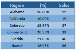
The following picture shows the selected team’s sales performance by region in percentage.

Section4:
The below picture shows the team’s sales & revenue performance by product.

Section5:
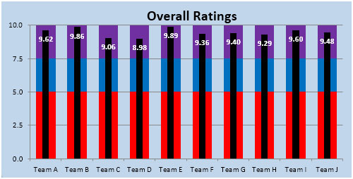
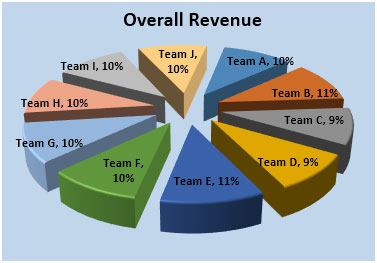
This section covers Overall Ratings & Overall Revenue through charts.
Rating in an overall scale of 10.

Overall Revenue shared in % by the Teams.

Section 6:
The following picture shows the Regional Revenue in a map.

Section 7:
In this section, Revenue, Productivity & CSAT are shown through speedometer chart.

Section 8:
Overall Ranking of the teams based on the Overall Ratings scored

Using this dashboard we can get a clear view of the Team Performance,and thus we can get the information from various points of view.
The applications/code on this site are distributed as is and without warranties or liability. In no event shall the owner of the copyrights, or the authors of the applications/code be liable for any loss of profit, any problems or any damage resulting from the use or evaluation of the applications/code.