About Dashboard:
This dashboard shows the team performance, considering team members, product, region and time.
The dashboard focuses on specific areas that are brought to attention by “team performance”, as well as indicating areas that are deteriorating or improving month-on-month.
The team performance uniquely measures both soft and hard performance factors and helps to drive continuous and corrective parameters.
There are many ways in which you can visualize team performance data to understand the achievements by various teams. In the month of October, Excel Forum team had launched a dashboard competing wherein you are asked to visualize team performance data using sample data. The challenge has generated a huge thrill around the community and has fetched 118 incredible entries.
Thanks everyone for participating and making it a huge learning experience for everyone. Excel Forum team has learned several useful dashboards and charting tricks.
In this article, we detail the process to create this dashboard.
Let us see how the Dashboard made by Edo F looks:

We have divided this dashboard into 5 sections of information. Let us take a look at each one separately.
Section1:
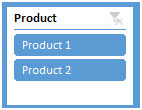
In this dashboard, there are two products, and we can choose any product in Slicer, on the top left hand side. If Product 1 is clicked, then the below charts will get updated automatically.

Section2:
We need to select the month from the timeline as shown in figure. When we select the month from the timeline, the data varies to show the figures of the selected months automatically.

We can also filter the data by year and can click on the timeline dropdown feature to see the report of a particular duration.

Section3:
If we click on any one region, say California, then the charts below will get updated automatically.

Section4:
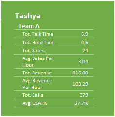
As we click on product or setting the months using timeline feature, on the top right hand side, Customer Satisfaction will automatically updated showing Avg Revenue per hour, Avg CSAT, Max CSAT & Min CSAT of all the team members who top the Avg CSAT.

If we select a particular team, then the corresponding team’s data will get updated from various perspectives.

Section5:
To find out the team’s performance in total, you can select single or multiple teams at the same time.

Further, to find out the strongest seller among the team members, the chart below will help you, for sure.

By clicking on the Radio button, we can find the information related to the all the sellers including the weakest seller, too.
Using this dashboard, one can get a clear view of the Team Performance, as well as the information from various points of view.
![]()
If you liked our blogs, share it with your friends on Facebook. And also you can follow us on Twitter and Facebook.
We would love to hear from you, do let us know how we can improve, complement or innovate our work and make it better for you. Write us at info@exceltip.com
The applications/code on this site are distributed as is and without warranties or liability. In no event shall the owner of the copyrights, or the authors of the applications/code be liable for any loss of profit, any problems or any damage resulting from the use or evaluation of the applications/code.
AWESOME!!!
Excellent....
Excellent job 🙂