
About Dashboard:
Basically team performance dashboard is used foranalyzing the team performance. By using the team performance dashboard we can see the individual performances and make improvements in the performance on the basis of data.It helps us to forecast the next vision of targets and achievement and managing things like how we can improve sales, how we can generate more revenue etc.
Below shown dashboard is useful to analyze the team performance in every field.
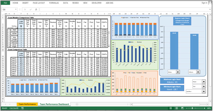
Let’s understand the dashboard:-
Team Member Comparison Table:-

Login hours, total talk time, total hold time, Total sales, sales per hour, Total Revenue, Revenue per hour, total attended calls, divide the total calls in categories for every team members are mentioned in the above shown table.
Sort Option uses

This table provides us some options such as Sort Option to organize the data in ascending or descending order as per the requirement.
Radio buttons uses:-

Radio button are provided to change chart analyses on the basis of data.
Scroll Bar:-
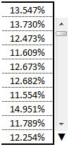
Also there is a scroll bar available to change the chart analysis to see the clear picture in the chart because the whole data cannot be covered in a single chart. Scroll is required to see the chart analysis for every consultant.
Team Comparison Table:-

In the above shown table we have Login hours, total talk time, total hold time, Total sales, sales per hour, Total Revenue, Revenue per hour, total attended calls, divide the total calls in categories Team Wise.
Chart based on Team members’ calls status

The above shown chart is about what are total login hours, in which how much total talk time is there and how much is the total hold time to every team member.
Chart based on Calls Vs Revenue

the above shown chart is to give the picture about how much revenue is generating out of the total number of calls.
Chart based on Calls Quality
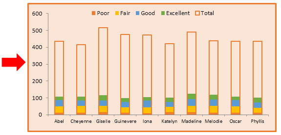
The above shown chart is used to analyze the calls quality; how they responding to customers, and how many customers are satisfied with their answers on this kind of parameters they judge the quality and categorized to calls in the few categories as such Excellent, Good, Fair, and poor.
This chart will give the picture about the call performance.
Chart: - Comparison b/w Teams, Region, and Consultants
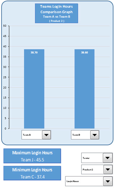
The above shown chart is prepared to compare the performance in between 2 Regions, 2 consultants and 2 teams. In this chart drop down filters are available where we can set our criteria for comparison as per the requirement.
Chart based on Team’s calls status

The above shown chart is to show what are total login hours, in which how much total talk time is there and how much is total hold time Team wise.
Through this chart we can take the idea, how the teams are working.
Chart based on Calls Vs Revenue
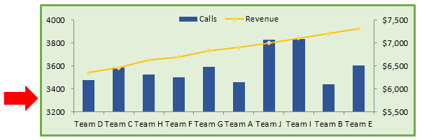
The above shown chart is to show how much revenue is generated out of the total number of calls. So we can recognize which team is performing well.
The applications/code on this site are distributed as is and without warranties or liability. In no event shall the owner of the copyrights, or the authors of the applications/code be liable for any loss of profit, any problems or any damage resulting from the use or evaluation of the applications/code.