About Dashboard:
This dashboard shows the team performance by revenue per day, revenue per hour, comments feedback, time in office, sales per hour.
The dashboard contains 5 interactive charts to display information to management.There are 5 pivot tables used & one slicer, which is linked with all the pivots to provide interactivity in the report.
The beauty of this dashboard is that a single slicer is used to update information.All the charts get updated dynamically as we select any team. The focus is given on total transparency of performance of the team.
There are many ways in which you can visualize team performance data to understand the achievements by various teams. In October, Excel Forum team launched a dashboard, competing in which you are asked to visualize data using sample data. The challenge has generated a huge thrill around the community and fetched 118 incredible entries.
Thanks everyone for participating and making this a huge learning experience for everyone. Excel Forum team has learned several useful dashboard and charting tricks.
In this article, we will show you the steps on how to create this dashboard.
Let us see how the Dashboard made by Mahesnrm looks:

We have divided this dashboard into 6 sections of information. Let us take a look at each one separately.
Section1:
The following picture is of slicer, which is the heart of this dashboard. The slicer is linked with all the pivots & as we select any team then all the related information for that team in all 5 charts will be updated dynamically.
In this way, one can make as many pivots from various directions & link them with a slicer to provide interactive functionality.
Section2:
This section covers revenue per day information as per selection of the team in slicer.

We can select any combination of the team, and this chart will get updated automatically.
Section3:
In this section, revenue per hour for the selected team will be updated.

Section4:
This section covers information of customer’s comments whether they are excellent, good, fair or poor for the selected team members. The following picture shows the selected team’s comments feedback report.

Section5:
The picture below shows total time in office per team on the basis of hold time, talk time & login hours. This is a column chart & all the bars have different colors for better visualization.

Section6:
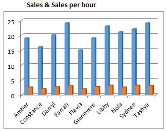
This section covers Sales per hour for the selected team.

Using this dashboard we can get a clear view of the Team Performance and thus we can get the information from various points of view.
The applications/code on this site are distributed as is and without warranties or liability. In no event shall the owner of the copyrights, or the authors of the applications/code be liable for any loss of profit, any problems or any damage resulting from the use or evaluation of the applications/code.