
About Dashboard:
This dashboard shows the team performance by team members, product, region, revenue by region, revenue by units sold, team-wise revenue, product-wise revenue, CSAT.
The dashboard focuses on total transparency of performance &the team is working to measure both soft and hard performance factors as well as indicating areas that are deteriorating or improving month-on-month.
There are many ways in which you can visualize team performance data to understand the achievements by various teams. In October, Excel Forum team launched a dashboard, competing in which you are asked to visualize data using sample data. The challenge has generated a huge thrill around the community and fetched 118 incredible entries.
In this article, we will show you the steps on how to create this dashboard.
Let us see how the Dashboard made by Chandra Shekhar looks:


We have divided this dashboard into 6sections of information. Let us take a look at each one separately.
Section1:
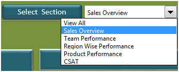
This section holds the drop down list, which contains different views like Sales Overview, Team Performance, Region-Wise Performance, Product Performance & CSAT. We can click on “View All” option to view all the information on the screen at the same time.
Section2:
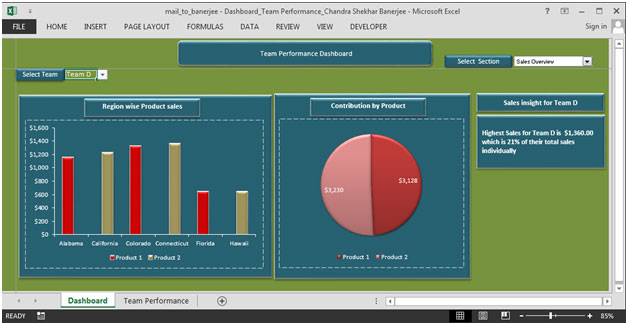
From Select Section drop down we have selected Sales Overview. This section contains drop down lists from which we can select the team name & all the related information for that team will be updated automatically.

In the above picture, there are two charts. The left chart shows the region-wise product sales & right chart shows contribution by product.
In the right portion of the picture, we can get highest sales for the selected team & the contribution in percentage of the total sales.
Section3:
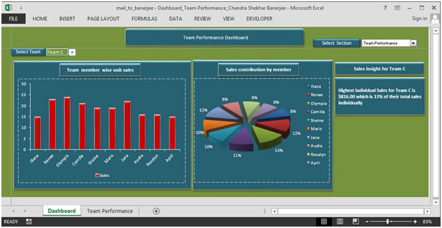
In this section, we will see the team performance details.
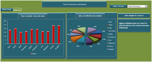
In the above picture, there is a drop down list, which contains team name. We can select any team & the charts will be updated dynamically.
The left chart shows team member wise unit sales & right chart shows sales contribution by all the team members in percentage for the selected team in the drop down list.
Section4:
This section focuses on showing region-wise performance.
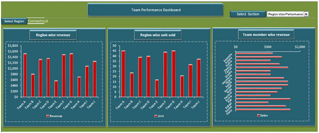
There is a drop down list, which provides flexibility to select any region & all the charts will be updated automatically.
The left chart shows region-wise revenue for all the teams.
The middle chart shows region-wise units sold for all the teams.
The right chart shows team member wise revenue.
Section5:
This section focuses on showing product performance.
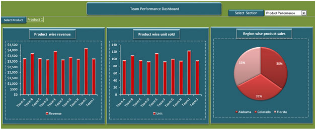
There is a drop down list, which contains product information & can be used to see the charts of the selected product.
The left chart shows product-wise revenue for all the teams.
The middle chart shows product-wise units sold for all the teams.
The right chart shows region-wise product sales.
Section 6:
The last section shows CSAT.
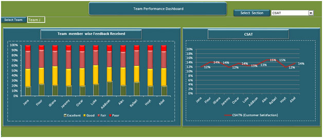
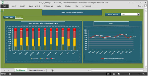
There is a drop down list in the above picture, which can be used to select team & all the charts will be updated dynamically.
The left chart shows team member wise feedback received.
The right chart shows CSAT using line chart in percentage for the selected team.
Using this dashboard we can get a clear view of the Team Performance and thus we can get the information from various points of view.
The applications/code on this site are distributed as is and without warranties or liability. In no event shall the owner of the copyrights, or the authors of the applications/code be liable for any loss of profit, any problems or any damage resulting from the use or evaluation of the applications/code.
hi