About Dashboard:
Team Performance: - A company always works in teams, and every team has a different team leaders who handled the team members. Teams always work in unity, every person has different skills in different areas. If we work as team every team member should equally contribute to achieve the targets but usually some members perform very well and few members perform very low. Through analysis done through the dashboards we can see the performance of every employee in each and every area.
Basically team performance dashboard works for analyzing the team’s performance. By using the team performance dashboard we can see individual performances and make improvements in the performance on the basis of data. It will help us to forecast the next vision of targets and achievements and managing things like how we can improve sales, how we can generate revenue etc.
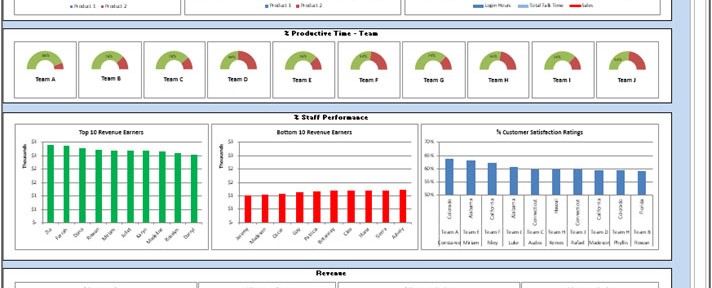
Below shown dashboard is useful to analyze the team’s performance in every field.

Let’s understand the dashboard:-
Chart:- Sales by Region
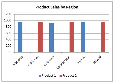
Column chart is used to represent the sales performance region wise for 2 products. Red columns are representing to product 2 and Blue columns are representing to Product 1.
Chart:- Sales by Team
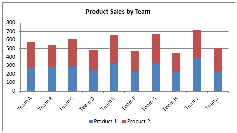
Column chart is used to represent the sales performance team wise for 2 products. Red columns are representing to product 2 and Blue columns are representing to Product 1.
Chart:- Sales by Team
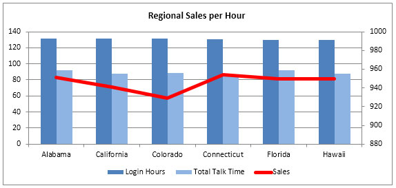
Column chart and Line chart are used to represent the sales per hour. Dark blue Columns are representing the Login hours, Light Blue columns are representing the Total talk time and Red line is representing the Sales per hour.
Chart:-% Productive Time – Team

Pie charts are used to represent the team performance. Through this chart we can analyze the team performance.
Chart:-Top 10 Revenue Earners
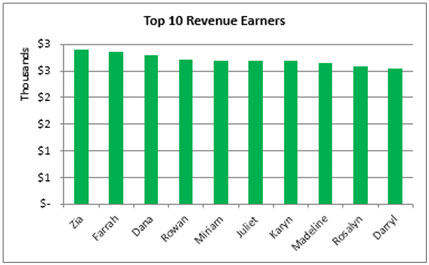
Column chart are used to represent the Top 10 Revenue Earners.
Chart:-% Staff Performance
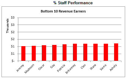
Column chart are used to represent the Bottom 10 Revenue Earners.
Chart:-Customer Satisfaction Ratings
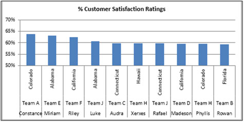
Column chart are used to represent to the %age of customer satisfaction ratings to region wise and as per the team.
Chart:-Revenue Team Wise
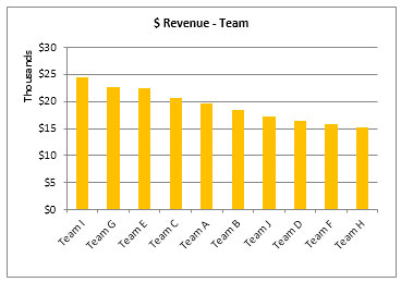
Column chart are used to represent to the revenue generate team wise, where we can see that which team is generating top revenue for industry and which team is generating very low revenue.
Chart:-Revenue Team Wise
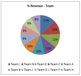
Pie chart are used to represent to the revenue Contribution team wise, where we can see that which team is contributing high revenue for industry and which team is contributing very low revenue.
Chart:-Revenue Region Wise
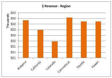
Column chart are used to represent to the revenue generate region wise, where we can see that which region is generating top revenue for industry and which team is generating very low revenue.
Chart:-Revenue Region Wise
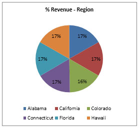
Pie chart are used to represent to the revenue Contribution region wise, where we can see that which region is contributing high revenue for industry and which region is contributing very low revenue.
The applications/code on this site are distributed as is and without warranties or liability. In no event shall the owner of the copyrights, or the authors of the applications/code be liable for any loss of profit, any problems or any damage resulting from the use or evaluation of the applications/code.