In this article, we will learn how and where we can create Column Chart in Microsoft Excel 2010. Column Chart is used to compare the values graphically across a few categories when the chart shows duration or the category text is long.
Column Chart contains 6 types of Column charts including Clustered Column, Stacked Column, 100% stacked Column, 3-D Clustered Column, 3-D Stacked Column, and 3-D 100% stacked Column.
Let’s take an example and understand how we can use the Column chart in Excel.
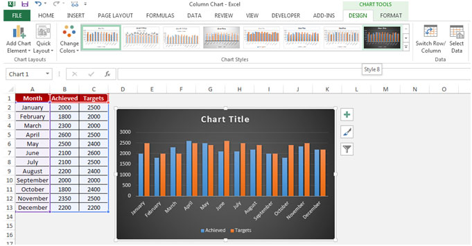
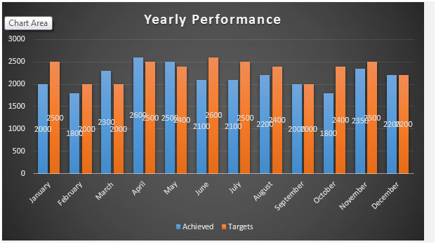
We have month wise achievement data in which column A contains Month Name and column B contains Achievement.

Let’s see how this can be achieved. To create the Column chart, follow below mentioned steps:-


This is the way we can create the column chart in Microsoft Excel.
The applications/code on this site are distributed as is and without warranties or liability. In no event shall the owner of the copyrights, or the authors of the applications/code be liable for any loss of profit, any problems or any damage resulting from the use or evaluation of the applications/code.