About Dashboard:
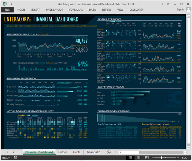
This dashboard shows the company’s financial summaryon industry-estimated vs. Actualrevenue, revenue by sales person, revenue by region, revenue by product, ranking.
There are 6 charts shown in this dashboard.
This review is for the business owner who needs an intuitive financial dashboard on a daily basis, but more so needs the ability to forecast and run scenarios to grow a company.
In today’s world there is anenormous pressure on the management to provide faster and transparent information, which helps in determining company’soverall performance. It tracks
financial data, which helps to see the growth from various perspective of the industry.
There are several ways in which you can visualize financial data to understand the company’s goal. In October, ExcelForum team launched a dashboard competition in which you were asked to visualize sample data. The challenge has generated a huge thrill around the community and fetched 118 incredible entries.
In this article, we will show you the steps on how to create this dashboard.
Let us see how the Dashboard made by Absolutelylivid looks:

We have divided this dashboard into 4 sections of information. Let us take a look at each one separately.
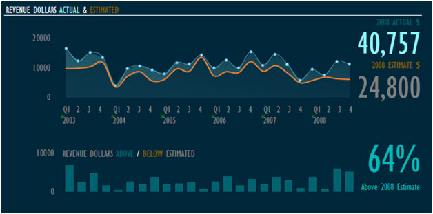
Section1:
This section covers revenue in dollars by actual vs. estimated for the year-wise performance.

With the above chart, we can find the estimated revenue in percentage.
Section2:
This section covers information on revenue by sales person.

The above chart shows actual vs. estimated revenue for each year. All the years’ actual revenue is higher than estimated revenue, which is calculated in percentage. This can be seen onthe right side of the picture.
Section3:
The below picture shows actual revenue vs. estimate revenue by industry, for all the years.

Using this chart, we can easily find the industry, which are performing above or below actual revenue vs. estimate revenue for any particular year.
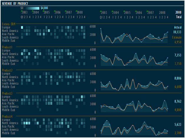
Section 4:
The below chart shows revenue by product for all the products, year-wise.

This way we can easily track the product performance by region & year.
Using this dashboard you can get a clear view of the financialindustry;and thus we can get the information from various points of view.
The applications/code on this site are distributed as is and without warranties or liability. In no event shall the owner of the copyrights, or the authors of the applications/code be liable for any loss of profit, any problems or any damage resulting from the use or evaluation of the applications/code.
Stunning
how can i download the dashboard?