 A histogram is simply a bar graph that shows the occurrence of data intervals into a bin range. Or say it shows the frequency distributions in data.
A histogram may look like a column graph but it is not interpreted from the column's height. It is intrepreted from the area it covers.
A bin is defined for frequency distribution. It is a kind of grouping.
For example, if you want to know, in a school, how many students are of age 5 or below, how many are between 6-10, how many are between 11-15, how many are between 15-20 and how many are 20 or more. The histogram in excel is
the best way to analyze and visualize this data and get the answer.
Enough of the theory, let’s dig into a scenario.
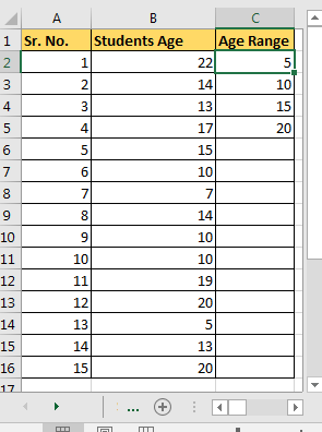
Let's say that we have this data in excel.

age<=5, 5<age<=10, 10<age<=15, 15<age<=20 and age>20. Simple, isn’t it? It is used to produce a frequency distribution.
Now, to plot a histogram chart in Excel 2016, we will use Data Analysis add-in. I assume you have read how to add data Analysis Add-In Excel for adding Data Analysis Toolpak. If you have already added it in, we can continue to our histogram tutorial.
To create a histogram in Excel 2016/2013/2010 for Mac and Windows, follow these simple steps:
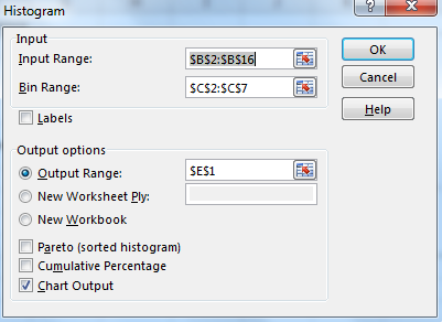
Select the output range. The place where you want to show your histogram in Excel worksheets. For this example, I have selected E13 on the same sheet.
Check Chart Output checkbox for Histogram chart.
Press that OK button on top. It will plot a histogram on the excel sheet.

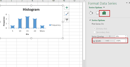
We need to do a little bit of editing in this chart.
Click on the little bars shown. Reduce the gap width to 0%.

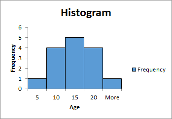
So yeah guys. It is done. We can tell that most of the students are b/w age of 10-15 and 15-20 by just looking at this Excel Histogram chart.
Now the biggest problem with the above method of creating Histogram in Excel, that its static. It's good when you want to create a quick report but will be useless if your data changes from time to time. You can make this dynamic by using formula. Since it shows frequency distribution, we can use the FREQUENCY function of excel, for making excel histogram charts. Let's see how…
So again we have that same data of students and same bin range. Now follow these steps to create a dynamic Histogram in excel 2010, 2013, and 2016 and above.
| {=FREQUENCY(A2:A16,C2:C5)} |
This chart is version independent. You can create this Histogram chart in Excel 2010/2013/2016/2019/365 and any upcoming since it is based on formula instead of any version-specific feature.
In Excel 2013 and 2016, we can directly create a histogram chart by using predefined histogram template in excel. It is useful when you don’t have defined bins for a histogram.
Steps to create histogram directly from the charts.
Now you have your, Histogram chart. It has predefined bins. You can customise to some extent. You can see it created 3 bins [1-9.8], (9.8-18.6], and (18.6, 27.4]. If you don want this then you can edit it.
To edit this histogram
I personally don’t prefer this chart. But its useful when i don’t have a bin range.
So we learned how to plot histogram in excel 2016. The histogram in Excel 2013 has the same procedure. Same case for older versions of Excel. Only the formatting options have changed.
Related Articles:
How to use the Waterfall Chart in Excel
4 Creative Target Vs Achievement Charts in Excel
How to use the Pareto Chart and Analysis In Microsoft Excel
How to do Regressions in Excel
Popular Articles:
50 Excel Shortcuts to Increase Your Productivity
How to use the VLOOKUP Function in Excel
The applications/code on this site are distributed as is and without warranties or liability. In no event shall the owner of the copyrights, or the authors of the applications/code be liable for any loss of profit, any problems or any damage resulting from the use or evaluation of the applications/code.