In this article, you will learn how to add error bars. Error bars is a great feature in Excel that provides flexibility to the user to show detail to a chart. We can use error bars to show variability in the KPI’s which are plotted in the chart.
Let us take an example to understand:
We have Sales Report that contains Month, Forecast Sales & Actual Sales.

Click on any cell in the above table of data.
Click on Insert tab
From Charts group, click on Line Charts

Select Line with Markers option

Assign name to the Chart (Sales Chart)

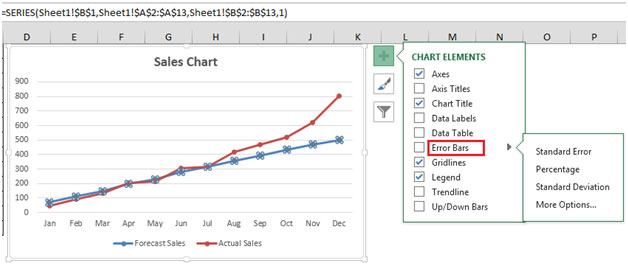
Click on the Forecast Sales Line (Blue Line)& click on Chart Elements on the upper right hand corner (plus sign)
Select Error Bars, you will find three options to select
Standard Error, Percentage, Standard Deviation & More options

If we click on Standard error then, the Chart will look like this:

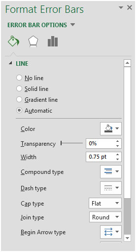
If you click on More Options, you will find the following Error bar options

In Vertical Error bar, we can show the error bar by Minus, Plus & both as well.
There are various Error Amount available for selection like Fixed value, Percentage, Standard deviation, Standard error, Custom, etc.

With Custom option, you can show custom error value that you want it to appear.
There are lots of different options available like Line color, transparency, width, etc.

The applications/code on this site are distributed as is and without warranties or liability. In no event shall the owner of the copyrights, or the authors of the applications/code be liable for any loss of profit, any problems or any damage resulting from the use or evaluation of the applications/code.