How To Create Dynamic Pareto Chart in Excel
In this article, you will learn how to create dynamic Pareto chart.
A Pareto chart, named after Vilfredo Pareto, is a type of chart that contains both bars and a line graph, where individual values are represented in descending order by bars, and the cumulative total is represented by the line.
Let us understand with an example:
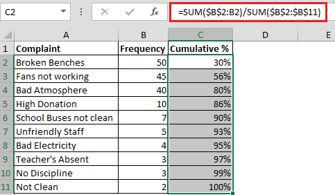
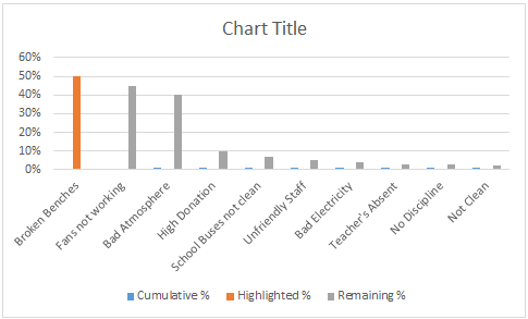
- We have School Complaint data & we need to create Pareto Chart.

- We need helper column Cumulative % in column C; formula in cell C2 would be =SUM($B$2:B2)/SUM($B$2:$B$11) & drag the formula down
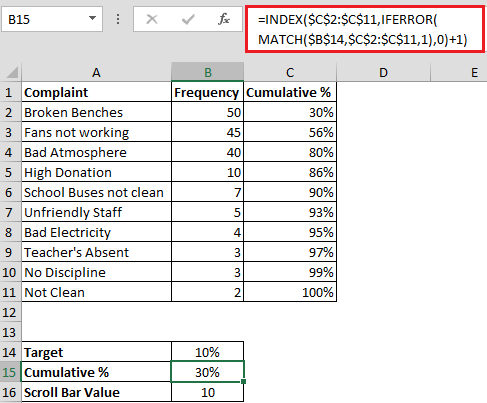
To create dynamic Pareto; chart we need three cells in which we will do some calculations
- First of all we will create Scroll Bar & linked it to cell B16
- Right click on Scroll Bar & select Format Control & enter the values as shown in below snapshot

- In cell B14 the formula is =B16/100 to calculate Target
- In cell B15; we have the following formula for Cumulative %
- =INDEX($C$2:$C$11,IFERROR(MATCH($B$14,$C$2:$C$11,1),0)+1)
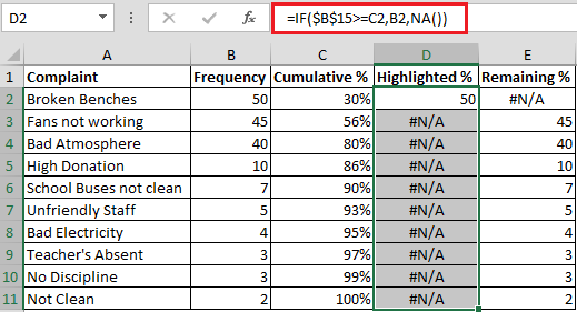
- Now we need to create 2 more helper columns i.e. Highlighted % & Remaining %
- In cell D2 the formula is =IF($B$15>=C2,B2,NA())
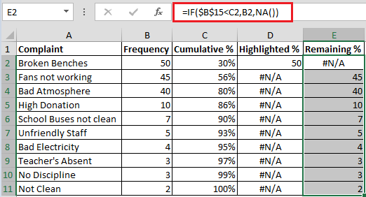
- In cell E2 the formula is =IF($B$15<C2,B2,NA())
- Finally everything is set to create the Pareto Chart; we need to select range A1:A11 & C1:E11
- From Design tab click on Chart Type
- Apply Line chart type to Cumulative % & click on Secondary Axis


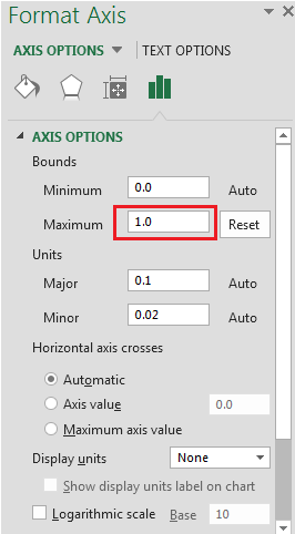
- We need to make the Cumulative % to 100 % as its showing 120 %
- Right click on Secondary axis & select Format Axis
- Select Maximum value as 1 instead of 1.2
- Now we are all set to view Dynamic Pareto Chart; the only problem is as you click on Scrollbar you will find that the Bar will shift from its original position because there are two series
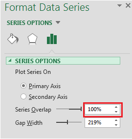
- To fox this issue we will click on Broken Benches (Highlighted %) Bar & right click on it select Format Data Series
In Series Overlap enter 100% refer below snapshot
- To see what Target % is selected; in cell J24 enter the formula as
- ="Target "&TEXT(B14,"0%")

In this way we can make Dynamic Pareto Chart wherein as you increase or decrease the scrollbar value it will update the Target.


