In this article, we will learn How To Plot X Vs Y Data Points In Excel.
Scenario:
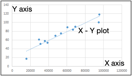
Excel to plot XY graph, also known as scatter chart or XY chart. With such charts, we can directly view trends and correlations between the two variables in our diagram. In this tutorial, we will learn how to plot the X vs. Y plots, add axis labels, data labels, and many other useful tips.
Scatter plot in Excel
Use the Scatter chart when you want to show relation between two or more variables. The scatter chart can help you learn the impact of one variable on other variables. We can visually see the correlation between two or more factors of data gathered. We can add trendlines to estimate future values.
Example :
All of these might be confusing to understand. Let's understand how to use the function using an example. Here we have data and we need to plot X vs Y plot. We need to see how add cost impacts the sales. To do this we can do several analysis tasks but here we will just create scatter plots in excel.
To make scatter plots in excel, follow these steps.
Select the two variables data. Here it is Ad Cost and Sales. We will select range B1:C13.
Go to insert > Charts > Scattered > Select Scatter

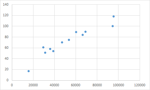
And the chart is ready.

This chart shows sales in relation to Y axis. But wait a minute we can’t see axis labels. To add axis labels, follow these steps.
Select the scatter plot.
Go to Design Tab.
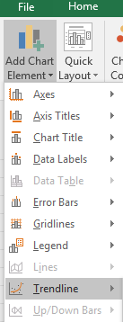
Go to Add Chart Element.
Click on Axis Titles.
Select Primary Horizontal and Primary Vertical, one by one.

Now rename them Ad Cost and Sales.

Now it is more readable. Now let’s add a trendline to this scatter plot.
To add a trendline to the graph, follow these steps.


We have our trendline added.

Go to designs.
In charts styles, select the chart style

You can change the intercept in the scatter chart if you want. Above the Display equation on the chart, you can see an option of Set Intercept. Check that to manually set intercept.
Here are all the observational notes using the formula in Excel
Notes :
Hope this article about How To Plot X Vs Y Data Points In Excel is explanatory. Find more articles on calculating values and related Excel formulas here. If you liked our blogs, share it with your friends on Facebook. And also you can follow us on Twitter and Facebook. We would love to hear from you, do let us know how we can improve, complement or innovate our work and make it better for you. Write to us at info@exceltip.com.
Related Articles :
Relative and Absolute Reference in Excel : Understanding of Relative and Absolute Reference in Excel is very important to work effectively on Excel. Relative and Absolute referencing of cells and ranges.
All About Excel Named Ranges : excel ranges that are tagged with names are easy to use in excel formulas. Learn all about it here.
4 Creative Target Vs Achievement Charts in Excel : These four advanced excel charts can be used effectively to represent achievement vs target data. These charts are highly creative and self explanatory. The first chart looks like a swimming pool with swimmers. Take a look.
Best Charts in Excel and How To Use Them : These are some of the best charts that Excel provides. You should know how to use these charts and how they are interpreted. The line, column and pie chart are some common and but effective charts that have been used since the inception of the charts in excel. But Excel has more charts to explore...
Excel Sparklines : The Tiny Charts in Cell : These small charts reside in the cells of Excel. They are new to excel and not much explored. There are three types of Excel Sparkline charts in Excel. These 3 have sub categories, let's explore them.
Change Chart Data as Per Selected Cell : To change data as we select different cells we use worksheet events of Excel VBA. We change the data source of the chart as we change the selection or the cell. Here's how you do it.
Popular Articles :
50 Excel Shortcuts to Increase Your Productivity : Get faster at your tasks in Excel. These shortcuts will help you increase your work efficiency in Excel.
How to use the VLOOKUP Function in Excel : This is one of the most used and popular functions of excel that is used to lookup value from different ranges and sheets.
How to use the IF Function in Excel : The IF statement in Excel checks the condition and returns a specific value if the condition is TRUE or returns another specific value if FALSE.
How to use the SUMIF Function in Excel : This is another dashboard essential function. This helps you sum up values on specific conditions.
How to use the COUNTIF Function in Excel : Count values with conditions using this amazing function. You don't need to filter your data to count specific values. Countif function is essential to prepare your dashboard.
The applications/code on this site are distributed as is and without warranties or liability. In no event shall the owner of the copyrights, or the authors of the applications/code be liable for any loss of profit, any problems or any damage resulting from the use or evaluation of the applications/code.