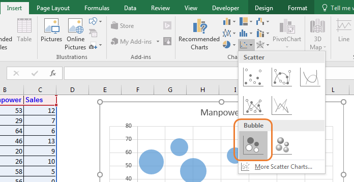
The bubble chart in excel is a version scatter chart. It adds one more dimension to the normal scatter chart. The size of the bubble can be used to indicate some numeric value. the larger the bubble, the larger value it represents. The size of the bubble determined by smallest number and largest number.
Example: Plot A Bubble Chart in Excel (Month Vs Sales vs Manpower Data)

Here I have this data, that shows the manpower used in different months and sales done in that respective month. We want to visualize data, where the month is represented on the x-axis, manpower is represented on y-axis and sales are represented by the size of the bubble.
To plot a bubble chart in excel, follow these steps.

 Interpreting Excel Bubble Chart
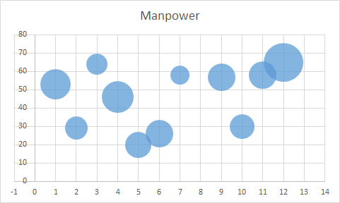
In the above chart, the x-axis represents the month intervals. It is by default represented with an interval of two months. You can change it to 1 from axis options.
We can see that the largest bubble is in the 12th month, which has used, probably most of the manpower since it is high on the chart’s Y-axis.
The bubble size is also the largest, which means it has the most sales done.
In the third month, we have used a large manpower of (64- represented by position on the y-axis) but sales are small (represented by bubble size).
Best Use of Bubble Chart in Excel
Disadvantages of Bubble Chart
So yeah guys, this how you use bubble chart in excel for data visualization. I hope this was helpful. If you have any doubts regarding this article or any other excel/VBA related article then please let me know in the comments section below.
Related Articles:
Excel Sparklines : The Tiny Charts in Cell
Speedometer (Gauge) Chart in Excel 2016
Creative Column Chart that Includes Totals
4 Creative Target Vs Achievement Charts in Excel
Popular Articles:
The applications/code on this site are distributed as is and without warranties or liability. In no event shall the owner of the copyrights, or the authors of the applications/code be liable for any loss of profit, any problems or any damage resulting from the use or evaluation of the applications/code.